Tomes of Mephistopheles patch 0.08a has just come out and brought along character saving, inventory, quickbar and spell book, among other things.
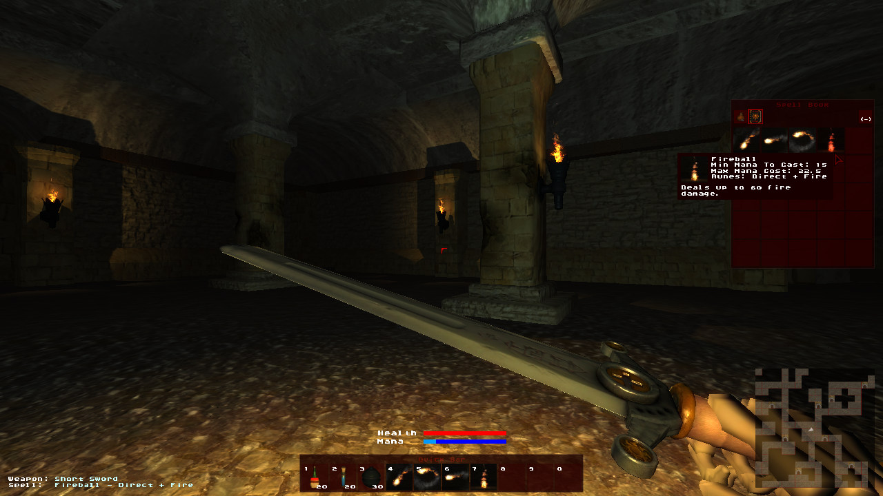
Official EU server got updated too, so ToM owners can enjoy co-op sessions with RPG'esque spirit ;)
Some you may have missed, popular articles from the last month:
All posts need to follow our rules. Please hit the Report Flag icon on any post that breaks the rules or contains illegal / harmful content. Readers can also email us for any issues or concerns.
12 comments
Could you explain the idea behind spellcasting? I figured out that you'll need specific runes to cast specific spells, but how will the Min/Max mana system work? Is it a chargeable?
btw, personally I'm not a big fan of quick bars like that. It's something I typically associate with MMOs and even then I find them distracting, but that's just me. :p
btw, personally I'm not a big fan of quick bars like that. It's something I typically associate with MMOs and even then I find them distracting, but that's just me. :p
0 Likes
Well if some skeletons are kicling your ass and you are low on health i prefer to say press 1 as a health potion is on a quickbar rather than having to search through an inventory for one, i think they are useful.
Still i have yet to pick the game up, funds are very low.
Still i have yet to pick the game up, funds are very low.
0 Likes
What min/max system? The way it works right now is you already have Spells. No runes needed. You also have certain amount of mana at first, which you use up and refill. When you find mana enhancer, so to speak, you expand your capabilities to carry more mana. Same goes for health.
Quickbars is something every single aRPG / RPG has. MMO btw simply stands for any game that can be played online with a ton of people (like WoW). It happened that RPG is the best genre that works well for that massive multiplayer model. You equip your quickbar with whatever items you need to use (health, potions, spells, etc.) and during the combat you have hotkeys from 1 to 0 (and perhaps from F1 to F11) to invoke whatever you need.
Whatever we have now, most likely will change quite dramatically. Meaning there will be totally different way of spell handling, in a better way (and it will be more fun). Melee combat will be different, again, to provide more fun. There still will be crafting and forging. The dungeons will change too. There is a lot more work to be done, and since alpha funding failed, our priorities shifted. However, we still yet to try Kickstarter and some other options to get funds necessary to keep development going at faster pace.
0 Likes
I'm maybe a lot of things, like too demanding and even too critical, but I'm definitely not blind... yet. In the screenshot the text writes 'Min mana to cast' and 'Max mana cast', as well as 'Runes: Direct + Fire' which is what my earlier question relates to. If this is only a placeholder, then could you be so kind as to explain what this new system of spell handling will be?
As for the quickbar, I never said there should not be shortcuts for using potions/spells/whatever. My statement was that I'm not a fan of 'bars like that', meaning I dislike the positioned middle-down on the screen design combining spells and potions in a single long window, mostly because it's been overused in almost every such game pre-today (exceptions excluded). There are a lot of other ways to make quickbars and I only implied that you could consider revisiting the design when you have time and not copy WoW. Personally I find it best for a 1st person RPG to not have too much stuff on the screen (like a huge noticeable 'quickbar') because it could ultimately break the immersion into world and the character you're portraying (think Oblivion or King's Field).
As for the quickbar, I never said there should not be shortcuts for using potions/spells/whatever. My statement was that I'm not a fan of 'bars like that', meaning I dislike the positioned middle-down on the screen design combining spells and potions in a single long window, mostly because it's been overused in almost every such game pre-today (exceptions excluded). There are a lot of other ways to make quickbars and I only implied that you could consider revisiting the design when you have time and not copy WoW. Personally I find it best for a 1st person RPG to not have too much stuff on the screen (like a huge noticeable 'quickbar') because it could ultimately break the immersion into world and the character you're portraying (think Oblivion or King's Field).
0 Likes
Quoting: "Alex V.Sharp, post: 4242, member: 136"I'm maybe a lot of things, like too demanding and even too critical, but I'm definitely not blind... yet. In the screenshot the text writes 'Min mana to cast' and 'Max mana cast', as well as 'Runes: Direct + Fire' which is what my earlier question relates to. If this is only a placeholder, then could you be so kind as to explain what this new system of spell handling will be?
And what did I say? You don't need any runes currently. Have you played the game? Did you see any runes in the dungeons? I haven't :) Daemon would be the one to ask about min/max mana parameters.
Quoting: "Alex V.Sharp, post: 4242, member: 136"As for the quickbar, I never said there should not be shortcuts for using potions/spells/whatever. My statement was that I'm not a fan of 'bars like that', meaning I dislike the positioned middle-down on the screen design combining spells and potions in a single long window, mostly because it's been overused in almost every such game pre-today (exceptions excluded).
To each his own. If you pay us to make a game you want to make, we will certainly make that happen :P
There is a reason almost every game uses quickbar the way it's used - usability and functionality. That's what people like, that's what people used to.Doesn't matter where quickbar goes as long as it clearly shows the hotkeys and items assigned to them, the number of slots available.
Quoting: "Alex V.Sharp, post: 4242, member: 136"There are a lot of other ways to make quickbars and I only implied that you could consider revisiting the design when you have time and not copy WoW. Personally I find it best for a 1st person RPG to not have too much stuff on the screen (like a huge noticeable 'quickbar') because it could ultimately break the immersion into world and the character you're portraying (think Oblivion or King's Field).
We not copying WoW, we copying Diablo :P Maybe you should consult us on game design :)
As I said, I haven't even began designing GUI for the game. I need to play all these games to see what they did and if I agree with their design decisions. I personally didn't find quickbars breaking immersion is any of the games I played.
Let me just reiterate, once again, how we make games. We make games for ourselves, thus if we play the game we are working on and we are not having true fun, we will be reworking the concept. We are not going to make games we don't like playing. That ensures we are working for particular audience that liked what we like. And there will be people who don't like what we implement. That's fine, we are all different and have different taste. That being said, once ToM shapes us and we see that quickbar on the screen indeed bothersome, we will do something about it. So far it's not the case. So far it's just a functionality that is being implemented.
0 Likes
Quoting: "Alex V.Sharp, post: 4238, member: 136"Could you explain the idea behind spellcasting? I figured out that you'll need specific runes to cast specific spells, but how will the Min/Max mana system work? Is it a chargeable?
btw, personally I'm not a big fan of quick bars like that. It's something I typically associate with MMOs and even then I find them distracting, but that's just me. :p
Right now you just start with 4 pre-built spells. Collecting runes and building spells with them will be introduced later. You can read our [URL='http://tom.kot-in-action.com/mwiki/index.php/Spells']spell wiki[/URL] for more information on building spells. Min mana to cast is just what it says: The minimum amount of mana you need to have to cast the spell. This is also represented on your mana bar when you have a spell selected. Note the light blue area. If your mana drops below that point, you cannot begin casting that particular spell. Max mana used is also just what it sounds like, when you hold down the cast button your charge bar builds up, when it reaches the end it stops using up mana, so the maximum amount of mana that spell can use up is 22.5 by the time the bar is charged.
A quick bar is simply an easy way to assign and activate items, skills, or spells that you might want to use w/o fiddling with the inventory. You can re-assign the keys used to activate the quick bar to anything you want in the control menu. Even games like Elder Scrolls use a quick bar, but it is hidden. Don't be discouraged simply because it is currently visible. We can always add an option to hide HUD elements. This game is still in very early stages, so we don't spend a lot of time with things such as focus groups to find out where best to place HUD elements, or if they should be hidden at all. We obviously have to show them somehow when showing off new game elements, so they have to be visible if we want to show them in a screenshot.
0 Likes
2 people answering the same question, big difference though in how it's answered though :)
0 Likes
Updated the main post to include an actual link to the website.
0 Likes
Hey Motorsep,
This is Larian from over on Phoronix. Remember brother; tease, tease, tease, and make the trolls work for you!
This is Larian from over on Phoronix. Remember brother; tease, tease, tease, and make the trolls work for you!
0 Likes
Quoting: "Larian1975, post: 4248"Hey Motorsep,
This is Larian from over on Phoronix. Remember brother; tease, tease, tease, and make the trolls work for you!
I didn't get the reference, sorry :/
0 Likes
Quoting: "Bumadar, post: 4245, member: 93"2 people answering the same question, big difference though in how it's answered though :)
That's because I come from a different world. I used to deal with real people all my life and I have been actually active online only since maybe 2010. So it's quite challenging to understand why people are asking certain things instead of reading WIKI or remembering what was said in the previous conversations :) If I could, I would prefer developing game without even going into community portals until the game is done and released.
0 Likes
Quoting: "motorsep, post: 4266, member: 154"If I could, I would prefer developing game without even going into community portals until the game is done and released.Well, technically you can do that... but I suppose then you'd never know about what needs changing until it's too late. Only other solution that comes to mind would be to do what the Indie Stone guys did and find a PR consultant. :rolleyes:
0 Likes


 How to setup OpenMW for modern Morrowind on Linux / SteamOS and Steam Deck
 How to install Hollow Knight: Silksong mods on Linux, SteamOS and Steam Deck