Linux Mint 20 has today been officially released across multiple official desktop environments and it's all sounding great. The Cinnamon desktop edition sounding especially good.
This is the first Linux Mint release to be based upon Ubuntu 20.04, the latest Long-Term Support release so you can keep on using Linux Mint 20 happily until around 2025. If you're looking for a good starting point with Linux, Mint is often a good choice.
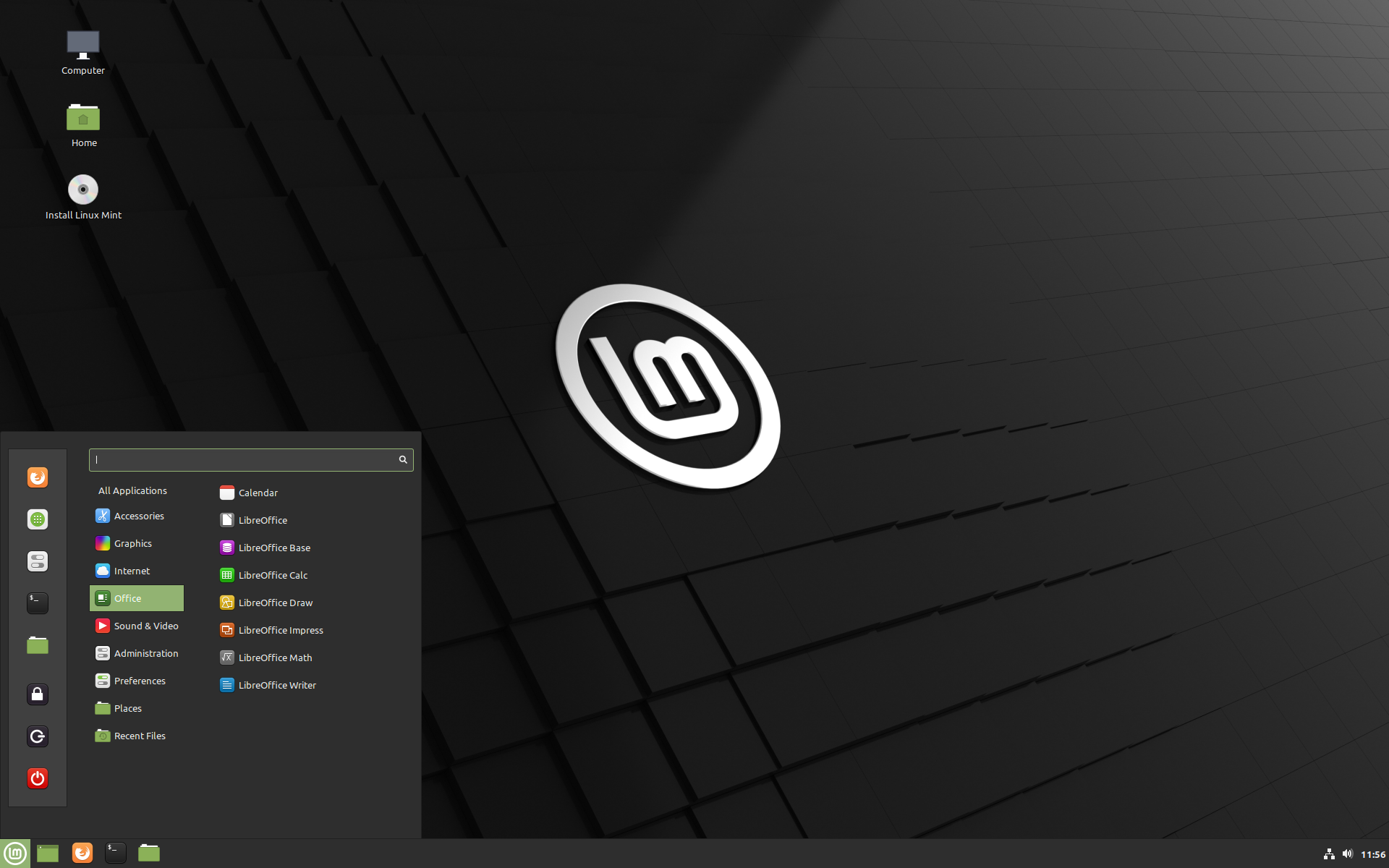 Pictured: Linux Mint 20 Cinnamon
Linux Mint 20 will likely see 2-3 point releases, all supported until 2025 and all made from the same base Mint 20. They no longer chase all the interim Ubuntu releases so they can focus on keeping things stable, this should mean upgrades to Mint 20.1 and 20.2 should be quite easy.
With this latest release, there's lots of fun new features included. For the Cinnamon edition, the biggest is the inclusion of fractional scaling for the UI along with each monitor being able to be scaled differently. Another big improvement is better support for NVIDIA Optimus out of the box, as their included applet easily allows you to pick your GPU from its menu. It also now support the NVIDIA "On-Demand" profile too. For gamers, the Optimus improvements are a big plus.
Some other nice fluff improvements came with it, like the Welcome app letting you pick a colour scheme easily.
More improvements can be found elsewhere like the improved system tray icon system, a new application named Warpinator to easily share files across networks, Nemo file manager performance improvements and the Gdebi tool used to manually install .deb files was given a fresh look.
The most controversial change in Linux Mint 20 is their disabling of Snap packages by default. Snap is the Canonical-backed next-gen Linux packaging format, which Mint's Clément Lefèbvre is not currently a fan of for various reasons like the Chromium package on Ubuntu actually being empty and just sets up a Snap instead. Their reasoning goes a lot deeper than that though, including Snaps being from one centralized store. If you want to read more on Mint's stance on Snaps, see here.
Additionally, the is the first time the Mint team have gone 64bit only as they've retired the 32bit downloads.
The currently released editions are:
Are you a Linux Mint or Cinnamon fan? Let us know what you think of the latest releases in the comments.
The Mint 20 Cinnamon is ideal for former Windows 7 users... [Specially if They use the right tweak ](https://www.omgubuntu.co.uk/2020/01/make-linux-mint-look-like-windows-7)I know it's all personal preferences, but I think overall the best looking Windows release of all time was Windows 2000.
Everything after that has just been too... colorful I guess is the word for it? Too much distraction, I hate flat icons of modern operating systems too. Granted, I still think the Amiga Workbench is the most adjustable visually and usability wise operating system out there.
Anyhow, congrats to the Mint team! I do like this trend to push back on things that Ubuntu try to force us to use. Seems they always get in this position where they try to force us to use things, but no one else seems to bite. Though it's also funny how many new things Redhat create for Linux that tend to get adopted in distributions. They really are the leader as far as pushing new things forward, it seems!
Are you a Linux Mint or Cinnamon fan?No.
The Mint team is good at listening to feedback from the community. They often make last minute changes because of community feedback. With most other distros, I got the vibe that changes are rolled out without the community really not having any say on the matter.
If there was one thing I would like to change about Mint, that would be to make a new icon theme. I'm thinking of something similar to the current Moka based one, but one that is designed to be scalable (so that there is not need to make one icon in lots of sizes, GNOME is moving towards that direction. However, the style they are going is not to my liking. I generally prefer icons that have templates and gradients).
Last edited by awesam on 28 Jun 2020 at 11:07 am UTC
Are you a Linux Mint or Cinnamon fan?No.
Is there some particular gripe you have with Mint that you would like to see fixed?
If there was one thing I would like to change about Mint, that would be to make a new icon theme. I'm thinking of something similar to the current Moka based one, but one that is designed to be scalable (so that there is not need to make one icon in lots of sizes, GNOME is moving towards that direction. However, the style they are going is not to my liking. I generally prefer icons that have templates and gradients).Good thing you can install any icon theme you like. :)
You can never please everyone when it comes to matters of taste like the look of the default icon theme. Personally I like the Mint-Y theme though. It's clean, consistent and legible. Colour variants for the folder icons are a nice bonus.
I'm a believer in good defaults. The current icons are not bad, the problem is just that some of them are outdated or missing, also they don't scale well. Both the Moka and Arc icons that the Mint icon-set is based on have been practically abandoned. So I think the writing is on the wall, they will need to be updated or replaced. I have free-time/vacation coming up in a few weeks so planning on making a mock-up of my vision
Granted, I still think the Amiga Workbench is the most adjustable visually and usability wise operating system out there.
Love the Amiga Workbench!, MagicWB and Newicons
Last edited by Purple Library Guy on 28 Jun 2020 at 6:49 pm UTC
Love the Amiga Workbench!, MagicWB and NewiconsI was fortunate and bought MagicWB and MUI back when you still could. Granted MUI is now open source and free. But the old key still works.
Sure, some of the 'feel of Workbench is werid, but it still probably has the best "you are sitting at a work bench" metaphor for desktop use.
Most people these days don't remember how things were called files and folders due to the 'desktop' metaphore, and filing cabinet drawer icons were the thing to equate all of it.
For example, Explorer on Windows is a folder icon. Nautilus on Gnome is still a filing cabinet, etc. The Spatial Nautilus that everyone hated was exactly how Workbench would do things by default...
I always try to explain to people the reasons I don't like macOS, and it probably all boils down to my widespread usage of other graphical interfaces that were much faster or simpler to use back in the late 80s/early 90s.
Well, then, don't let us know what you think of the latest release.
It sure is. On my main machine I tried it on my third monitor which is my TV, I was able to set it, but after not liking the results (the only thing this scaling does is render the UI at 150% and badly at that, text is blurry), I could not revert it back with the display manager. It would hang every time.
So I had to edit the settings file myself and then reboot.
I was hoping for pixel perfect scaling...
Are you a Linux Mint or Cinnamon fan?No.
Is there some particular gripe you have with Mint that you would like to see fixed?
No, it's just a personal taste, I don't care with any distribution trying to mimic Windows.
The Mint 20 Cinnamon is ideal for former Windows 7 users... [Specially if They use the right tweak ](https://www.omgubuntu.co.uk/2020/01/make-linux-mint-look-like-windows-7)I have noticed that every time I see an article relating to Linux as a general use desktop that might interest Windows users, somebody always comes along in its comments claiming to be a Windows user who has spent time recently, recently mind you, switching to or trying to switch to Linux, and they always claim software has to be installed from the command line etc. etc. in Linux.
Every. Damn. Time.
I have begun to think that Microsoft has some PR company on call whose job it is to browse for such articles and go in there with a sock puppet or two and recycle old anti-Linux propaganda while pretending to be sympathetic.
Last edited by Purple Library Guy on 29 Jun 2020 at 4:01 am UTC
If there was one thing I would like to change about Mint, that would be to make a new icon theme. I'm thinking of something similar to the current Moka based one, but one that is designed to be scalable (so that there is not need to make one icon in lots of sizes, GNOME is moving towards that direction. However, the style they are going is not to my liking. I generally prefer icons that have templates and gradients).
No. Even scalable icons have to be done for several sizes. I've worked on a few Papirus icons and you still do 6 sizes per icon. It's explained here
https://github.com/PapirusDevelopmentTeam/papirus-icon-theme/tree/master/tools/work
The Mint 20 Cinnamon is ideal for former Windows 7 users... [Specially if They use the right tweak ](https://www.omgubuntu.co.uk/2020/01/make-linux-mint-look-like-windows-7)
Oh dear, another one of these "Windows 7 users won't spot the difference" success stories.
They will. Since Linux does not and will not work like Windows. Ever.
"So I a have this Linux thingy and it looks like my Windows, but it hasn't got my D: an E: drives. How am I ever gonna store my stuff? And I couldn't find my tool for configuring the special keys on my keyboard. And..."





 How to play games from GOG and Epic Games on Linux, SteamOS and Steam Deck
 How to get Battlefield 3 and Battlefield 4 online working on Linux, SteamOS, Steam Deck