Now that the dust has settled on the new Steam Library design, along with various other UI overhauls like the Properties page for games (and the recent SteamPal console leaks) - Valve will be fixing up the Steam Downloads page now too.
The Downloads page in the Steam client hasn't really been touched for a long time. It does the job, sure but it could be a lot more useful. That's set to change, although we don't know when, you can test it yourself right now if you go to "steam://nav/library/downloads".
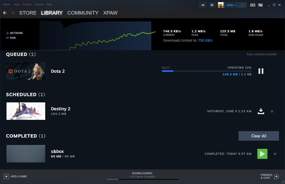
It seems it's supposed to look something like this (thanks to Pavel Djundik of SteamDB on Twitter):
Weirdly though, it's not the same for everyone.
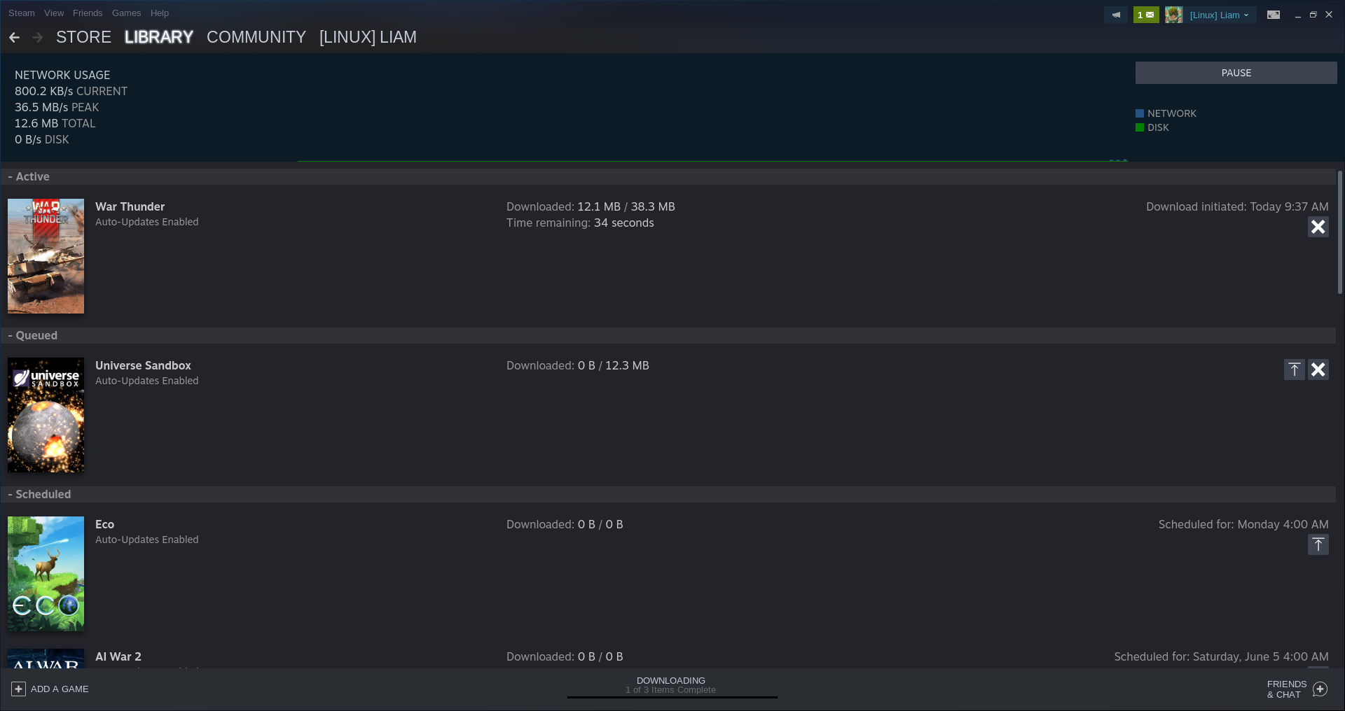
Trying it myself sort-of gives me it, but not quite and this was tested across both the Stable and Beta versions of Steam. So they're clearly not quite ready to roll it out just yet. This is what I see which has a few adjustments but not quite the overhaul as seen above:
Hopefully Valve will finally add a "Download All" button, so we don't have to keep pressing download on individual items to queue them up. Although, that might only be an issue for people like me, who set Steam to only download between super-late hours to prevent it just auto updating everything all the time. As that seems like the only way to have a bit of control over downloads.
Apparently they're also working on a new settings page too, although not easily accessed.
This looks horrible.
Valve could just display the small informations (downloaded, total download size, ETA) below each thumbnails alongside controls like (download / pause, cancel).
That way you could stuff as many game thumbnails close to each other like in the library page.
Those thumbnails could be sorted as above ; active, queued, scheduled, completed.
Edit: nvm, it's xPaw who's teasing me :D
Last edited by Scrumplex on 26 May 2021 at 9:46 am UTC
Quoting: AciDThe wasted space indeed.I never had more than half a dozen games to download, and if I would, I wouldn't care to watch them downloading..
This looks horrible.
Valve could just display the small informations (downloaded, total download size, ETA) below each thumbnails alongside controls like (download / pause, cancel).
That way you could stuff as many game thumbnails close to each other like in the library page.
Those thumbnails could be sorted as above ; active, queued, scheduled, completed.
Although, that might only be an issue for people like meNo, no Liam there are others :grin:
But Epic, Uplay, Origin, EA Desktop, Battlenet, Amazon Games, MS Store + Xbox PC, even GOG Galaxy? I'd say Battlenet is the least awful of those, but we're talking king of the poo-pile among that bunch.
Of all of them together, the only one I never have problems with updating, pausing, stopping, altering queue order at all, installing, verifying, is Steam. Just these basic functions. I could break down my problems with every one of these clients, and it's amazing how the industry has settled where it has.
Honestly I have strong suspicions as to why, being adjacent over the years to a bunch of devs of different ages but not being one myself, and I don't see the trend getting better any time soon; It truly is an industry thing.
Maybe one of these days they try to fix something that could actually be useful like the crackling of their build in voice-chat or the resource wastefulness of their new design.
Quoting: GuestI've tested it myself now and i get this version:Am I the only one who, every time I see "Master Chief" always thinks "Master Chef"?
External Media: You need to be logged in to view this.
I can't welcome a "All Downloads" page fast enough. Godspeed Mr Gaben.
But i don't see much room for improvement anyway...maybe it would be nice to have an easy way to alter the scheduled times, but other than that i don't really see anything amiss ^^
You know an application hasn't gotten a facelift in a long time when a tiny UI change with no new functionality is newsworthy! Ha.
Quoting: 14What is up with you guys having to download all the updates as soon as you know they exist? I let my "queued for later" list do its thing. It's called letting a computer be a computer. Am I going to play like 5 games in the same day? No. Am I even going to play one of those games in the next week? Unlikely. Let it be.I know I do, but for me it's a combination of having slow internet for a very long time (not so much anymore, still slower then "city-folk" speeds along with my complete lack of ability to stand pending anything). Some people can ignore pending notification/unread counts on their phones for instance, and some cannot (of course, on my phone, this is solved by just turning the notifications off). When you have slow internet, you think differently, because if an urge to play a game comes up you typically want to play it now-or-soon, not in a day or two. This is also why I have ~1500 games installed at once. I routinely run through all my clients and install any updates that are pending.
You know an application hasn't gotten a facelift in a long time when a tiny UI change with no new functionality is newsworthy! Ha.
That said, I'm surprised so many people here don't seem to grasp why Steam doesn't update games immediately. Of course they wouldn't, they're pretty obviously staggering updates to ease pressure on their network+servers, but _giving the option to do it now anyway_. I'm sure it's the same reason an update all button does not exist (although I would love that as well, but I do understand it).
I assert again that it's still friendlier then other clients, take uPlay for instance. That one only auto updates games you recently launched; If you haven't, you actually have to launch the game to get the current update to download.
Last edited by dibz on 30 May 2021 at 4:16 pm UTC
Quoting: GuestIt will *never* do its thing because the download times are *always* when my computer is turned off.Did you actually try this? Because I'd expect a semi clever program to maybe try that once or twice, but then download when it is active. Which would be fine with the goal to not have huge load on the servers when an update for a popular game has been released.
Quoting: GuestHow sure are you about that? My computer goes to sleep all the time. Not only that, I don't run Steam all that often. My computer is absolutely not online during most of the scheduled updates, yet they happen automatically. I dare you to test it. Of course, if it's just a pet peeve of yours, then that's what it is and that's that.Quoting: 14What is up with you guys having to download all the updates as soon as you know they exist? I let my "queued for later" list do its thing.1) It will *never* do its thing because the download times are *always* when my computer is turned off.
Quoting: idk-manI absolutely hate this new design (talking about the oversimplifying Trend) Why can’t they just leave things as they are or at least give people the chance to change to the original design.Well... They weren't good. I mean, from a usability perspective. If I understood correctly, I can now define the download queue with drag and drop, while before, I had to push the up arrow on the games in order... but in reverse order. Same for library places: The new interface can do more. And in my humble opinion, it also looks better, but well, that's just taste, isn't it?
Last edited by Eike on 10 Sep 2021 at 5:46 pm UTC
Quoting: EikeAgree. While I don't think it's especially great, it's still slightly better than it was before. I don't get the "oversimplification" argument, since it was even more lacking in functionality before. As far as I can see, they didn't remove anything, but they did add more features, some of which I find somewhat helpful.Quoting: idk-manI absolutely hate this new design (talking about the oversimplifying Trend) Why can’t they just leave things as they are or at least give people the chance to change to the original design.Well... They weren't good. I mean, from a usability perspective. If I understood correctly, I can now define the download queue with drag and drop, while before, I had to push the up arrow on the games in order... but in reverse order. Same for library places: The new interface can do more. And in my humble opinion, it also looks better, but well, that's just taste, isn't it?





 How to setup OpenMW for modern Morrowind on Linux / SteamOS and Steam Deck
 How to install Hollow Knight: Silksong mods on Linux, SteamOS and Steam Deck