I get it, you worked hard for hours and days and weeks on your incredibly cool-looking interface for your game. You made it so all the text perfectly lines up everywhere and picked a slick looking font, but it's all too darn small.
Even worse when it's some pixel font. Again, I get it, I do understand the why. You think it looks cool and it fits in with the theme of the game, and yes it does look cool but not only is it small but it becomes pretty terrible to actually read.
So, I am begging you, all of you game developers making something, can we set 2025 as the year you truly think about and actually add in some text and interface scaling? And if you use a pixel style font, always include an alternative clear font.
It's bad enough when some games text is so small I'm physically pulling myself closer to my PC monitor, which I'm already quite close to, but massively worse when playing on a smaller handheld screen. From the Steam Deck to the ASUS ROG Ally and all the others, it's a big problem. Made even worse when you decide to dock your handheld to a TV or monitor (or a living room PC), where you're expecting to sit back and relax a bit, I can't read a damn thing in a lot of games when doing that.

Game devs, I'm begging you, please add text and interface scaling into your games.
While we're at it, if your game interface has transparency on it, please (begging you again) add an option to remove this with a solid background. I want to be able to read all the cool stuff your teams worked hard on, stop making it even more difficult again.
Sure, my eyesight is not exactly the best, but I do religiously wear my glasses and with them on I do have rather clear vision (and I do regular check-ups to ensure my glasses are correct too — I like to see in HD). This is a huge accessibility problem in gaming. Think about this too: add into it the ageing population, with more and more older folks continuing to play games, this situation is only going to get worse as the years go on.
It's something I hope more game reviewers focus on too, or at least actually mention in every review if a game has any scaling, something that seems to be quite rarely mentioned. At least players can begin to make more informed decisions. Heck, it would be lovely if stores (hi Valve / Steam) had a way to show if a game has accessibility options for developers to fill out. Things like that would really be ideal, and put more of a focus on it for developers to actually think about it more too.
:tongue:
I'm in the same boat, my eyes get worse, so larger text is always appreciated. Some games are completely unplayable, though. And I got me my first glasses for the deck only, btw. :grin:
Last edited by KROM on 9 Jan 2025 at 10:37 pm UTC
Scaling options should be default for every game indeed
I play games on my screen, tv and steam deck. For example Final Fantasy IV 3D is perfect on the deck, but the UI is way too big for screen or TV. Other games are too small for TV and too small for the deck.
With TV in general, people have very different sitting distances to it, so UI scaling makes sense from that perspective already.
But yeah, scalable UIs should be much more of a standard at this point...



 How to setup OpenMW for modern Morrowind on Linux / SteamOS and Steam Deck
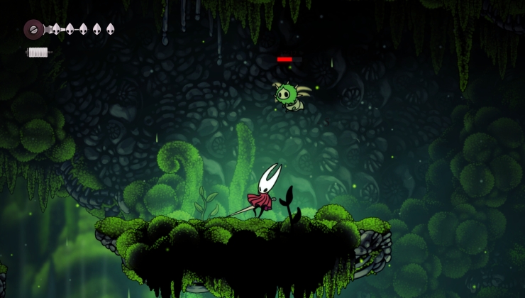 How to install Hollow Knight: Silksong mods on Linux, SteamOS and Steam Deck