Those of you who follow us on twitter @gamingonlinux will know I have been working on a new website for us for many reasons
It is now ready for wider testing: www.prxa.info
Please tell me of any bugs you find and give your suggestions.
I am aiming to have it live by the end of the month.
Features not in:
Editors can't yet auto post to front page without the post going in my admin queue.
No share to social networks on articles.
Ignore:
Ignore messed up bbcode styling on home page articles, it's from the importer from this software which i will clean up as i go (not doing it now as it will be wiped and re-imported before it goes live)
I need from you lot:
More logos! At the moment we are only using one logo the christmas themed one but usually we have 3 in rotation, I want more so submit them if you fancy getting your work on here!
Why?
The website is not for me, but for everyone, can we make it a group effort? Either way this current website has to be replaced due to:
1)The software costs money
2)It's hard to style and extend as i don't know the code
3)It's not being updated by the authors for security fixes, bugs etc
4)The software itself may not be legal, vbulletin is suing xenforo
Some you may have missed, popular articles from the last month:
All posts need to follow our rules. For users logged in: please hit the Report Flag icon on any post that breaks the rules or contains illegal / harmful content. Guest readers can email us for any issues.
Just regarding the look, I feel like it's a step back compared to this. I can't say how to improve it, but the current site just looks better.
Regarding bugs, clicking on the GoL link at the top doesn't take me back to the homepage but to ./index.php, which means that if I'm in forum it doesn't work.
Regarding bugs, clicking on the GoL link at the top doesn't take me back to the homepage but to ./index.php, which means that if I'm in forum it doesn't work.
0 Likes
You are the first one to say they feel it is going backwards so far everyone has said it's cleaner and easier to use. What exactly would you miss from the current setup? If you are going to say it doesn't look as good there has to be reasons.
I have implemented a lot of suggestion on it over the past week so if you can give feedback regarding styling I do appreciate it.
Thanks for the bug report - now fixed :D
I have implemented a lot of suggestion on it over the past week so if you can give feedback regarding styling I do appreciate it.
Thanks for the bug report - now fixed :D
0 Likes
i dont like the comments in news... too small or something dunno. News should be integrated with the forum like we currently have.
other than that.. looks clean and solid.
other than that.. looks clean and solid.
0 Likes
Regarding how the comments work - will you still be able to post them from the forum interface, or will it just be a regular type comment section?
EDIT: I see me and Xpander were having the same thoughts at the same time...
EDIT: I see me and Xpander were having the same thoughts at the same time...
0 Likes
Agreed I will make the comments have stuff like avatars :)
0 Likes
If you want, I could try my hand at some re-skinning and send you a draft?
0 Likes
After thinking about this a bit more, here's the styling stuff that bugs me:
If I think of anything else I'll mention it. But generally, it just seems to loose a bit aesthetically.
And a separate issue, the captcha here/there sometimes doesn't work, and I have to copy the text I wrote and refresh the page for it to take.
- font size - it seems to small generally, and also I think there's an issue with quotes there
- colouring - too uniform, it's all blue! - I thin a little variance could go far, for example categories, headers. Perhaps a slightly darker shade of blue (closer to what's now)
- the side bars seem mostly unimportant - a bit different ordering and such, remove the redundant ones (why a second menu?) and maybe slightly more colours - to emphasize headers, activity on articles and important links (e.g. submit articles). Also, the width seems to make some of them useless (twitter)
- top bar's links are not the clearest because it's white on light blue
- nothing you can do anything about, but I'm getting Windows ads, so I'm placing the blame on Google and their lack of targeting
If I think of anything else I'll mention it. But generally, it just seems to loose a bit aesthetically.
And a separate issue, the captcha here/there sometimes doesn't work, and I have to copy the text I wrote and refresh the page for it to take.
0 Likes
Font size is that an issue for everyone else? It's the same size as currently on here for me.
Colouring - yeah i do actually agree there as well it does need some variation.
Ads - yeah blame google :P, you must have looked up windows recently heh, captcha works for me everytime and i've tested it countless times, do you wait until you complete it and it tells you its okay until you hit enter?
0 Likes
I changed article headers to the same style we have here now and i agree it looks loads better thanks for the tip!
0 Likes
Font size is that an issue for everyone else? It's the same size as currently on here for me.
In posts it's smaller than here by about 2 points for me.
Ads - yeah blame google :p, you must have looked up windows recently heh, captcha works for me everytime and i've tested it countless times, do you wait until you complete it and it tells you its okay until you hit enter?
I do wait and it simply tells me to do the captcha first. Then I refresh and it's fine again. This only happens sometimes though, like one out of five.
Oh, and some thing’s wrong with the avatars for comments, they appear for the wrong person, the one behind. Although generally I don't like their look, but I've no idea what would be better.
And a small suggestion, a more human readable date?
0 Likes
I changed article headers to the same style we have here now and i agree it looks loads better thanks for the tip!
Just an idea, maybe the background should be coloured according to the category? I can't say whether that'd look good, but might be something interesting to try and decide on.
0 Likes
Sorry for triple posting, but just noticed a bug - the images are shown far too big to make any sense - the McDroid one takes more space outside the postbox than inside.
0 Likes
No need to say sorry for triple posting it's acceptable in this one I want to get it sorted ASAP and I think you are right the text is smaller but checking my style and this forum both have 13px so i don't get it hrmm.
I also removed the redundant Main Menu block as well since it didn't really serve a purpose as all other links are in the nav anyway now. Saves some nice space.
Text - changed to the same font we use here it's a bit bigger now and more familiar :)
Avatars for wrong people fixed on comments.
Dates are now parsed nicer as well - awesome idea.
0 Likes
also the marked "headers" could use some work:
https://dl.dropbox.com/u/28788188/Screenshot-562.png
maybe different color for text and slightly smaller cuz it seems too big atm.
https://dl.dropbox.com/u/28788188/Screenshot-562.png
maybe different color for text and slightly smaller cuz it seems too big atm.
0 Likes
Hmm thanks chrome bug it seems.
Edit > Fixed that now.
Edit > Fixed that now.
0 Likes
Agreed I will make the comments have stuff like avatars :)
About that, I have a few concerns with that part of the new website in general. I usually much prefer websites where you get a base article and then go to a separate forum thread where you post comments rather than just a standard comment box. It tends to cut down on garbage posting and actually allows for more proper discussion on a topic (or in the case of Phoronix, it makes it so that the discussions are not 100% pure gobshite).
I like much of what is going on there, especially as an (occasional) content producer as what you are doing does make it look a lot more friendly and professional for potential article/review/interview writers. But that point does concern me a bit. I do not know if anyone is with me on that though.
0 Likes
Well it wouldn't be hard to implement I will have a think on it, a lot has been improved already.
0 Likes
Well, you do what you think is best. :)
0 Likes
Its looks are a lot less polished than the current site and the color scheme isn't very pleasant neither. Anyway, it looks promising. Still, I wonder why none of the opensource forum/portals was good enough, it takes a lot of work and time into creating your own.
0 Likes
You probably saw it whilst i was nuking the layout. It should look much better now since the side and content properly fit on the page now :).
All the current ones where far far too bloated for what i wanted and made it difficult to import the current content.
All the current ones where far far too bloated for what i wanted and made it difficult to import the current content.
0 Likes



 How to install GE-Proton on Steam Deck, SteamOS, Linux
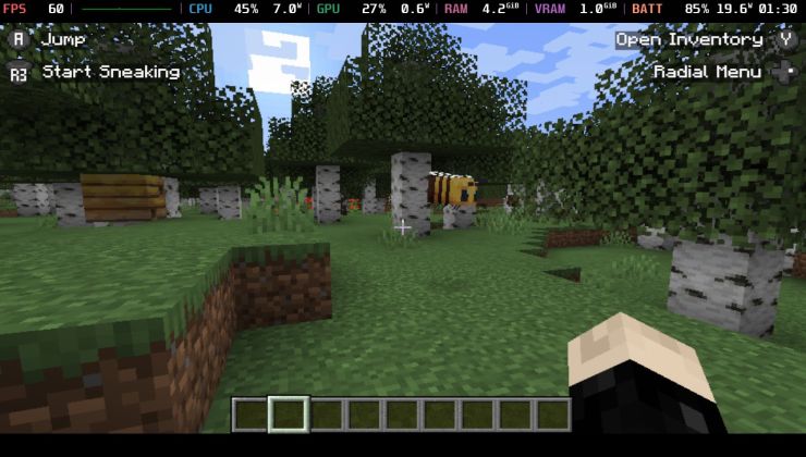 An idiots guide to setting up Minecraft on Steam Deck / SteamOS with controller support
See more from me