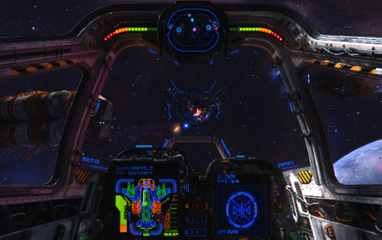
Wings Of Saint Nazaire is probably one of the most beautiful space combat sims around, and it has a brand spanky new free alpha to try!
New Stuff
-3 different human fighters
-You can die
-Better alien ship collisions
-Better font rendering, it's a lot clearer
-And more fun things!
The mouse handling is still a little bit iffy, and I imagine they aren't using a Unity version with all the Linux mouse fixes yet, so that should improve in future.
I am completely in love with the visuals and theme of this game, and I really hope they take time and care with it. I don't care if it takes until the end of 2016 to be released as it looks so good.
From what I understand they will be doing a crowdfunding campaign at some point, but for now they are developing it and letting people play for free.
Try it out and tell us what you think.
0 Likes


Some you may have missed, popular articles from the last month:

All posts need to follow our rules. For users logged in: please hit the Report Flag icon on any post that breaks the rules or contains illegal / harmful content. Guest readers can email us for any issues.

i really like the mixture of classic spaceshooter pixelgraphics and fancy explosions/particles. if the font rendering is a lot clearer now i wonder how its been before, because its still blurred and hard to read. i think some of that has to stay to fit the graphicsstyle, but some improvements to font and general HUD wouldnt hurt, namely:
a) dont use darkblue as font if the space is black already, theres little contrast. thats fine for most of the hud but important stuff should stand out with a brighter tone. especially targetship-name, targetdistance, targetbrackets, crosshair.
b) get rid of redundant information. why would anyone need a 5 digit decimal place in the target distance. why does my hud has colorful indications for my entire shipparts but not even an indicator in which direction my not-on-screen target is
gotta say tho i totally love the menu/shipyard style & music. the field of view is way to low for me as i feel like looking through a scope while flying but other than that this game has tons of potential in my eyes, kudos!
0 Likes
 Plintslîcho 6 Aug 2014
Looks sweet indeed. However, I suck on the mouse controls. So, not my game. May try it one day again with a joystick.
0 Likes
Got trouble to set it up on Ubuntu 14.04 64bits
./wings.x86: error while loading shared libraries: libGLU.so.1: cannot open shared object file: No such file or directorytried to setup i32-libs but also get this message :
The packet « ia32-libs » has no version compatible(personnal translation)
0 Likes
 How to set, change and reset your SteamOS / Steam Deck desktop sudo password
 How to set up Decky Loader on Steam Deck / SteamOS for easy plugins
See more from me