Update 2015-06-13: The original article was confusing regarding what the video was meant to represent, and I've updated the text a bit to rectify this. See the comments from the developer below the article.
Side Scroll Studios have released a video to show off their engine, 2DEvolved, with some preliminary in-game footage from their upcoming metroidvania Corpses 'N Souls.

Note that the video is of an early build made to show off what the engine is capable of, and is not meant to represent the final visual direction.
Their in-house engine has been built to be cross-platform and has some very interesting features. One of them is a free form camera system that is meant to be less restrictive than those of most 2D platformers. The most interesting feature though, is that every item and enemy in the game is implemented as persistent objects. This is to enable a system of harvesting corpses and souls (hence the name) and picking up items to use or craft into new objects, like in the action RPGs that have inspired parts of the gameplay.
Visually the game reminds me a bit of Symphony of the Night, and the game will include several of the elements that are a staple of the metroidvania genre. That includes a large multi layered world where you have to revisit areas to open up new paths as you progress in the game. There will also be several playable classes to choose from and tons of loot, spells and a stealth system.
No release date has been announced yet, but if you're curious to learn more about this metroidvania/ARPG hybrid, there's a ton of info about the game on the official website.
Side Scroll Studios have released a video to show off their engine, 2DEvolved, with some preliminary in-game footage from their upcoming metroidvania Corpses 'N Souls.

YouTube videos require cookies, you must accept their cookies to view. View cookie preferences.
Direct Link
Direct Link
Note that the video is of an early build made to show off what the engine is capable of, and is not meant to represent the final visual direction.
Their in-house engine has been built to be cross-platform and has some very interesting features. One of them is a free form camera system that is meant to be less restrictive than those of most 2D platformers. The most interesting feature though, is that every item and enemy in the game is implemented as persistent objects. This is to enable a system of harvesting corpses and souls (hence the name) and picking up items to use or craft into new objects, like in the action RPGs that have inspired parts of the gameplay.
Visually the game reminds me a bit of Symphony of the Night, and the game will include several of the elements that are a staple of the metroidvania genre. That includes a large multi layered world where you have to revisit areas to open up new paths as you progress in the game. There will also be several playable classes to choose from and tons of loot, spells and a stealth system.
No release date has been announced yet, but if you're curious to learn more about this metroidvania/ARPG hybrid, there's a ton of info about the game on the official website.
Some you may have missed, popular articles from the last month:
All posts need to follow our rules. For users logged in: please hit the Report Flag icon on any post that breaks the rules or contains illegal / harmful content. Guest readers can email us for any issues.
I'm not sure where you're seeing the SoTN in this. Judging from the video, I think the visuals are messy and the different layers tend to blend into each other which makes it hard to see what's what. The lighting effects don't help things either. The harvesting and crafting side to it doesn't really appeal to me either and I hope that they don't make it too tedious. In fact, I'm a bit skeptical of the so-called arpg elements working well in general. Guess I'll wait and see how it turns out, but I can't say that this looks too promising.
The title threw me off if I'm honest. I expected this to be a Ghosts 'n Goblins type game which I think is a niche that hasn't been fully exploited.
The title threw me off if I'm honest. I expected this to be a Ghosts 'n Goblins type game which I think is a niche that hasn't been fully exploited.
1 Likes, Who?
I'm not sure where you're seeing the SoTN in this.
I was thinking of the silhouette effect on one of the attacks and the light effects on several of them. The changing weather also reminded me of that, but that's probably not unique to SotN. I agree that the environment looks a bit messy and blends together too much, but it's an early build and hopefully they improve on that. The ARPG elements is what interests me the most about this game, but it remains to be seen how well it will work in practice.
0 Likes
Visually not appealing to me.
1 Likes, Who?
I am digging the colours but at the same time it's difficult to tell what is going on. All the action also seems floaty and slow. This is an early build, however, so I expect this to be resolved by the time the game releases.
0 Likes
Sorry to say that but I think the looks of this game are absolutely horrible. To me it looks like nothing but a mess of randomly spread out pixels and it's difficult for me to even make out the players' character, let alone noticing what is actually going on. From this video I would never buy this game. And while I'm at it: I think the background-music doesn't fit in. And it sounds rather much as if it would get on my nerves very soon. So all in all: There's not a single thing in this video that appeals to me. :-/
1 Likes, Who?
The YouTube compression turn the graphics messy, here is a .png

But yes, is still confusing. I think this is a tech demo of what they engine cold do, not the final game.
Let's hope that all that little details don't ask for a high end machine to play a 2D game.

But yes, is still confusing. I think this is a tech demo of what they engine cold do, not the final game.
Let's hope that all that little details don't ask for a high end machine to play a 2D game.
2 Likes, Who?
But yes, is still confusing. I think this is a tech demo of what they engine cold do, not the final game.
Thanks, but yep, still quite messy, imho.
1 Likes, Who?
Yeah, I concur. I love the genre to bits, but... The art style here is going to make it very difficult to discern the background from the foreground, and all the bright particle effects and neon colours make it look quite ridiculous TBH.
But, I'm optimistic that there would be other locations than "acid trip swamp". I could easily imagine how great the very detailed artwork would look in a castle setting for instance... I'm hoping that the neon look is just for this one level, to make it low visibility and therefore harder than the rest. But something tells me that this is going to take precedence throughout the game. Hopefully it changes, but I don't really think it will.
But, I'm optimistic that there would be other locations than "acid trip swamp". I could easily imagine how great the very detailed artwork would look in a castle setting for instance... I'm hoping that the neon look is just for this one level, to make it low visibility and therefore harder than the rest. But something tells me that this is going to take precedence throughout the game. Hopefully it changes, but I don't really think it will.
1 Likes, Who?
Who thought it was a good idea to go that overboard with obnoxiously bright contrasting colors? 
0 Likes
Hello, I am the single person that created this game engine and is making the game Corpses 'N Souls, our team is made up of my self and a Composer Michael Kelly who does the awesome music. The video above is a engine demo running the current state of the game. I have finally gotten my engine to a state that I am able to show it off for the first time in motion and everything is working. I only mentioned E3 in the video cause I love video games and always wanted to be part of the show and it is the favorite time of year for me. I am not going to be at the show and clearly the game is in very early development and no where near being finished.
The game Corpses 'N Souls will not be ready for probably more than a year(at best) this is extremely early development. My efforts now will be focusing on the game, since the engine is in real good shape so a lot will change. I have already completed a lot of the base systems for my game so that is why I used the current state of Corpses 'N Souls in the engine demo than rather script something for that would be wasted time and work.
As for the comments about the player being lost in the backgrounds and everything blending I am aware of this and have already started on a solution(this is not final):
Light theme 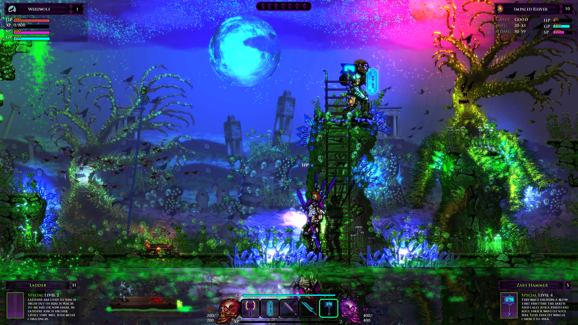
[Light Theme 1080p](http://www.sidescrollstudios.com/images/FIX_BACK_SEP/CNS_FIX_l1.png)
Dark theme 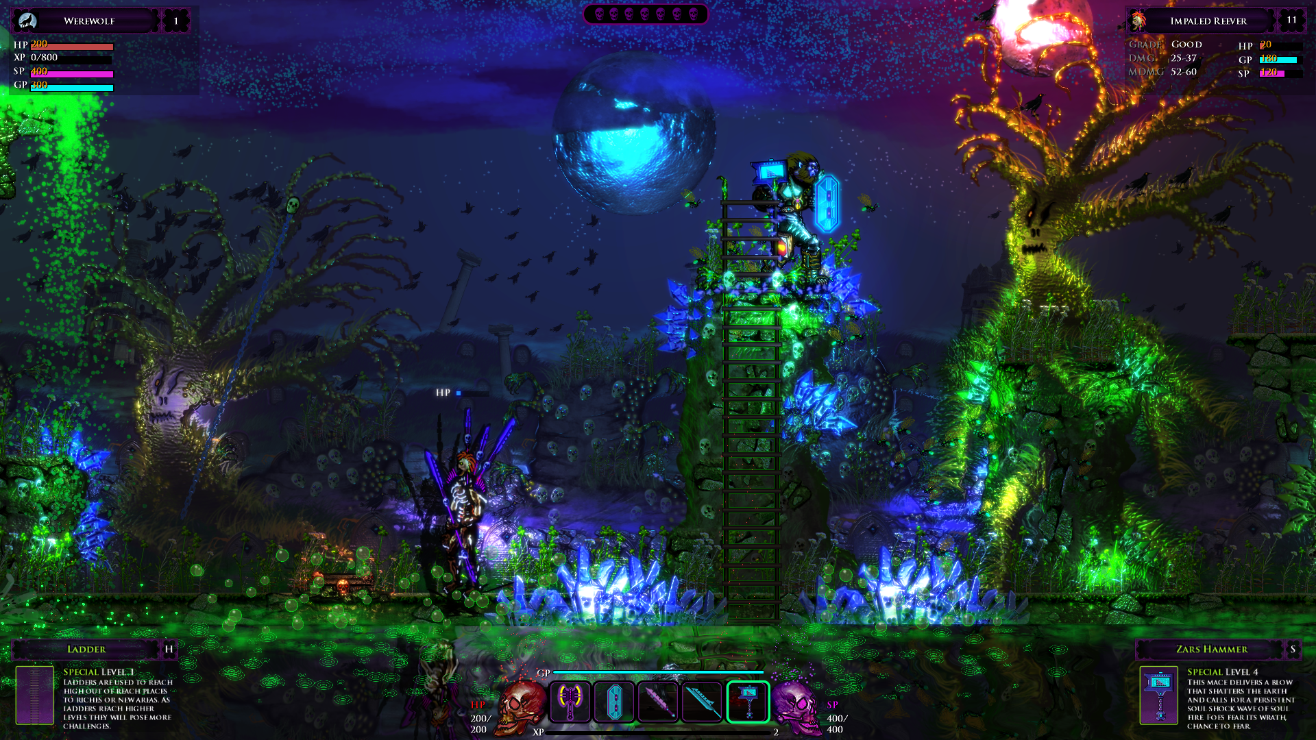
[Dark Theme](http://www.sidescrollstudios.com/images/FIX_BACK_SEP/CNS_FIX_d1.png)
This FX will be optional like DOF, this is of course a WIP and a lot will change as development goes on, things are very early right now.
Also keep in mind this game has a base line of 1080p it is not meant for lower resolutions, YouTube destroys the details in videos @ 1080p that have high detail. Here is a link to some direct footage videos captured in the engine demo if interested:
http://www.sidescrollstudios.com/images/video/
Anyways a lot will change over time, the video above is very early footage, I will release a proper gameplay video down the road.
Thanks for your time.
The game Corpses 'N Souls will not be ready for probably more than a year(at best) this is extremely early development. My efforts now will be focusing on the game, since the engine is in real good shape so a lot will change. I have already completed a lot of the base systems for my game so that is why I used the current state of Corpses 'N Souls in the engine demo than rather script something for that would be wasted time and work.
As for the comments about the player being lost in the backgrounds and everything blending I am aware of this and have already started on a solution(this is not final):
Light theme 
[Light Theme 1080p](http://www.sidescrollstudios.com/images/FIX_BACK_SEP/CNS_FIX_l1.png)
Dark theme 
[Dark Theme](http://www.sidescrollstudios.com/images/FIX_BACK_SEP/CNS_FIX_d1.png)
This FX will be optional like DOF, this is of course a WIP and a lot will change as development goes on, things are very early right now.
Also keep in mind this game has a base line of 1080p it is not meant for lower resolutions, YouTube destroys the details in videos @ 1080p that have high detail. Here is a link to some direct footage videos captured in the engine demo if interested:
http://www.sidescrollstudios.com/images/video/
Anyways a lot will change over time, the video above is very early footage, I will release a proper gameplay video down the road.
Thanks for your time.
1 Likes, Who?
Hi Valcan, thanks for your reply. What is the hardware target you have in mind? Is a beef desktop or something like a laptop with integrated graphics?
0 Likes
Hi Valcan, thanks for your reply. What is the hardware target you have in mind? Is a beef desktop or something like a laptop with integrated graphics?
Hey M@GOid, both. I am targeting a wide amount of configs from the top rigs to as much as I can below with my engines scalability. I am aware that a lot of indie games have a big scene on the laptops so I will not ignore this group and have a scale for them. The engine is coded for multi core CPUs and as many GPUs as you have, and plan to make the graphics very scalable(early on I have taken steps since I have the game running on 5760x1080 which take a lot of work and your forced to scale your engine).
My self I am a power PC desktop guy who loves mutli screen gaming and all the new tech so I will have a Ultra mode and continue to push the tech in my game and that is what you see in the video. The most expensive stuff are my dynamic interactive particle system and second the lighting. The mega particle system uses both the CPU and GPU together I have a second particle system(if you turn that one off) that is only GPU and very efficient but you lose the interactive(the collisions) but keeps the physics. Same with the lights I will have a smart LOD/culling system that will scale back the lighting if need be or you can turn them off but only keep some of the main global illuminating ones to still keep the cool look.
Currently on my comp on Ultra @ 1080p @ 60FPS what is in the video :
[ note - this is pre alpha code un optimised I have a lot planned on culling and other performance measures and will still do a lot of work ]
- First Gen Geforce Titan
-> Min usage is 5%
-> Max usage is 50%
-> vid mem does not go over 1.5gig
- CPU is a 6 core i7 3.2 - 3.8 turbo
-> Min 16%
-> Average is around 20%
-> Max around 33%
* note the load is spread on all the cores, my engine is multi cored *
- Sys mem is around 700 Megs to a 1 Gig
Keep in mind I can optimize a lot of stuff this is a early pre alpha build there is still a lot of improvements I know I can do, which is nice to know that I will get things faster.
If you dump the MEGA interactive dynamic particles and swap to my GPU only particles that don't react to the environment but still have physics you probably could run it on quit a low spec system, you will gain a huge boost in resources.
This will give you an idea of the requirements, this is real rough though, I would guess a 580 would run Ultra @ 1080p 60FPS right now. I will try and test laptops, AMD rigs, Geforce rigs, SLI, Cross Fire, Intel, multi screen and try and cover as much as I can.
My goal is to have as many users to play it in Ultra or High as I can and make sure I don't sacrifice the cool tech as you go down in settings.
Hope that helps but that is as much info as I can share right now.
1 Likes, Who?
@valcan_s: Thanks for your comments. :) I've updated the article a bit to hopefully be less misleading.
0 Likes
Nice to see a new metroidvania game on the horizon. Thanks for the news, flesk and valcan_s :)
0 Likes
I totally missed all the comments by the developer of Corpses 'N' Souls! Thank you for those informative posts,
valcan_s! Please do stick around!
valcan_s! Please do stick around!
1 Likes, Who?




 How to set, change and reset your SteamOS / Steam Deck desktop sudo password
 How to set up Decky Loader on Steam Deck / SteamOS for easy plugins
I run the Hidden Linux Gems group on Steam, where we highlight good indie games for Linux that we feel deserve more attention.
See more from me