I have owned Frozen State for some time and when I tried it a long time ago it felt weird, unfinished and not very fun. So I took a look at the brand new finish version.
First thing to note is that if you use more than one screen like me, it will open on the wrong screen. It will also use a wrong resolution, two notches against it already. On the second run once I sorted out the resolution, it seemed to start on the correct screen which was weird.
On first look, the introduction is extremely uninspired. You watch a really slow moving snowplough as you read text at the bottom of the screen. I didn't even notice the text had changed at times as it just pops in with no real visual indicator to carry on reading. There is literally nothing going on apart from a slow moving vehicle.
Essentially, these Pillar things appeared which mutated people and animals into evil creatures. These creatures don't do so well in the cold, so we made some satellites to create a micro ice-age. As far as stories go, it's actually somewhat interesting.
Something about the character movement seems really off, it makes the entire game feel sluggish. I have noted other reviewers have also said this, so I'm glad it's not just me. It just doesn't feel right at all. The movement in which your character turns towards where the mouse is pointing also feels sluggish as there's a slight delay, the controls just feel outright awkward to use.
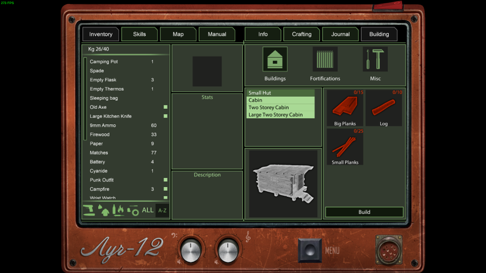
The user interface is really quite basic, flat and outright ugly. I noted this when I covered it before, that the entire UI with its glaring ugly solid green is a really poor design choice as it doesn't fit in with the game at all.
I know, we have a survival game in the harsh cold, what colour blends in well and creates immersion? PUKEY GREEN. Sold.
The interface is also a mess to use, weapons for example need you to go into the inventory, equip it and then activate it. This was confusing at the start, as I equipped an Axe and so expected to then be able to use it. I only figured it out when I right clicked on the item again, to see an "Activate" option. It makes zero sense to make you equip it and then an additional step to be able to use it.
It's not a big world, but rather a small world cut up into chucks of areas at a time. You can only leave each area by going into one of the green on-screen overlays ("transition zone") which not only breaks immersion, but looks ugly too:
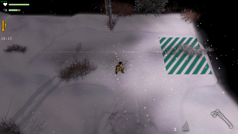
Exploring the map is also yet another poorly designed clunky area of design. I clicked a new area and then clicked explore and was dumped back into the same area. So I tried again, nope. It turns out you need to double click somewhere for your character to move on the map, then click explore once your little cross gets there. It screams out to me as a really poorly designed and explained game in almost all aspects of it.
You might come across a door that is locked, requiring you to see that ugly solid green UI again. You move a rather plain slider from left to right to undo the latch or whatever and then it's open. Seriously, that is it. Another completely immersion destroying and irritatingly designed element—it's so damn boring.
Combat is where the game literally falls apart on you. There's zero strategy to it, apart from keep clicking the left mouse button to swing, try to avoid being hit with the slow and clunky controls and wait to kill or be killed. It's so without creativity it's bland as hell.
The whole game feels terribly clunky, visually displeasing with lots of poor design choices and it just isn't fun. I have literally nothing nice to say about this title. It feels like it was strung together by people who had zero creative vision and just wanted to build a survival game.
Out of 350 reviews 80% are positive, I feel like they must be playing a terribly different game to me.
You can find Frozen State on Steam if you desire.
First thing to note is that if you use more than one screen like me, it will open on the wrong screen. It will also use a wrong resolution, two notches against it already. On the second run once I sorted out the resolution, it seemed to start on the correct screen which was weird.
On first look, the introduction is extremely uninspired. You watch a really slow moving snowplough as you read text at the bottom of the screen. I didn't even notice the text had changed at times as it just pops in with no real visual indicator to carry on reading. There is literally nothing going on apart from a slow moving vehicle.
Essentially, these Pillar things appeared which mutated people and animals into evil creatures. These creatures don't do so well in the cold, so we made some satellites to create a micro ice-age. As far as stories go, it's actually somewhat interesting.
Something about the character movement seems really off, it makes the entire game feel sluggish. I have noted other reviewers have also said this, so I'm glad it's not just me. It just doesn't feel right at all. The movement in which your character turns towards where the mouse is pointing also feels sluggish as there's a slight delay, the controls just feel outright awkward to use.

The user interface is really quite basic, flat and outright ugly. I noted this when I covered it before, that the entire UI with its glaring ugly solid green is a really poor design choice as it doesn't fit in with the game at all.
I know, we have a survival game in the harsh cold, what colour blends in well and creates immersion? PUKEY GREEN. Sold.
The interface is also a mess to use, weapons for example need you to go into the inventory, equip it and then activate it. This was confusing at the start, as I equipped an Axe and so expected to then be able to use it. I only figured it out when I right clicked on the item again, to see an "Activate" option. It makes zero sense to make you equip it and then an additional step to be able to use it.
It's not a big world, but rather a small world cut up into chucks of areas at a time. You can only leave each area by going into one of the green on-screen overlays ("transition zone") which not only breaks immersion, but looks ugly too:

Exploring the map is also yet another poorly designed clunky area of design. I clicked a new area and then clicked explore and was dumped back into the same area. So I tried again, nope. It turns out you need to double click somewhere for your character to move on the map, then click explore once your little cross gets there. It screams out to me as a really poorly designed and explained game in almost all aspects of it.
You might come across a door that is locked, requiring you to see that ugly solid green UI again. You move a rather plain slider from left to right to undo the latch or whatever and then it's open. Seriously, that is it. Another completely immersion destroying and irritatingly designed element—it's so damn boring.
Combat is where the game literally falls apart on you. There's zero strategy to it, apart from keep clicking the left mouse button to swing, try to avoid being hit with the slow and clunky controls and wait to kill or be killed. It's so without creativity it's bland as hell.
The whole game feels terribly clunky, visually displeasing with lots of poor design choices and it just isn't fun. I have literally nothing nice to say about this title. It feels like it was strung together by people who had zero creative vision and just wanted to build a survival game.
Out of 350 reviews 80% are positive, I feel like they must be playing a terribly different game to me.
You can find Frozen State on Steam if you desire.
Some you may have missed, popular articles from the last month:
All posts need to follow our rules. For users logged in: please hit the Report Flag icon on any post that breaks the rules or contains illegal / harmful content. Guest readers can email us for any issues.
The funny thing about saying it feels off and clunky... that's how No Man's Sky felt to me. Like why can't I be in the ship and head straight into the planet... it only lets me dip down and up a tad... really annoying.
I'm not sure if I have this game or not, I probably do, maybe I'll give it a shot, but yeah when it feels off like No Man's Sky. And before anyone says anything, I played it in Windows and was getting close to a constant 60fps, so it wasn't frame rate, just game play.
I'm not sure if I have this game or not, I probably do, maybe I'll give it a shot, but yeah when it feels off like No Man's Sky. And before anyone says anything, I played it in Windows and was getting close to a constant 60fps, so it wasn't frame rate, just game play.
1 Likes, Who?
That might sound evil but maybe you should try Windows version as well in order to check whether clunky controls and sluggish gameplay are OS specific.
0 Likes
Out of 350 reviews 80% are positive, I feel like they must be playing a terribly different game to me.
This is the reason I avoid Early Access games, the review are often way too much optimistic.
0 Likes
That might sound evil but maybe you should try Windows version as well in order to check whether clunky controls and sluggish gameplay are OS specific.The negative reviews already confirm it is not my issue, as does the rest of the games performance.
The combat is poorly implemented and feels very unresponsive making it almost impossible to attack or dodge anything.
The combat is absolutely horrible to the point of it being impossible as there is no way to dodge attacks.
The movement is horrible, melee combat is just terrible and general control is bad at best.
And so on.
1 Likes, Who?
But Can It Survive Early Access?
1 Likes, Who?
Survival, Shooters, RPGs, FPS, Turn-Based strategy, Simulators, RTS...
All I'm missing is RTS with build-up like good old StarCraft, C&C or similar.
All I'm missing is RTS with build-up like good old StarCraft, C&C or similar.
3 Likes, Who?
Out of 350 reviews 80% are positive, I feel like they must be playing a terribly different game to me.Maybe they don't all share your irrational hatred of the beautiful color green. :P
1 Likes, Who?
puke puke puke ;)Out of 350 reviews 80% are positive, I feel like they must be playing a terribly different game to me.Maybe they don't all share your irrational hatred of the beautiful color green. :P
0 Likes
Ah, now I see why you ditched Mint in favour of Ubuntu.puke puke puke ;)Out of 350 reviews 80% are positive, I feel like they must be playing a terribly different game to me.Maybe they don't all share your irrational hatred of the beautiful color green. :P
0 Likes
Agreed. Many early access reviews tend to be defensive in nature rather than objective and informative.Out of 350 reviews 80% are positive, I feel like they must be playing a terribly different game to me.This is the reason I avoid Early Access games, the review are often way too much optimistic.
0 Likes



 How to set, change and reset your SteamOS / Steam Deck desktop sudo password
 How to set up Decky Loader on Steam Deck / SteamOS for easy plugins
See more from me