Thanks to the great TheLinuxGamer for the poke on Twitter about it, it seems that 'Owlboy' [Official Site] will come to Linux using FNA.
@thelinuxgamer @TheIndieBox The linux/ mac port will come soon after the PC launch. We're still experimenting with FNA but it looks good
— Adrian Bauer (@AdrianGBauer) September 16, 2016
Looks utterly gorgeous, looking forward to trying it out. Check out the trailer below:
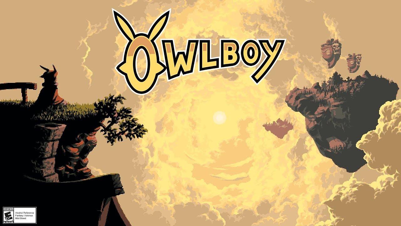
Direct Link
About the game
Owlboy is a 'high-bit' adventure game, where you can fly and explore a brand new world in the clouds! Pick up your friends, and bring them with you as you explore the open skies. Overcome obstacles and greater enemies, in one of the most detailed adventures of this era.
Being a mute, Otus struggles living up to the expectations of owl-hood. Things spiral from bad to worse with the sudden appearance of sky pirates.
What follows is a journey through monster infested ruins, with unexpected encounters, and burdens no one should have to bear.
"FNA is a reimplementation of the Microsoft XNA Game Studio 4.0 Refresh libraries."
http://fna-xna.github.io/
Gimme scanlines and I'm sold....Why?
Seriously, I've always found those effects pointless.
It's just that pixels were always meant to be accompanied by scanlines. They were designed with CRTs in mind, which are a perfect complement to them. Scanlines were the things that turned ugly, low-res blocks into beautiful works of art. (As well as chiptunes, off course.)Pixels weren't designed with anything in mind. The hardware had low resolution, which meant visible pixels. Same goes with scanlines. They're an ugly (IMHO) artifact of an inferior display technology, and I don't get the nostalgia. I love me some pretty pixel art, but I don't see what blurring and distortion adds to the experience.
EDIT: These are my purely subjective opinions, not trying to put down anyone's personal feelings on the subject.
Last edited by tuubi on 16 Sep 2016 at 3:45 pm UTC
I wonder if this was made using the same program as Frogatto... it looks really similar to me, and I know Frogatto was originally meant to be a template for people to make new games.
It's just that pixels were always meant to be accompanied by scanlines. They were designed with CRTs in mind, which are a perfect complement to them. Scanlines were the things that turned ugly, low-res blocks into beautiful works of art. (As well as chiptunes, off course.)Pixels weren't designed with anything in mind. The hardware had low resolution, which meant visible pixels. Same goes with scanlines. They're an ugly (IMHO) artifact of an inferior display technology, and I don't get the nostalgia. I love me some pretty pixel art, but I don't see what blurring and distortion adds to the experience.
EDIT: These are my purely subjective opinions, not trying to put down anyone's personal feelings on the subject.
You are both correct. And both wrong too. :)
On CRT monitors, the pixels were not "square" as with crisper monitors, mainly due to the dots on screen consisting of seperate RGB guns, arranged a certain way. On most, these were in a triangle shape, and on Trinitron screens, these were arranged next to each other. The result is that even on these two types of CRT screens, a pixel would look subtly different to the another, and a LOT different to how it looks on a crisp screen.
So designers definitely designed for graphics to look good on these screens specifically (usually televisions). Colours also came out differently: A precise mix of R, G and B would look different based on screen type.
Older games were specifically designed for thee screens, but emulating the effect on modern screens is also not as simple as adding scanlines.
See this comparison: https://www.youtube.com/watch?v=v3SZkjF1RDI
Also, read this detailed description by Kyle Pittman http://www.gamasutra.com/blogs/KylePittman/20150420/241442/CRT_Simulation_in_Super_Win_the_Game.php
Last edited by rustybroomhandle on 17 Sep 2016 at 8:48 am UTC
Modern pixel games aren't automatically "retro", and there's no reason to assume they were designed to look good or tested on an old CRT. Most likely the graphics were created using--and intended to be viewed on--modern LCD screens. If you miss the "good" old days of 16 bit consoles or something, sure go nuts with your blurry filters, but I for one always disable them if possible.
Modern pixel games aren't automatically "retro",
Bingo. Modern pixel art games often have an aesthetic that does not really resemble anything from ye good olde days. Games in the 8 and 16 bit era did not aspire to be "pixel art" - it was just graphics and they worked to make em look as good as they could within the limitations. Modern pixel art tends to rub the pixelness in quite a bit.
Flink (1995):

On a CRT screen the individual pixels would have been barely discernible.
Last edited by rustybroomhandle on 17 Sep 2016 at 4:00 pm UTC
I do like everything about the look of this game... except for the red noses. They conflict with my pathetic need for glamour.
I suppose pixel art is more of a statement these days than a limitation to overcome.More artistic choice than statement I think, like black-and-white versus colour photography. Could be a statement of course, but I must admit the message eludes me.
I do like everything about the look of this game... except for the red noses. They conflict with my pathetic need for glamour.Hehe, we're such a glamorous bunch, us Linux gamers.



 How to set up Decky Loader on Steam Deck / SteamOS for easy plugins
See more from me