YouTube videos require cookies, you must accept their cookies to view. View cookie preferences.
Direct Link
Direct Link
Disclosure: Key provided by developers.
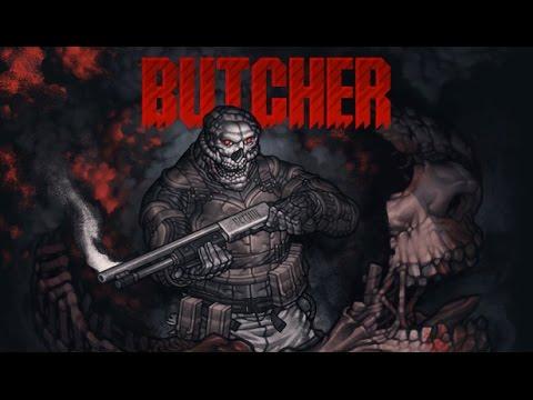
BUTCHER is a blood-soaked action platformer from Transhuman Design, the developer behind King Arthur's Gold and Trench Run.
It's brutal, difficult, fast paced and it's actually rather good. It's almost as if Doom or Quake were re-designed as an action platformer, with the difficulty and speed of Broforce thrown in for good measure. That's how I can best describe it. It has a similar atmosphere to Doom and Quake, and great action. There's very little plot to it, no tutorials to get through and nothing standing in the way of getting in, killing stuff and getting on with it.
You have very little time for reactions, it's kill or be killed. Enemies generally take one shot to be killed, but you can be killed just as easily. This can get frustrating when enemies seemingly teleport out of nowhere and fly at your with a chainsaw.
Two things I didn't much like about the game though: the first being how low resolution the graphics are. I found it often hard to focus. The second being no checkpoints, if you die right near the end of a level, you have to do it all over again. It takes a lot of practice to really get going.
Blowing up people with the jet-packs, watching the explosion and hearing their screams is terribly satisfying.
Honestly though, I've really struggled with this one, the difficulty really is screwing with me. I am enjoying it mind you even with the struggle, but it's certainly not easy. I'm not kidding, it took me five attempts to pass level two. Their motto of "The easiest mode is Hard" isn't a joke.
Some you may have missed, popular articles from the last month:
All posts need to follow our rules. For users logged in: please hit the Report Flag icon on any post that breaks the rules or contains illegal / harmful content. Guest readers can email us for any issues.
Curious what other people's thoughts on how such a disproportionate number of indie games go the retro graphics route. Is it a cop out due to laziness? maybe trying eliminate scrutiny of the art assets? is the true target audience mobile? or is it truly nostalgia of a console generation?
As someone has been gaming for 35+ years and PC gaming for 30 years I grew up with those types of graphics and was happy to see them die (for awhile anyway). The developers back then were trying to push the envelope and improve graphics. They didn't intentionally create games with such low fidelity, it was the only option.
Curious what other people's thoughts might be.
2 Likes
Curious what other people's thoughts on how such a disproportionate number of indie games go the retro graphics route. [...]I think it's a combination of an honest love of the art style (rose-tinted or not), a higher focus on game mechanics and the fact that it's quite a bit more difficult to compete with AAA games if one chooses a more photo-realistic style instead.
Personally (though I haven't yet released any games), it's because I will always miss my Amiga.
0 Likes
It's an extreme bloodbath and/but very cool game :)
It reminds me of Abuse: https://lgdb.org/sites/default/files/node_images/978/1326.jpg
It reminds me of Abuse: https://lgdb.org/sites/default/files/node_images/978/1326.jpg
0 Likes
I'm still a big fan of retro graphics when they're used well. I'm not referring to the Butcher specifically; I'd have to play it to find out if I thought the graphics were appropriate. But it's really not as simple as saying "retro = ugly" and "AAA = pretty." The style of graphics used is often an artistic choice meant to evoke a certain tone or ambiance in a game. The Witcher 3 would not work with retro graphics, and Stardew Valley would not work with modern "AAA" graphics. Different styles are appropriate for different games.
It's easy to say that "retro is easier so developers are lazy" and maybe that is true sometimes, but you can't just ignore games like Starbound, Terraria, and Fez where I believe the graphics were a deliberate artistic choice; whether it was an easier choice is irrelevant.
There are also many examples of retro graphical styles being able to age much better than others. Look at how terrible Heavy Rain looks now even though it was state-of-the-art at the time, then look at Chrono Trigger, a much older game that still looks good today.
Also, maybe I shouldn't bring my old grievances to this conversation, but I am not okay with holding "AAA" studios up as the end-all-be-all pinnacle of perfection that all developers should aspire to when they are pulling so much sh** on consumers lately with pre-order, microtransaction, DRM bullsh**. Remember The Order 1886? Sold completely on graphics, even though it was generic, lazy, CoD style shooter. It's true! "AAA" games with great graphics can be LAZY too! Not to mention that it was gutted to stretch out the franchise they wanted it to be, and crammed full of microtransactions on top of that. Not something to aspire to!
1 Likes
Curious what other people's thoughts on how such a disproportionate number of indie games go the retro graphics route. Is it a cop out due to laziness? maybe trying eliminate scrutiny of the art assets? is the true target audience mobile? or is it truly nostalgia of a console generation?
As a game developer starting out, with more research than results under his belt, I'd say it definitely depends. I'm quite passionate about pixel art (though currently looking at vector art) and I'd say titles like Hyper Light Drifter show how fantastic the medium can turn out with the right style and artistic skill.
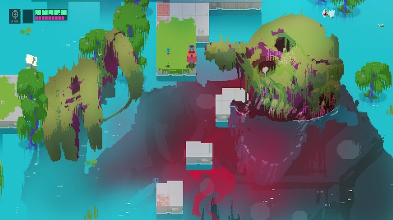
But at other times it's basically a cost effective step up from 'programmer art', which is a term meaning the most basic graphics/shapes used by devs who have much more programming than art experience. I don't know where Butcher falls, but from the trailer I immediately thought that with the small scale and muted color pallet (save for red, of course) probably makes it a bitch to play :B As you can see with the above the picture, contrasting colors makes a big difference.
edit: Also, I'm in my early 20s, whose first console was the N64, so I can't really say my love is nostalgic in nature :P
Last edited by HadBabits on 6 Oct 2016 at 3:58 pm UTC
0 Likes
To me it mostly seems like an excuse, at least now that there is such a huge number of indie games that going this route.
While I like the nostalgic stuff as much as anyone else growing up in that era, it's getting a bit much.
The Amiga (which I still have up and running) had better graphics than many of these games, so what are they aiming at? C64 level?
Will probably still get this game, though, it looks fun :)
Last edited by chrisq on 6 Oct 2016 at 6:55 pm UTC
1 Likes



 How to set, change and reset your SteamOS / Steam Deck desktop sudo password
 How to set up Decky Loader on Steam Deck / SteamOS for easy plugins
See more from me