For those who know me, they will know I love strategy and sandbox building games. Not only that but I love things based around space and other planets. So Earth Space Colonies [Steam, Official Site] deserved a try.
I like how for the most part the game tends to keep things simple, like actually creating your colonies. You select buildings from simple lists and place them down as you would in any other game of this type.
I really do love how certain modules come down to the planet by their thrusters and land, as opposed to people building everything. It certainly makes it feel like a space game, but sadly the rest of the building in the game isn't as awesome. Other buildings get this horrible looking thing:
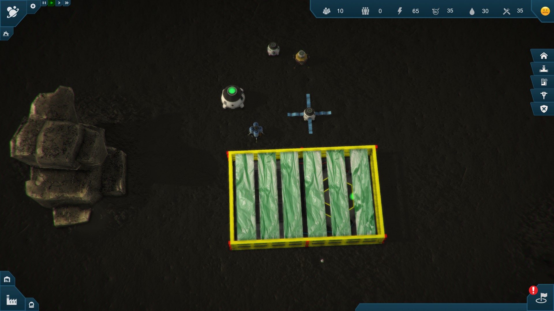
That big ugly yellow thing is a something being built, it looks completely out of place and it's so damn ugly compared to the rest of the game.
No one comes out to build it either (even though the game has astronauts wondering around), and you don't get any sense of how it's progressing unless you click on it to see a progress bar come up in the bottom info section of the screen.
Each building is placed separately to everything else, nothing can connect or snap together. I fully admit this peeve is going to be different for everyone, but to me it would make more sense for modules and buildings to connect together, especially in a zero oxygen environment.
The building menu I have found to be too simplistic. There's no ability to see what a building costs at a glance. You have to open the building menu, then open another menu and then see what each building costs. You need to do this for every building too, rather than having icons and counters or something come up when hovering over a building. When you get into the details screen for a building to see what it costs, even this has no thought really put into it. It will tell you that you need, so let's say 8 iron, but if you don't have enough it will just have a red overlay. It won't tell you how much you currently have, which would have made the game have far less clicking through menus constantly. On top of that, you can't just build something from the additional details screen, you have to close it and go back into the right-hand building menu to select it again to be able to place it. The entire user interface was aggravating to use.
It has a resources system like Oxygen, Food and so on, but there's no way to actually see what your current use, is only what you currently have. It's a little over simplified in a way that doesn't engage you.
One major issue is the repeating mosaic of the single ground texture each planet uses, it looks terrible to the point of being able to see the repeating texture quite easily.
It's also rather buggy, I paused the game, alt+tabbed and came back to find this:
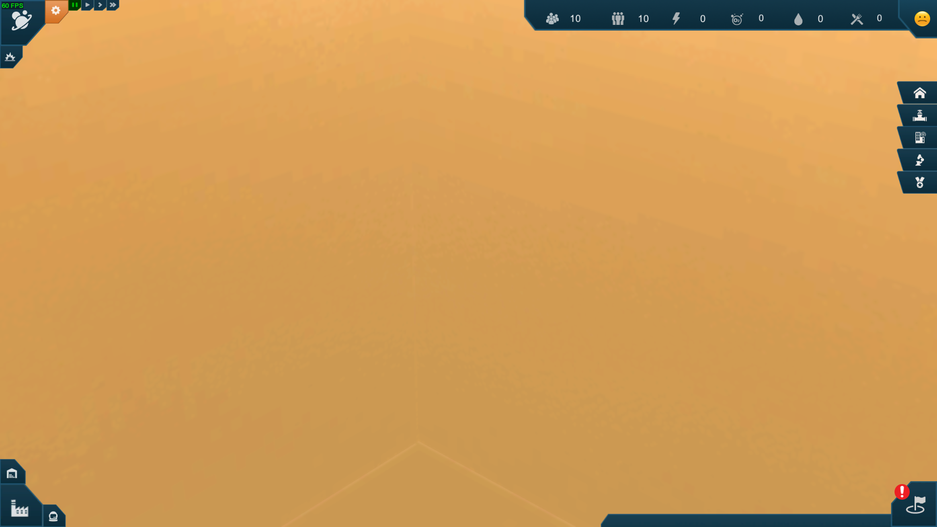
That happened repeatedly and utterly broke the game. I wasn't sure if the camera had somehow zoomed in or out, but nothing I tried could get it back so I could see.
The tutorial is really slow, it doesn't explain things very well and it was boring to follow it.
There's no visual feedback or indicator when you save a game, so I ended up saving each time with a new name and going back into the save menu to check it was done. This is extremely basic stuff that all save systems should have.
On top of all that, everything is just so slow.
About the game
Earth Space Colonies is a strategy-simulation game where you build space colonies around the Solar system. Your first destination is Mars. Establish a first self-sustaining colony and terraform a red wasteland into a green oasis. Balance your resources and expand the infrastructure. Build anything from high-tech factories, hotels, military bases to space elevators and terraformers. Colonize other worlds as well: defend a mining colony on a dwarf planet Ceres and explore the subsurface ocean on Ganymede, Jupiter’s largest moon. Survive intense combat on Saturn's moon Titan.
I'm really sad about this one, I was hoping it was at least a tiny bit engaging, but it's just not fun to play. A nice idea, but poor execution with little thought put into the UI. I would avoid this one and go for something like RimWorld if you want to build a colony. There's just too many things I disliked about the game, and very little I liked about it. There's just no excitement in it at all.
The game was put into Early Access in February and officially released in July, that's not a lot of time to polish up a game based on user experience and feedback and it badly shows the developer rushed it.
I like how for the most part the game tends to keep things simple, like actually creating your colonies. You select buildings from simple lists and place them down as you would in any other game of this type.
I really do love how certain modules come down to the planet by their thrusters and land, as opposed to people building everything. It certainly makes it feel like a space game, but sadly the rest of the building in the game isn't as awesome. Other buildings get this horrible looking thing:

That big ugly yellow thing is a something being built, it looks completely out of place and it's so damn ugly compared to the rest of the game.
No one comes out to build it either (even though the game has astronauts wondering around), and you don't get any sense of how it's progressing unless you click on it to see a progress bar come up in the bottom info section of the screen.
Each building is placed separately to everything else, nothing can connect or snap together. I fully admit this peeve is going to be different for everyone, but to me it would make more sense for modules and buildings to connect together, especially in a zero oxygen environment.
The building menu I have found to be too simplistic. There's no ability to see what a building costs at a glance. You have to open the building menu, then open another menu and then see what each building costs. You need to do this for every building too, rather than having icons and counters or something come up when hovering over a building. When you get into the details screen for a building to see what it costs, even this has no thought really put into it. It will tell you that you need, so let's say 8 iron, but if you don't have enough it will just have a red overlay. It won't tell you how much you currently have, which would have made the game have far less clicking through menus constantly. On top of that, you can't just build something from the additional details screen, you have to close it and go back into the right-hand building menu to select it again to be able to place it. The entire user interface was aggravating to use.
It has a resources system like Oxygen, Food and so on, but there's no way to actually see what your current use, is only what you currently have. It's a little over simplified in a way that doesn't engage you.
One major issue is the repeating mosaic of the single ground texture each planet uses, it looks terrible to the point of being able to see the repeating texture quite easily.
It's also rather buggy, I paused the game, alt+tabbed and came back to find this:

That happened repeatedly and utterly broke the game. I wasn't sure if the camera had somehow zoomed in or out, but nothing I tried could get it back so I could see.
The tutorial is really slow, it doesn't explain things very well and it was boring to follow it.
There's no visual feedback or indicator when you save a game, so I ended up saving each time with a new name and going back into the save menu to check it was done. This is extremely basic stuff that all save systems should have.
On top of all that, everything is just so slow.
About the game
Earth Space Colonies is a strategy-simulation game where you build space colonies around the Solar system. Your first destination is Mars. Establish a first self-sustaining colony and terraform a red wasteland into a green oasis. Balance your resources and expand the infrastructure. Build anything from high-tech factories, hotels, military bases to space elevators and terraformers. Colonize other worlds as well: defend a mining colony on a dwarf planet Ceres and explore the subsurface ocean on Ganymede, Jupiter’s largest moon. Survive intense combat on Saturn's moon Titan.
I'm really sad about this one, I was hoping it was at least a tiny bit engaging, but it's just not fun to play. A nice idea, but poor execution with little thought put into the UI. I would avoid this one and go for something like RimWorld if you want to build a colony. There's just too many things I disliked about the game, and very little I liked about it. There's just no excitement in it at all.
The game was put into Early Access in February and officially released in July, that's not a lot of time to polish up a game based on user experience and feedback and it badly shows the developer rushed it.
Some you may have missed, popular articles from the last month:
All posts need to follow our rules. For users logged in: please hit the Report Flag icon on any post that breaks the rules or contains illegal / harmful content. Guest readers can email us for any issues.


 How to set, change and reset your SteamOS / Steam Deck desktop sudo password
 How to set up Decky Loader on Steam Deck / SteamOS for easy plugins
See more from me