When I last tested Castle Story [Steam, Official Site] I came away thoroughly unimpressed by how many issues I saw. It's had a huge update, so it's time for another look.
Disclosure: Key provided by the developer.
The developer claims they've done a complete rework of the UI, they added a resources list below the minimap, new bricks, a new 1v1 map, a new tutorial with better first-steps, trading cards and new audio. It sounds like a pretty good update overall, especially in terms of the UI which was a mess before. For the full details on what's changed, see the release notes here. They also have this trailer for the update:
Direct Link
I'm usually quite easy to please, but when developers have a lack of attention to details, I do get a little annoyed. First impression of the new update wasn't great. When launching, you're now greeted with this useless picker:
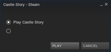
The second one seems to be windowed mode, for those who don't have a crystal ball.
Okay fine, I can forgive a simple lack of text on something like that. However, something I noted in my previous article from over three months ago is how broken their launcher is on Linux. Guess what—still a mess:
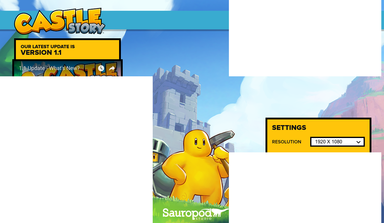
Those white boxes—yeah—shouldn't be appearing all over the place of course.
After guessing where the play button was, I finally got the game to load up. It loads in windowed mode, so I set it to fullscreen and save it. To be thorough, I tested to see if it even saved the setting properly—it did not. On the next load, it was windowed mode once again. Turns out there's a checkbox to launch it in fullscreen under the resolution box in the launcher, I wouldn't know that of course unless I saw it in the brief moment before the white boxes appear all over the damn thing.
Okay, let's attempt to actually play it now…
To my surprise, they finally fixed the Invasion game-mode telling you that you're in the Sandbox game-mode, something which led to a lot of confusion last time. On top of that, it seems their UI adjustments have also fixed the UI being able to leave the screen, something which was a pain before.
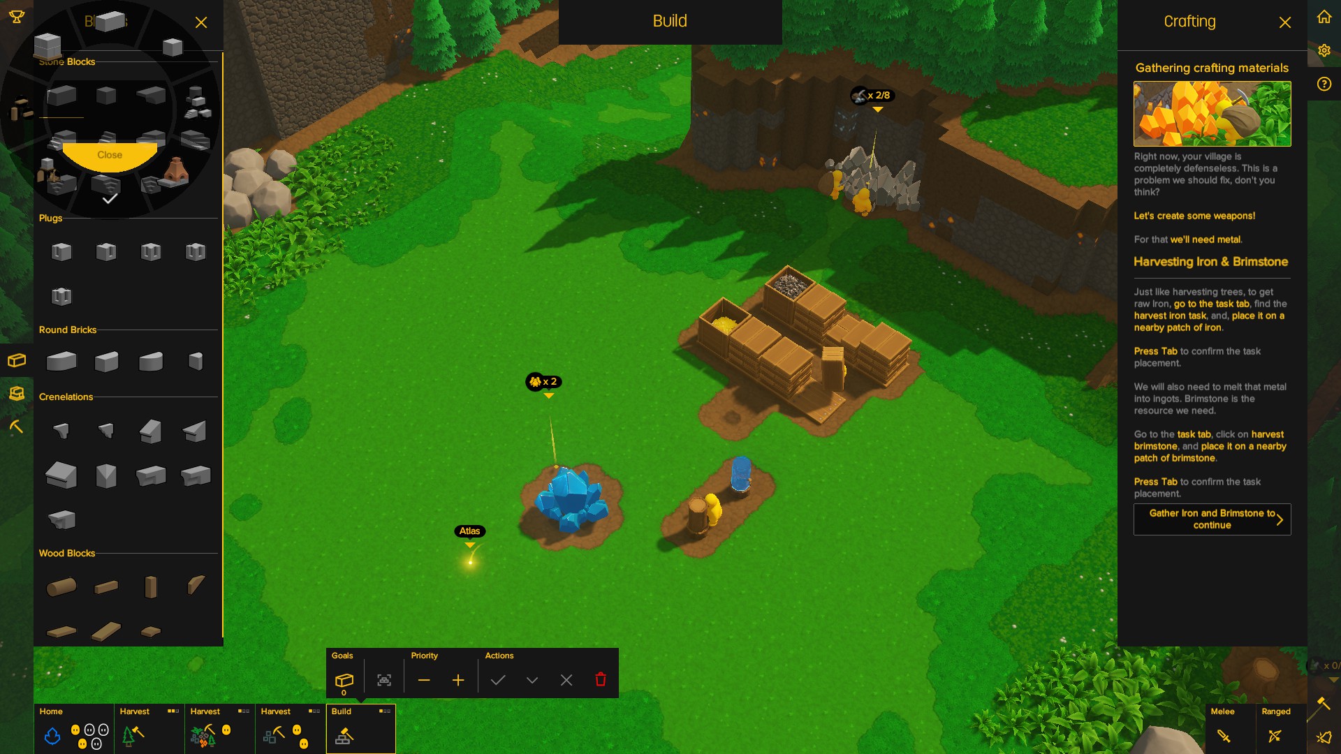 You can see in the above shot, that the UI now properly stays within the boundaries of the screen.
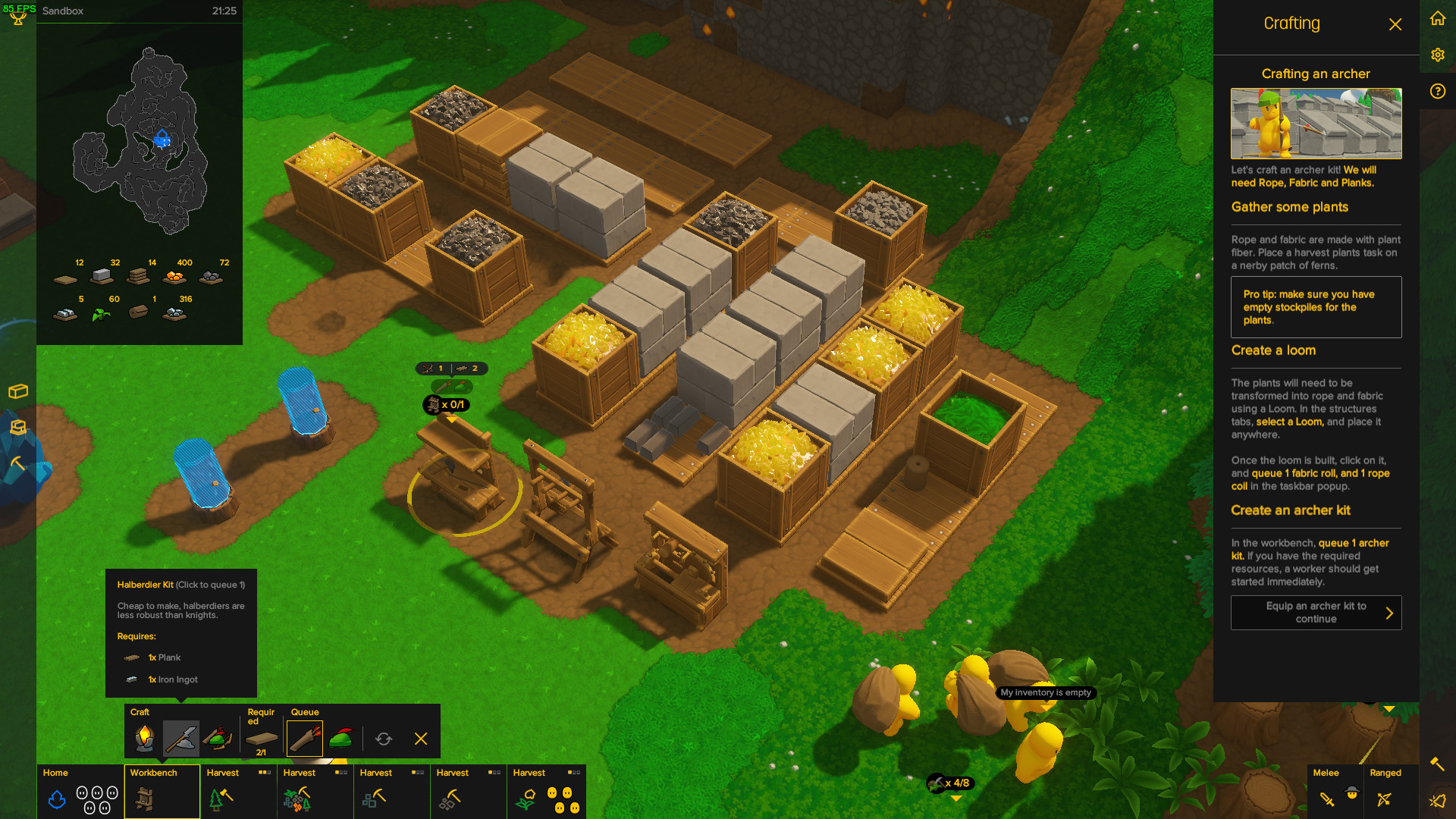
So they've made some improvements which is good to see, but their claim of a "complete rework" of the UI is a little bit of a stretch, it's more of an incremental update with a bunch of quality of life changes. What they've done is good and overall the UI is a vast improvement over the mess it was before. The ability to quickly adjust which resource a gathering task is for, or the priority of it is a great feature. The ability to just quickly queue up items after clicking on a building and set it to repeat is also quite a big change
The problem with the UI is still the same as before, it's massive and it feels like it's in your way. That's even more true now, since the huge minimap now has the resources list below it taking up even more of your screen. Some of the other issues are still around, like scrolling in the UI also zooms the camera, which is a nuisance.
The tutorial did feel a little smoother, but they've removed the ability to go backwards in the tutorial box, so if you needed to re-read a part of it from the previous bit—tough luck. They still haven't solved the tutorial text not matching up to what the UI says either, there's multiple times the tutorial text tells you to do something, but the UI for it says something else. Like when it tells you to "harvest stone", but the UI is actually "Boulders" and when you actually set the task to harvest the Boulders, the quick info box that pops up for you to adjust the resources and priority for the task says "Stone". It's a small issue, but when there's multiple like that, it all adds up to make the game confusing for new players.
The AI, where do I start? They're still complete idiots. They block each other constantly, it takes them forever to realise there's a new task or build order, requiring a lot of micro-management to force them onto a particular task. The problem is when you do that, you then need to remember to move them from that task to something else as you've put them in that group manually, whereas if they went to that task naturally, they would move onto something else when they're needed. The AI is probably one of the biggest issues in the game, it's just not good.
There's other little things that annoy me. Creating a halberd kit for example, queues up a halberd and a helmet. One of my people made the halberd and then buggered off instead of making a helmet. I thought it wasn't queued, so I clicked it and accidentally removed the helmet from the queue. The problem here, is that you can't just make a helmet, since they come as a package. So I now had one halberd and no helmet, forcing me to make another "kit" with the two together, before one of my people could become a soldier, since it literally requires them to have a helmet. If you're going to require both, don't let one be removed from the queue, make them come as a package, or let us make them individually. The game is full of little oversights like that, which make certain parts a nuisance to play, especially if you don't know the game inside-out.
While they've improved some parts rather a lot, they're still not tackling some of the other major issues at all (the poor AI, the launcher issues, the minimap/resource list taking up tons of space etc). I am pleased to see them making some progress to make it a better game and I'm happier with the state of it and I started to actually enjoy some of it, but it still has a lot of issues to fix. I'm not going to outright recommend it—yet.


 How to set, change and reset your SteamOS / Steam Deck desktop sudo password
 How to set up Decky Loader on Steam Deck / SteamOS for easy plugins
See more from me