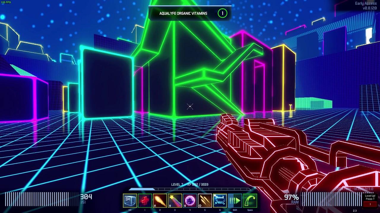
Black Ice is a cyberpunk FPS with tasty loot coming out of every orifice and this latest update is absolutely incredible.
I've long been a fan of it, watching it mature and grow into a pretty impressive game. However, two issues plagued it previously. It didn't perform all that well and on Linux it had fullscreen issues due to Unity. Both are completely solved with the latest update. Input is fine in fullscreen and performance even when jacked up is around double what it was before—simply amazing.
Here's a quick look at how it runs now:
Direct Link
They've gone through two major versions of Unity, added in Occlusion Culling, and now de/respawn enemies/powerups with distance so it's no surprise it feels so much better.
A new enemy has entered cyberspace named "Mor.tar.gz" (love the name, hah!) which, as the name suggests, fire mortars to deny an area for a little while so you need to get in close.
Enemies also behave slightly differently, as you can now stagger them by doing enough damage to allow you to get in real close. They also have smoother pathing, so it all looks a bit better overall.
You can find it on Humble Store (DRM free build + Steam key), itch.io and Steam.
Quoting: TcheyI want to like this game, but it's quite boring too quickly repetitive, with little to do. Exploration is also limited due to otherwise rather nice neon style, as more or less everything looks the same.
Pretty much my thoughts. The neon look is neat, but the burden of distinction is put entirely on the geometry, which isn't varied enough to keep it looking like a box rave. Maybe if they plaster company-specific textures (e.g. company logo, advertisements) across the server buildings or something.
Quoting: HadBabitsIndeed, that's one of my only real concerns with it. There's a few roaming enemies now, which made it a little better. Once they've got more mechanics fleshed-out, I do hope they start doing more world-building elements.Quoting: TcheyI want to like this game, but it's quite boring too quickly repetitive, with little to do. Exploration is also limited due to otherwise rather nice neon style, as more or less everything looks the same.
Pretty much my thoughts. The neon look is neat, but the burden of distinction is put entirely on the geometry, which isn't varied enough to keep it from looking like a box rave. Maybe if they plaster company-specific textures (e.g. company logo, advertisements) across the server buildings or something.
Last edited by HadBabits on 28 June 2018 at 6:30 pm UTC


See more from me