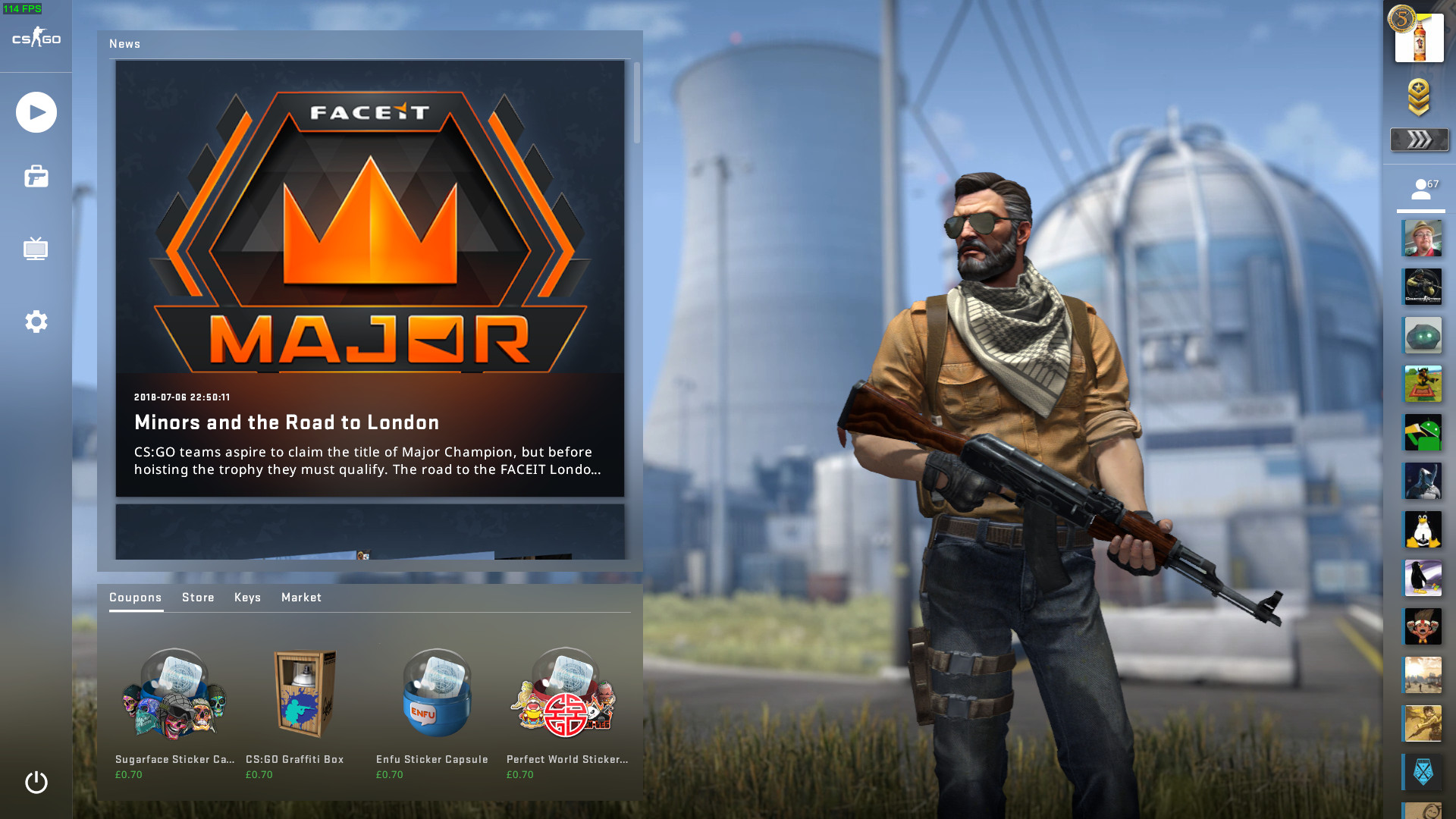
After waiting for a bit of extra time, Linux gamers can now enjoy the brand new Panorama UI update in Counter-Strike: Global Offensive.
To activate it, you need to add "-panorama" as a launch option on Steam. Simply right click on the game in your Steam library, hit properties and then hit the set launch options button and paste it in there.
Valve said this about it:
This visual overhaul is the most substantial change to the look and feel of CS:GO since the game was released in 2012. From the Main Menu to the Scoreboard, the entire experience of interacting with the game has been updated.
We’re still working on Panorama, but the biggest pieces are ready so it’s time for the CS:GO community to try it out!
Counter-Strike: Global Offensive was looking rather old, since it hadn't changed too much since the original release back in 2012 so this is quite welcome. It's an absolutely massive change, literally everything is different. It's not the first game to get it though, as Dota 2 got it in a previous update.
The minimap was also updated to give a better overview of elevation too and it does look pretty slick.
Also, if you had issues with Steam crashing with it on Linux, Valve released an updated beta client to address that too.
This is gonna be great! Been checking github for updates on this every day for the past few weeks. Can't wait to get home and try it.
Looks pretty good, but it's kinda unstable (surprise, surprise!). It crashed for me three times in one Wingman. So testing it out seems possible, but using it as 'main' UI is only if you are brave (or foolish?) enough.
Besides that it still has loads of little edges and corners which are not quite there yet. Some scaling, some UI behaviour wise and some straight up ctd. (which of course is reasonable for a beta)
Last edited by IdleGandalf on 12 Jul 2018 at 11:00 am UTC
This is gonna be great! Been checking github for updates on this every day for the past few weeks. Can't wait to get home and try it.
Looks pretty good, but it's kinda unstable (surprise, surprise!). It crashed for me three times in one Wingman. So testing it out seems possible, but using it as 'main' UI is only if you are brave (or foolish?) enough.
Besides that it still has loads of little edges and corners which are not quite there yet. Some scaling, some UI behaviour wise and some straight up ctd. (which of course is reasonable for a beta)
I'll probably just play against bots at first, also to familiarize myself with the new features. If it crashes or gives me trouble I can just go back. I guess what I'm most excited for is just to try it out first hand.
I think it looks great but I have to try it to see if it’s good.
this looks much better . . . the old/current UI looks like a poorly designed website from 15 years ago.True but I wish they did something about cheaters and raging kids instead. I don’t think reporting does anything at all.
this looks much better . . . the old/current UI looks like a poorly designed website from 15 years ago.True but I wish they did something about cheaters and raging kids instead. I don’t think reporting does anything at all.
They do something against cheaters:
https://www.youtube.com/watch?v=ObhK8lUfIlc
Last edited by 1xok on 12 Jul 2018 at 10:49 pm UTC
However, at the moment I need to verify the gamecache integrity everytime I launch the game (1 to 3 files are reaquired every time), otherwise the game crashes on launch. Haven't tested with Steam beta though.
Nevertheless, I appreciate that updated UI.
This UI looks very nice. I tried it yesterday and unfortunately it lowered my fps from ~260 to 140-190. Kind of heavy if you ask me.Weird...Mostly what I have been reading have stated that it actually increases once fps.
Maybe they should do more. More often than not I get (clear) cheaters shooting through walls and roofs.this looks much better . . . the old/current UI looks like a poorly designed website from 15 years ago.True but I wish they did something about cheaters and raging kids instead. I don’t think reporting does anything at all.
They do something against cheaters:
https://www.youtube.com/watch?v=ObhK8lUfIlc
Do they do it in Competitive Mode only or Casual as well?
Rage kids I actually don’t care that much because there’s the “Block Communications” option (love it!).
But it’s nice to know they care.
Anyway, back to topic:
Is the UI available in all game modes now?
I’d love to give it a try!
That would be great as I am trying to upgrade an old machine to the point of making CS:GO playable.This UI looks very nice. I tried it yesterday and unfortunately it lowered my fps from ~260 to 140-190. Kind of heavy if you ask me.Weird...Mostly what I have been reading have stated that it actually increases once fps.
Are those statements from Linux users?
What graphics cards /drivers are we talking about?
Using GTX 1060. Driver was from nvidia ppa long lived 390 branch. Running on Linux Mint and things up to date. Not sure if you wanted this from me or jesta ;)
Panaroma ui is english, is there any fix / help for this ?



 How to set, change and reset your SteamOS / Steam Deck desktop sudo password
 How to set up Decky Loader on Steam Deck / SteamOS for easy plugins
See more from me