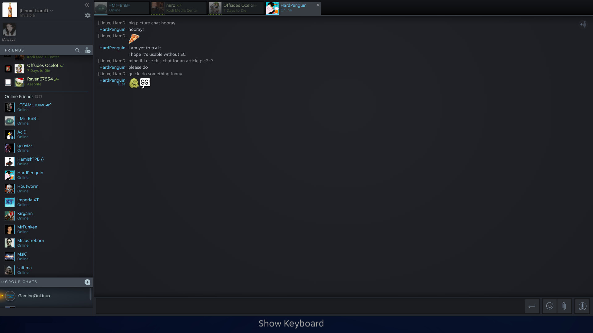
It's taken Valve a while to get there but they've new added the new Steam Chat into Steam's Big Picture Mode.
One thing to note, is that for the new key-binds to actually work on the Steam Controller, I had to go into Steam's settings and re-select the official Steam Controller config. Do this by going into Big Picture Mode > Settings > Base Configurations > Big Picture configuration and then simply select the official one again and apply it. I've opened an issue on the Valve GitHub for it.
Once I did that, it worked better, although not exactly as they describe. The D-pad binds don't seem to work correctly, you're supposed to be able to do a long press on the D-pad or the stick for certain actions. This works for the stick, but the D-pad always picks up like you're pressing Left to open/close the actual friends list. On top of that, it was basically unusable with a Logitech F310. The Steam Chat system is still new to Big Picture, so there will be teething issues.
This should mean that SteamOS itself will now have the new Steam Chat too, for those of you using it. Even so, it's a shame they basically shoehorned the existing UI into Big Picture Mode without making it work any better.
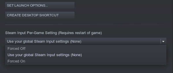
Another Steam Input change, is now having per-game settings into the desktop client's game properties:
See here for the full details, including key-binds.
On top of that, it was basically unusable with a Logitech F310That's what I was afraid of :) Daisy Wheel chat input was the best!
Anyway, the BPM is sooo broken and missing features and it hasn't seen any updates in a while.
Ya it looks absolutely horrendous and screams laziness. I hope they just did that so that its usable until the next big picture update. It will make me really sad if this is indicative of Valve bailing on BPM
Without bailing out on BPM... Couldn't it be possible, with good screen scaling, to have a controller friendly UI that looks a lot more like the classic desktop client. In fact, couldn't be the same UI on both?
In this case, absolutely not. Anyone who has any experience with UI/UX or even has any kind of an eye for aesthetics will tell you that the current chat implementation does not maintain any uniformity or fluidity. I really hope that this is temporary and isn't a sign that theyve given up on improving BPM
I was just referring to this:
https://www.pcgamesn.com/steam-ui-overhaul-game-keys-g2a
We still have no clue what it's going to look alike. The only thing that got updated until now, correct me if I'm wrong, is the chat window.
It's probably more a sign of what, like it or not, Steam will look alike?



 How to set, change and reset your SteamOS / Steam Deck desktop sudo password
 How to set up Decky Loader on Steam Deck / SteamOS for easy plugins
See more from me