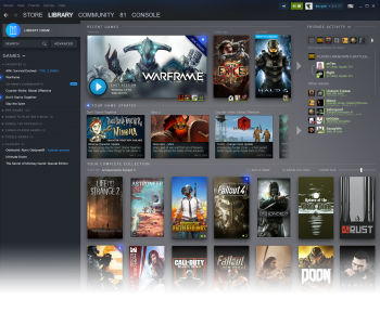
At GDC today, Valve did their presentation and they finally showed off the new design coming for the Library page and more.
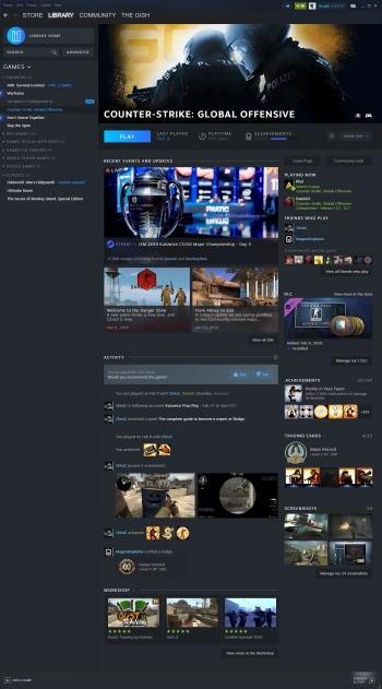
For those with a growing backlog of games, the Steam Library as it is right now is so basic it's just incredibly unhelpful. Going by what they've shown off, it's actually looking a serious amount better. Firstly, it has a home page for your Steam Library, to go over some recent games and recently updated titles, as well as show a slice of your friends list. That's a pretty handy feature, especially if you have a game you play regularly enough it will probably be quicker and easier to get going the next time.
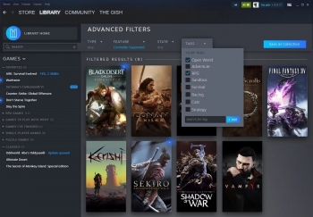
The Steam Library search feature is also finally seeing a decent upgrade, allowing you some more control over finding what game you want to play and this will include setting tags on games, picking a feature they have like gamepad support and so on. It's much more like how you actually search the store, so it makes total sense.
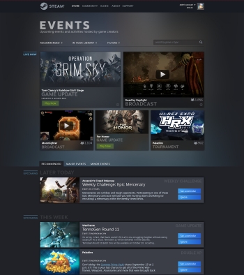
Also announced is a new Events system which is a very good idea. Having one place to follow all the current and upcoming events to your games and by the looks of it games you don't own too, will give you reasons to keep coming back to them. There will be plenty of options to follow these events too like getting an email, adding to your calendar and so on.
By the sounds of it, they will also be rolling out some more statistics for developers to see, to help them get an idea of visibility on the store which might be quite helpful.
No date was said on when it will all go live, however there will be an open beta sometime.
Credit to SteamDB for some of the info.
Looks pretty cool, would love to see the events system encourage devs to do more in game unique/live events to bring some life back into games I may not otherwise have a reason to go back to. Hopefully UI updates mean some Big Picture upgrades are not far behind.I think that's part of the point, a call to arms to say "hey we're doing this" or "we added this in" and that sort of thing by developers.
Something that I miss in the current interface is a direct option to see the store page of a game in my library. Sometime I want to check the current price for a game I've already bought or if a new content was released, and I have to go to the store page and search manually.
You have a link to the store page on the detailed view + categories page:
Spoiler, click me
Otherwise, this new design looks pretty, and useful. It's likely a lot better than what we have now, though it could likely be made even better. What I'd really like to see is an API to control the steam client from Kodi, Lutris, or any other frontend. We alreasy have steam:// urls and command lines, but that's one way communication (no library enumeration, images (official art, links, screenshot) retrieval, friend info, etc.). There would be a lot of interesting ideas to explore (cloud tags, automatic categories, etc).
Last edited by MayeulC on 21 Mar 2019 at 9:29 pm UTC
Can the app finally support HiDPI? It is a real pain to use that thing on a 4K monitor ...Steam client can scale it's GUI on 4K currently.
Can the app finally support HiDPI? It is a real pain to use that thing on a 4K monitor ...Steam client can scale it's GUI on 4K currently.
Oh indeed. It's not enabled by default. Thanks for making me check
Can the app finally support HiDPI? It is a real pain to use that thing on a 4K monitor ...
Steam -> Settings -> Interface -> Enlarge text & icons based on monitor size
I AM REALLY DISAPPOINTED!
Is this ALL you can do??
PROTON is OK, but it is not enough for to compensate what EPIC is doing with the big industry players.
Practically every days Tim Sweeney is kicking Gabe Newell in the balls, and the fat guy doesn't even react because He lies on the floor almost passed out!



If Steam want to survive this war, We (Linux gamers) need more than a new library design: GabeN must reduce the cut to the 10% or less for to attract big titles like EPIC is doing...
The reason why Valve stopped to develop games a long time ago is because is more easy to live from the 30% cut of the work of other developers.
Can the app finally support HiDPI? It is a real pain to use that thing on a 4K monitor ...Steam client can scale it's GUI on 4K currently.
It actually scales too big on my 4k screen, I only want a %25-50 scaling increase. That is whats missing, atm it seems to do a %100 enlargement and is a bit overboard...
Also what EPIC is doing is called poaching, there not making developers come there way out of goodness of their heart. They are offering up millions to go EPIC store exclusive where there was no plan to before. Poaching.
Last edited by TheRiddick on 21 Mar 2019 at 10:52 pm UTC
If Steam want to survive this war, We (Linux gamers) need more than a new library design: GabeN must reduce the cut to the 10% or less for to attract big titles like EPIC is doing...
That's not how you fight the war. That's how you bleed out.
and the fat guy doesn't even reactClassy.
C'mon, Valve!
Practically every days Tim Sweeney is kicking Gabe Newell in the balls, and the fat guy doesn't even react because He lies on the floor almost passed out!


If Steam want to survive this war, We (Linux gamers) need more than a new library design: GabeN must reduce the cut to the 10% or less for to attract big titles like EPIC is doing...
Steam already sells movies... :D
Last edited by Nasra on 21 Mar 2019 at 11:33 pm UTC
But, again with the padding, why this weird padding everywhere? A couple of pixels, certainly, but ~1em padding? I get it on buttons but I don't get it on labels? Seems a bit excessive and takes away from the visual distinction between the two. :S:
*Insert 'hell it's about time' gif*
Seriously though, Valve seems incredibly slow and not self-aware at times. I can certainly tolerate it, especially if they do the occasional cool thing like Proton, but in terms of companies with tons of resources and zero fucks they make me think of Bethesda






 How to set, change and reset your SteamOS / Steam Deck desktop sudo password
 How to set up Decky Loader on Steam Deck / SteamOS for easy plugins
See more from me