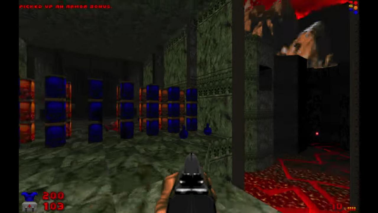
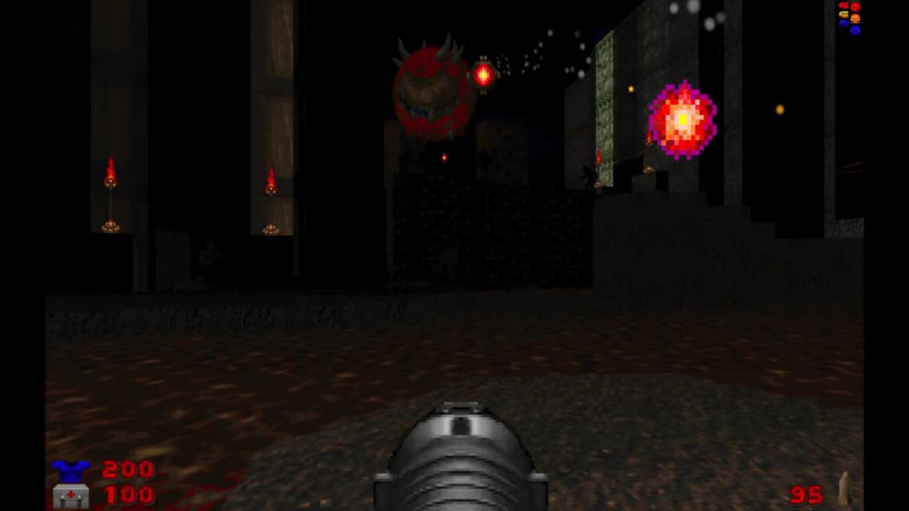
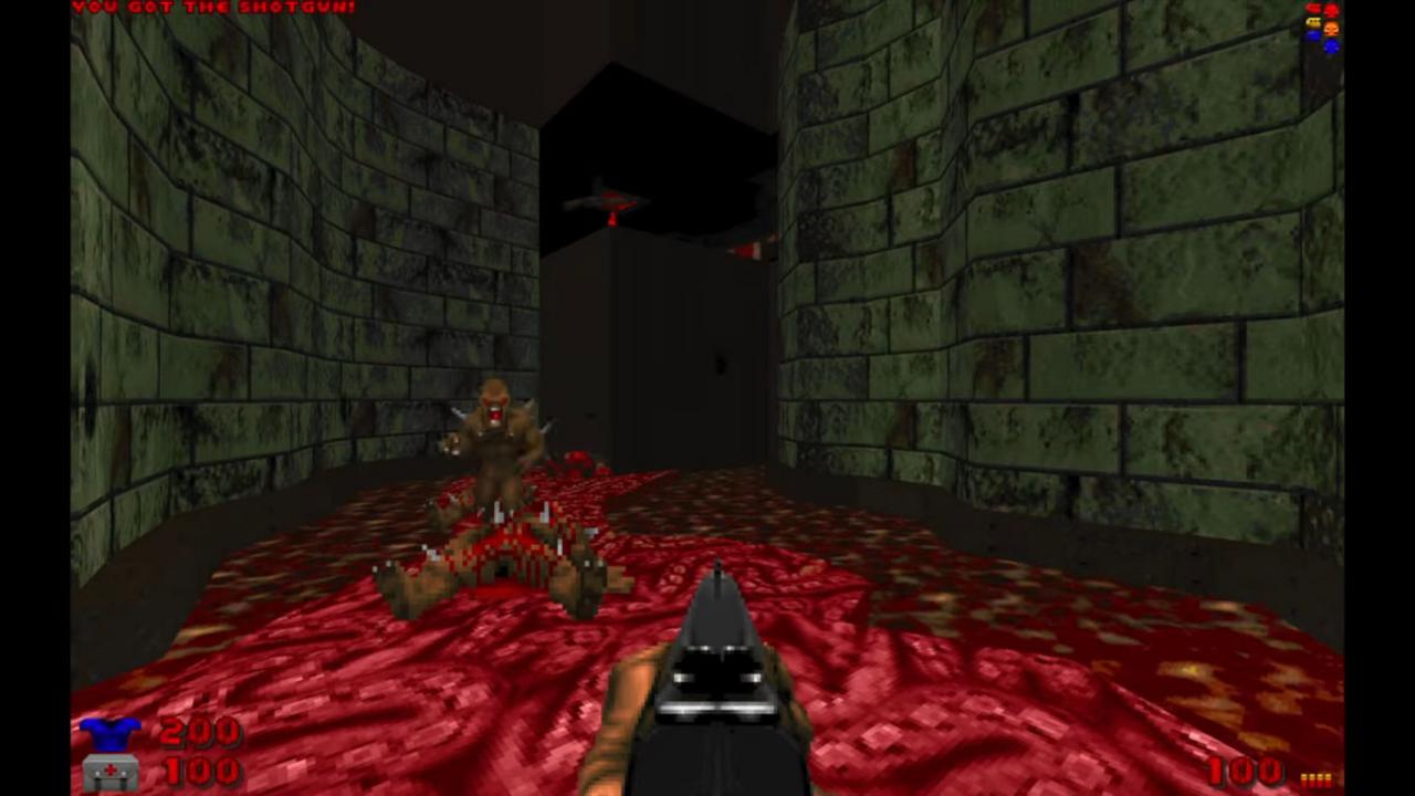
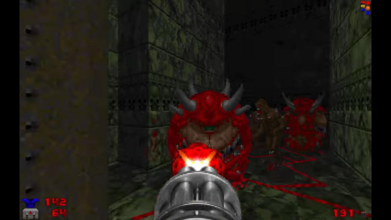
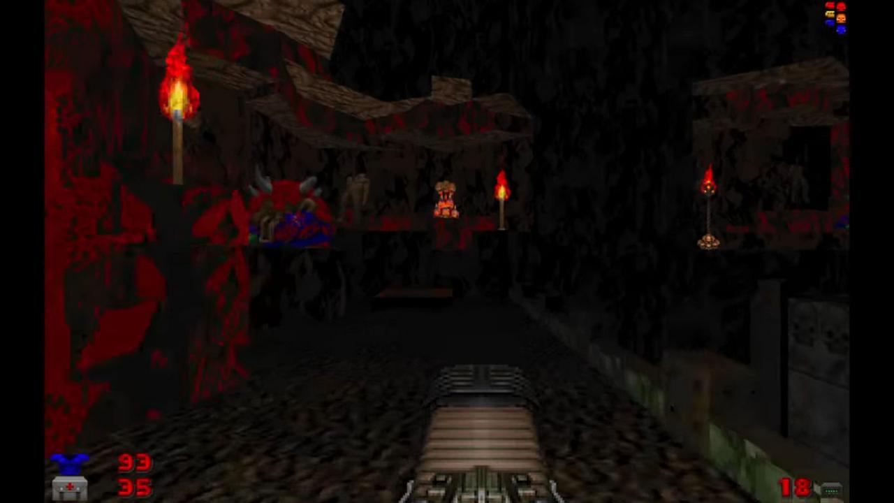
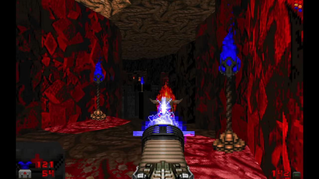
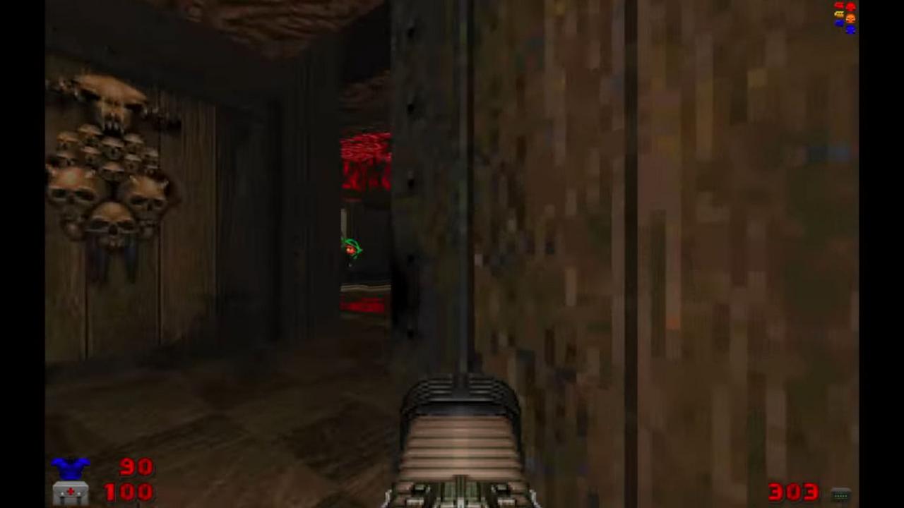
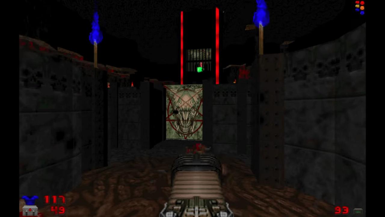
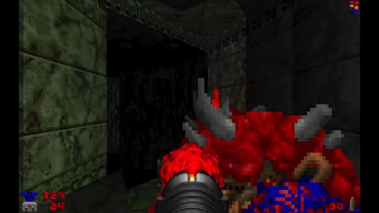
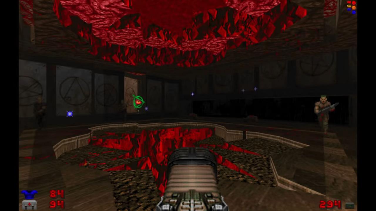
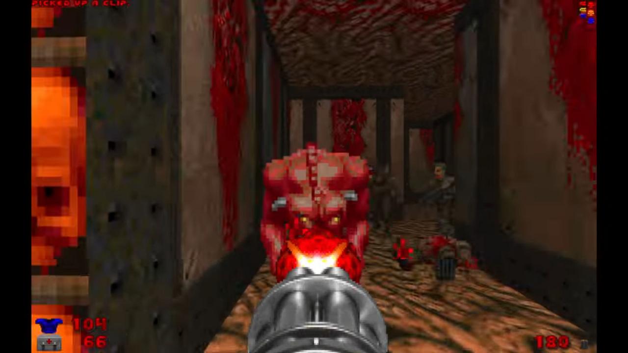
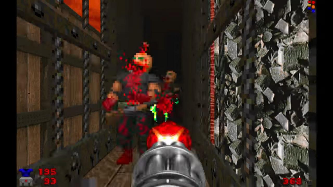
NOTE: The following article only has very minor spoilers, regarding general aspects of some of the levels (although nothing concrete). Also, the complementary images were extracted from the official trailer. However, if you want to ensure to get the purest possible experience when playing the episode, in that case it's recommended to stop reading and come back once you've finished with it.
Before saying anything else, it's fundamental for me to disclose that both Ultimate Doom and Doom II are my preferred games of all time, and honestly, at this point it's very likely that they will never be dethroned. Having said that, I was pretty enthusiastic when John Romero announced an unofficial fifth episode for the first game, in commemoration of its 25th anniversary; not a long time ago, he released alternate versions for both E1M4 and E1M8 which were very well received by the Doom community.
At the same time, I wondered if he would be able to deliver an episode with a quality on par with other map-packs released by the community during all these years. Because, let's be honest, some users have created authentic masterpieces! I'm talking about new levels that not only have an obsessive attention to detail, but even in some cases they designed them in ways that completely change the way you used to play the original levels, and all this without even need to add new assets (monsters, guns, etc). So basically, this time it was no longer about comparing new versions of some levels with their original ones, but to compare these new levels with the works of some of the most established level creators in the Doom community. It's true that Romero claimed...
"Well, I wanted the levels to feel like they belong to the original game as if they were a true fifth episode. There’s more detail in the levels than episodes 1-4, but not overly so."
... which basically implies that he only focused on keeping a cohesiveness with the previous four episodes, and didn't care much (or at all) about the subsequent levels that were released by the community, but I cannot avoid being influenced by the experiences these latter levels offered. Still, I can say that my conclusion on this subject will be a bit unexpected.
With these thoughts in mind, I spent this last weekend playing SIGIL thoroughly, having completed the game on the "Hurt me Plenty" difficulty first and then replaying it on "Ultraviolence" to find the hidden level and the rest of the common secrets (as of the moment of writing this article, I only have two left of these to find in the whole episode). I must note that I used GZDoom to be able to use mouse look, so remember this when I describe how I felt the difficulty was for the episode.
Also I chose, for immersion purposes, to listen to the MIDI soundtrack, created by James Paddock, instead of Buckethead's OST; personally, I didn't find the latter's songs that appropriate for this episode, and I prefer to eventually play them on their own at extreme volume, to focus my attention exclusively on them. As for Paddock's songs, he definitely did a pretty nice job capturing the ambience of these levels, and they certainly fit the style of the original Doom MIDIs... but unlike those, once I quit the game I can hardly remember how they sounded. If you're a Doom fan, I can mention great examples like E1M6 or E2M8, and it's likely that you remember immediately the memorable pieces of music those levels had. There is one big exception, though: the song used for the second level, called "You Ain't the Boss of Me", which is excellent! It's absolutely catchy and thrilling, and really manages to create a sense of danger and urgency. It's a shame the rest of the music was so calm and didn't follow this pace instead.
Finally, in order to play it on Linux, like I said I downloaded the last version of GZDoom (v. 4.1.2), and executed the level using the following commands, directly quoted from a previous GOL article:
"The easiest way to get it running on Linux is to download it from the official site, grab a copy of GZDoom and place the SIGIL files into "/home/username/.config/gzdoom" so it can easily find it. You can then use your favourite Doom launcher or run it simply with a quick terminal command like so:
gzdoom -iwad DOOM.WAD -file SIGIL.wad
For some reason, I was having some trouble loading the episode, but this was fixed by renaming the .wad to be lower case. I'm pretty sure this is due to GZDoom being case sensitive when you launch it.
So, having made all the necessary clarifications, let's start with my personal impressions, level by level:
E5M1 - Baphomet's Demesne
First of all, it might be important to clarify that, due to it being the "fifth" episode, it's assumed that you've already played and beat the original Doom, so things will escalate extremely quickly. You directly start surrounded by enemies, and the level, although pretty short, certainly doesn't get any less intense.
I have to praise the level design for a number of reasons: first, from the beginning it marks the return of the classic Romero's "horseshoe" layout, which is used here to teach you a new mechanic that you'll be performing several times to keep unlocking your path. This mechanic will be used again in later levels of the episode. But what I found totally remarkable were the secrets, and how they interconnect with the progress of the level. I would strongly recommend you to make an effort to explore and find them all, because for this map it was really rewarding to get the whole picture and see how intricate the design was.
To summarize, a solid introduction to the episode.
E5M2 - Sheol
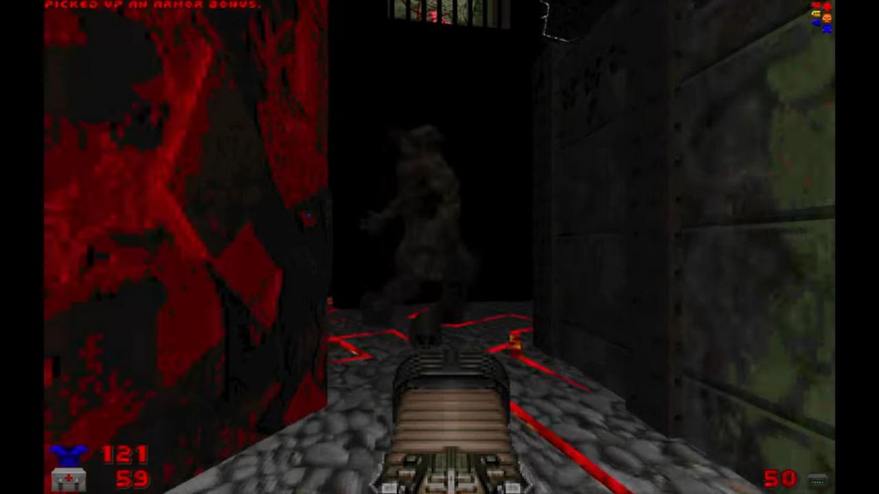
I've already made a brief mention of this level, because this is the one that has what I consider the best MIDI song, but unfortunately, not only such song wasn't that fitting for this second level (I think it should've been used on E5M4 or E5M5 instead), but I also found this map immensely underwhelming. Its whole layout isn't that bad, to be honest, but it has some remarkable problems: the first one is the area around the key, which is so unnecessarily dark that I got stuck for a few minutes figuring out what did I need to do; it also didn't help the fact that one single misstep meant falling to an almost certain death.
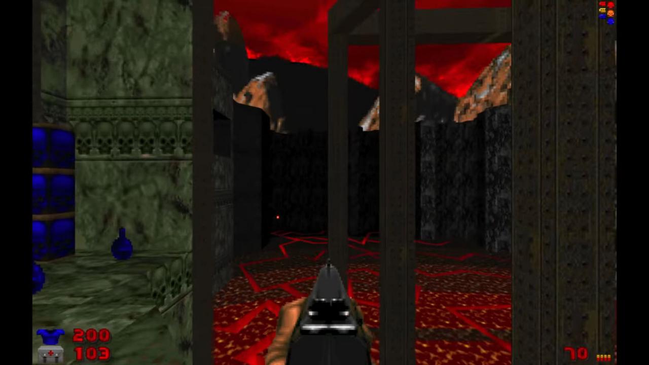
Besides, the level is incredibly short (I think it took me less time than the previous one). I remember thinking it was going to become pretty good at certain point... only for it to suddenly end. It's a shame, really, because it had a very interesting premise which could've been developed further. Also, I don't get the point of having such a massive area around the level completely in the dark; this was a pattern that repeated on a lot of levels: there could've been some impressive landscapes, but for some strange reason Romero decided instead to set them in total penumbra.
E5M3 - Cages of the Damned
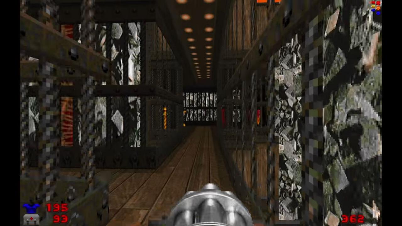
For this one, you start at another "horseshoe" corridor, but the progress for a considerable part of the level is by "peeling the onion", so to say: from this starting point, you will be unlocking new areas around it, adding new layers of complexity every time.
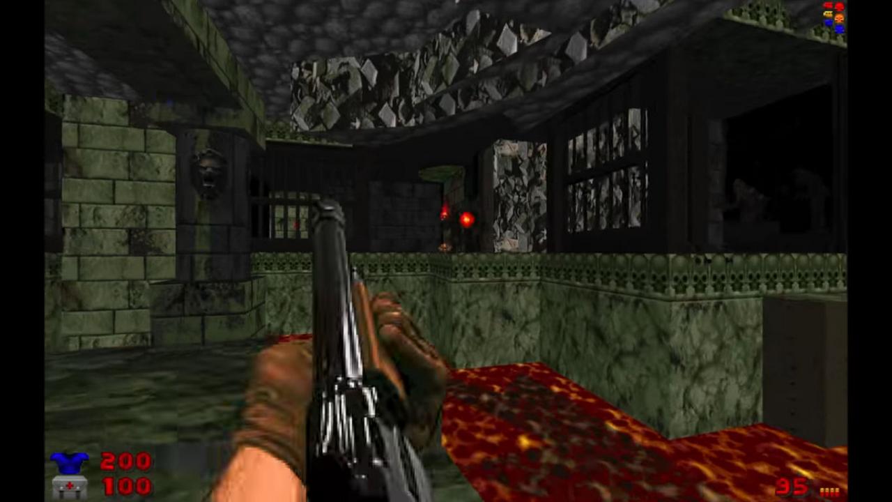
There is also a big outdoor area, which has a pretty decent layout, but also exposes an issue that will appear a couple of times on later maps: the level of detail can vary a lot between areas at the same map, so in some cases the visual presentation feels uneven. You will explore closed areas with a lot of care put on the decorations, and then you'll go out to open areas which may feel pretty empty or undeveloped. It's far from being a big issue, of course, and it isn't that Romero got lazy when creating these particular spots, but still it's something that I wanted to point out, because those areas would've benefited a lot with some extra effort on the visual details. If you add the dark massive areas, I think a lot of opportunities to create unforgettable landscapes were wasted because of these two design decisions.
But apart from that particular problem, feel free to consider this level another good one.
E5M4 - Paths of Wretchedness
Not only one of the highlights, but also probably the best level of the episode, in my opinion. If you don't count the exit area, this map is basically divided in three distinct sections, all of them involving different ways to fight and survive:
1) An area where you'll be attacked by a lot of enemies at a medium distance, without having much chance to take cover;
2) A series of subsections where your temple, spatial awareness and capacity to plan will be put on test. I can see the most impatient players raging-quit these parts;
3) An unnerving place that will have you directly run for your life.
I have to commend the level of detail put on the rooms from the first and second sections, and for the last one, although it's extremely simplistic, since you can't afford to stop to look around in this case it wasn't a problem at all.
Along with E5M7, it was one of the most difficult levels, but I also had a lot of fun playing this one for sure.
E5M5 - Abaddon's Void
This level can be considered the most unusual one, regarding the general layout and the way you progress through it. It kinda feels like E3M6's "younger brother", and gives me the impression that it might become the most divisive one among the players. In my experience, apart from two small but somewhat annoying rooms in complete darkness, I enjoyed figuring out the slightly weird path to solve it. I would've loved that the level extended a bit more, based on this unusual premise, but as it is right now it's still acceptable (unlike E5M2). Also, I don't really know how you could discern that the secrets were in those sectors; I didn't find any kind of hint, honestly, and I discovered them by pure luck.
If you play on "Ultraviolence", you'll face a couple of particular enemies which are stuck at specific spots. It's a shame they weren't allowed to freely roam the level, not only because it felt artificial, but also because it would've been really fun to be chased by them while you try to reach the different sections.
And, now that I mentioned E5M2, just like that level, here we also have a massive area in complete darkness, which is for me a real pity, for the reasons already explained before.
E5M6 - Unspeakable Persecution
I must remark the beautiful level of detail at the very first room, as well for the second section of the map, but that's pretty much the only positives I have to say about this one. While it isn't per se a bad level, it was pretty disappointing, specially considering the expectations I had for it after this statement on the official site:
"There’s a massive room in E5M6 that is the coolest room I’ve created in any map."
I tend to believe there are two main problems with this level, each one belonging to every section: during the first part there are a lot of plain dark places, and although you won't get stuck trying to find your path, it wasn't fun to do so either. Also there was a circular room which definitely was the most annoying part of the whole episode, and I can't simply imagine how purist Doom players would solve this part without being able to free look.
As for the second part, at first glance it appears to be very complex, but once I found out what needed to be done, I couldn't help but think "Is that all?" because of how simplistic the solution was. Even more, it became worse on "Ultraviolence", because of the addition of a certain element which was supposed to make the area more tense, but it only turned it into something unnecessarily annoying.
Strictly speaking, the level wasn't a complete disaster, and it would be unfair if I start bashing it mercilessly. Let's just say I respect it enough to be along the others and not ruin the flow of the general episode; also it never became boring and the general difficulty on "Hurt me plenty" was decent, but still this one was clearly the worst map for me, no doubt about it.
E5M7 - Nightmare Underworld
Along with E5M4, this is one of the most complex levels, and also another of the highlights of the episode. I simply loved how long and intricate the overall path is, without making it a confusing level at all; and I'm not sure if it was some kind of homage, but at some point there is a subsection that reminded me to one of the latter levels of TNT: Evilution, which was a plus. Besides, a lot of effort was put on the visual aspects of the different areas, which by the way have a lot of variety and offer different kind of challenges, and it definitely has to be the most fun level to explore and find secrets.
Perhaps some people may complain that there aren't enough items to survive until the end, but in my case playing carefully allowed me to reach the end without any major complications. Still, I'm sure some people will rage-quit at the last two sections.
The only downside was a pretty evident glitch with the sky at the open area, which doesn't affect the playability at all, but still doesn't look good.
E5M9 - Realm of Iblis
Writing about the secret level involves necessarily writing about the secret path to enter it. Luckily, although the way to the exit path is way more simpler than the original episodes, it still was very satisfying to discover; I will only say that it will require extreme attention from you. If you accidentally skip it, you'll miss it and there won't be second chances.
As for the level itself, you really should make the effort to find it, because it's totally worth it. Along with E5M1, E5M4 and E5M7, this is the fourth highlight of the episode. Not only it has a very unconventional path (just like E5M5), but also there are some pretty interesting areas that definitely will defy your expectations. Also, the secrets are very nice to discover, along with the ones from E5M7.
Does it have any downside? Well, it has some very appealing visual ideas at the very beginning and at a certain section later, but overall, the different areas don't have a particularly high level of detail, so this is another case where a level might feel a bit simple and empty, but that's all.
E5M8 - Halls of Perdition
Despite the minimalistic design, this level was still visually compelling due to a lot of care put on certain spots. But the thing is: it's also pretty minimalistic due to its linear path, and while it's superior to the final levels from the other episodes, that doesn't mean a lot, since those weren't memorable levels in the first place. It could be argued that it was made like this to create suspense before the final battle, but the MIDI song that was chosen certainly didn't help to create anticipation at all, and it felt as if it was any other common level.
On a positive note, the only thing worth mentioning was a certain spot where you activate a trap that was completely unexpected, but that's pretty much everything.
The definitive downside, though, was the completely dismal final battle. I can't enter into details to avoid spoiling it, but basically I can say that even a novice level designer can come up with such undeveloped showdown for their very first level.
Plus, I didn't really get the point of the very last secret of the level (and episode).
So yes, the episode doesn't end on a high note. And after E5M6, this is definitely the second worst level.
* * *
Having beaten the whole episode, how can I then summarize my overall experience with it? Definitely it was a fun and satisfactory group of levels, and I think you should give it a chance, but I also must confess that there wasn't a single point where I was impressed. I just didn't find any idea or design that made me think "Wow! This was so clever!" or "How cannot anybody thought about something like this before!?". Let's just say that I wouldn't object at all if this episode was later declared as canon, but at the same time if it stayed as unofficial I wouldn't lose my sleep either. Besides, having replayed it to test another difficulty made me discover it has good replayability, and looking for the remaining secrets never became an annoyance, but it also didn't improve at all the positive appreciation I already have with it.
Of course, there are some things that could've been a lot better, and I can summarize them under two groups: first, Romero didn't actually take any risk, so there wasn't even the most minimal attempt at trying something new, even when something like that wouldn't have necessarily "betrayed" the essence of the first four episodes.
And second, the episode lacks an identity; this is the underlying issue that made me question the visual decision of some of the levels. SIGIL looks and feels like a rehash of Inferno, the third original episode. If we take any chapter of Doom we can easily remember how everyone had a distinctive look: Knee-Deep on the Dead features the futuristic Mars' bases, The Shores of Hell mixed those settings with the demonic-infected areas, and then Thy Flesh Consumed featured those levels full of wood and marble, and the characteristic orange sky. If I had to define this fifth episode based on those conditions, I honestly wouldn't be able to pinpoint a general theme for it. And no, the blinking cracks on some of the levels, the new exits or the big dark areas simply aren't enough to represent a new style. All this could've been easily solved by adding new textures, for example, but I wonder why Romero decided not to do it and stick with this already-seen look.
But obviously, none of these problems will ever prevent me from appreciating this gift he decided to offer to the whole Doom community. He didn't have any reason to do so, he could've just made a simple YouTube video for the 25th anniversary of Doom, for instance, but instead he spent a considerable time creating this set of levels, and for free. Also, it must be noted the correct way he chose to promote SIGIL; my appreciation of these levels would've been much worse if the marketing campaign was "Prepare for the next big thing!" or "The new and absolute masterpiece by John Romero", for instance; so this is another positive aspect that is useful to remark.
So, for all these reasons, I will be very interested to see what new levels or projects he might release in the future. I sincerely don't think we will be seeing a 32-level megawad for Doom II's 25th anniversary, but nobody can deny that it would be an excellent surprise if he keeps releasing alternate versions of levels. Imagine having a new "Icon of Sin" or "The Factory", just to name some levels which would greatly benefit from a revamp. He already said he's working on something else, so time will tell if it means more Doom levels or a completely new game.
Q: Are you working on anything else?
A: Of course, and it will be done when it’s done. :)
Now, has anyone had the chance to play SIGIL's multiplayer maps?
I love how passionate this community is about the core material though, and that's reflected here. Well done!
SIGIL INFO: If you're using GZDoom and find the look of SIGIL to be dark, go into SET VIDEO MODE and set the render mode to DOOM SOFTWARE RENDERER. Then go down to APPLY CHANGES.
- Romero
[Tweet Link](https://twitter.com/romero/status/1133772409620881408)
All things said though, a lot of the mechanics and stylistic choices Romero made in SIGIL feel like sort of little nods to community wads in a way. For example, the overarching mechanic introduced in room 1 of E5M1 reminds me a lot of
Spoiler, click me
Spoiler, click me
I personally really loved SIGIL. My only gripe with it is
Spoiler, click me
I know, the lure of ferraris lol...



 How to set, change and reset your SteamOS / Steam Deck desktop sudo password
 How to set up Decky Loader on Steam Deck / SteamOS for easy plugins
Guest Writer
February 2016 - September 2016
June 2019
December 2019 - April 2020
Contributing Editor
September 2016 - July 2017
Opinions at the moment of writing the articles were mine, though in some cases contents were edited or critical information was added by GOL Editors before approval.
See more from me