Valve announced on Steam today, that the Steam Library overhaul is to get a public beta and it's only "weeks" away.
Posting on the Steamworks Development Steam Group, Valve is getting developers to come and update their store assets to match the new sizes of icons and more that will be available in the refresh. In this post, they said "We are weeks away from the public beta of this new feature set".
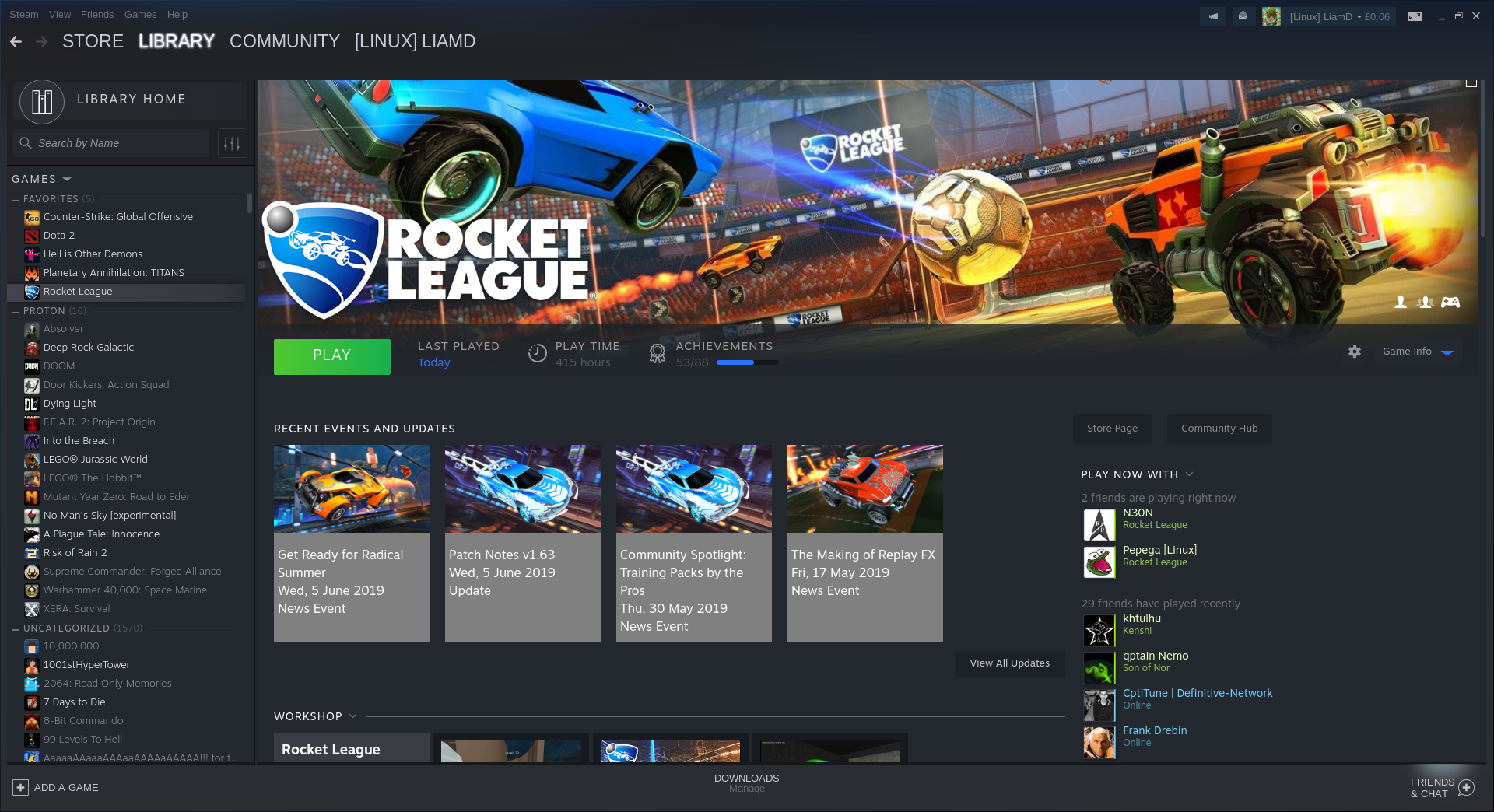
If you missed it, we managed to get a sneak-preview thanks to a leak which you can see a shot of below:
Are you looking forward to giving it a go? Let us know in the comments.
Some you may have missed, popular articles from the last month:
All posts need to follow our rules. For users logged in: please hit the Report Flag icon on any post that breaks the rules or contains illegal / harmful content. Guest readers can email us for any issues.
I'll let others be the beta testers. :)
3 Likes
Pluses of the new layout:
- uses full width, unlike the current Steam client that looks designed for a vertical device(higher rather than wider, like a phone).
Minuses:
- achievements are less prominent,
- where did DLC selection go?
- multiple direct community links(guides, discussions, hub) were combined into a single slightly bigger button.
On the whole, I don't like the new layout.
1 Likes
I see a settings button next to "Game info" on the right. Does that mean it allows you to configure things to make visible?
0 Likes
I was hoping to see some upgrades for BPM too. Any words on this?
5 Likes
I see a settings button next to "Game info" on the right. Does that mean it allows you to configure things to make visible?
No, it only has the same options as the right click menu on the games list.
BTT: I don't like the new library. It's a real space wasting mess and tries to mimic social network bullshit. Like why is 1/3 of the screen wasted with a banner on top? When I select a game I don't want to see as first the recent updates and events and I don't want to see what others in my contact list have achieved in the game recently. I want to see informations about the god damn game and MY PROGRESS, not the progress of others.
Then again more important stuff, like achievements are hidden on the right side and you need to scroll to even see them. Then trading cards are more important than screenshots, really?
It's not all bad though, like having the ability to show the game infos like publisher and such is nice. It's also nice to be able to filter games for multiplayer and such. But the UI is terrible, utterly terrible. But TBH, after the new chat I'm not even surprised, Valve doesn't now shit about good UIs apparently.
Last edited by Egonaut on 12 Jun 2019 at 9:38 am UTC
0 Likes
Is there hope to have an opt out of this in the future?
1 Likes
Do we have a screenshot of new sorting and filtering options?
And is the list view still there?
Last edited by pb on 12 Jun 2019 at 9:39 am UTC
And is the list view still there?
Last edited by pb on 12 Jun 2019 at 9:39 am UTC
0 Likes
Do we have a screenshot of new sorting and filtering options?Check the other article for the new filtering.
And is the list view still there?
2 Likes
but.... WHY? What about people who use custom skins?
I imagine they'll be unaffected. From what I can tell, this is just replacing the default skin.
0 Likes
Do we have a screenshot of new sorting and filtering options?Check the [other article](https://www.gamingonlinux.com/articles/more-shots-of-steams-new-library-design-thanks-to-a-leak.14315) for the new filtering.
And is the list view still there?
Thanks, great to see filters by type, genre and the others.
What about sorting, the default seems to be alphabetical, is there sorting by user reviews, hours played, achievement completion etc.?
Last edited by pb on 12 Jun 2019 at 10:17 am UTC
1 Likes
Here's two more I quickly took for you:Do we have a screenshot of new sorting and filtering options?Check the other article for the new filtering.
And is the list view still there?
Thanks, great to see filters by type, genre and the others.
What about sorting, the default seems to be alphabetical, is there sorting by user reviews, hours played, achievement completion etc.?
https://imgur.com/a/O3eHyYz
6 Likes
Anything Steam can do to improve either of their clients will be something I'll look forward to. I kinda like the big banner of the game there at the top more than the current faded one we have now (even if the one we have now might use a screenshot of ours). This one seems to make better use of the screen's space too, though fonts are still too small to read on my TV screen with any ease.
I'd like to see maybe a "tags" list, or perhaps the same pop-up we get when hovering over a title on the Store page. Sometimes I can't remember enough details about a game from just its name and a picture alone, but this is a minor nicety than any feature I feel is missing.
I'd like to see maybe a "tags" list, or perhaps the same pop-up we get when hovering over a title on the Store page. Sometimes I can't remember enough details about a game from just its name and a picture alone, but this is a minor nicety than any feature I feel is missing.
2 Likes
Here's two more I quickly took for you:
https://imgur.com/a/O3eHyYz
Nice, thanks a lot! Looks like I'll be getting into the beta when it's available. I really like the option to sort by release date and hours played, but notably missing is sorting by user score (instead of not-so-useful metacritic score) and by achievement completion. There are external tools allowing that (steamdb, astats) but it would be great to have them at hand.
Filtering by single/multi/coop is very handy too (they added the coop filter to big picture some time ago and I'm using it often on SteamOS). But I'd also like to see negative filters like "NOT multiplayer". :D
1 Likes
but.... WHY? What about people who use custom skins?
I imagine they'll be unaffected. From what I can tell, this is just replacing the default skin.
I wouldn't be so certain... Just look at what Valve did with the new hideous, buggy chat system. I really hope custom skin support remains though.
1 Likes




 How to set, change and reset your SteamOS / Steam Deck desktop sudo password
 How to set up Decky Loader on Steam Deck / SteamOS for easy plugins
See more from me