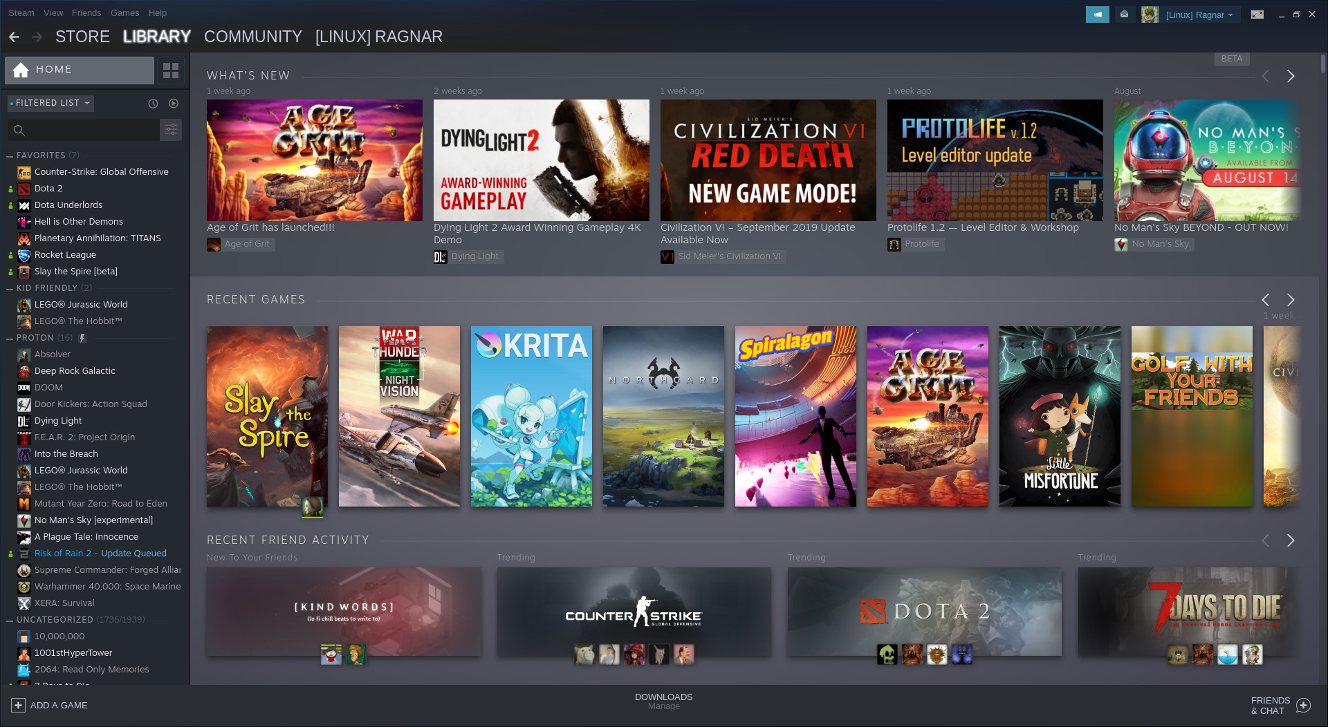
The day has finally arrived, Valve have now put out a Beta for the massive overhaul to the Steam Library so you can try it yourself. A huge amount has changed but likely some rough edges to be found since it's not quite finished. Promising though, a lot better in many ways than the old and stale interface that Steam has currently.
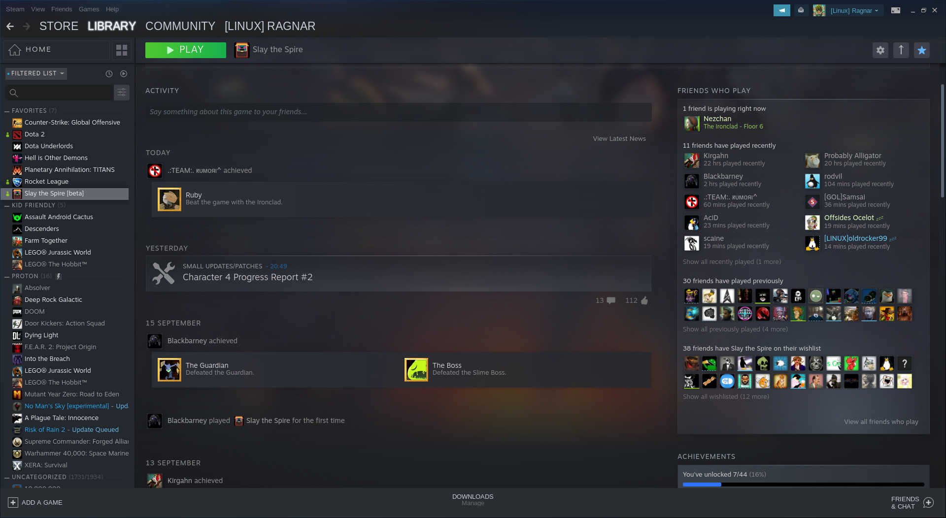
Here's how it will look now:
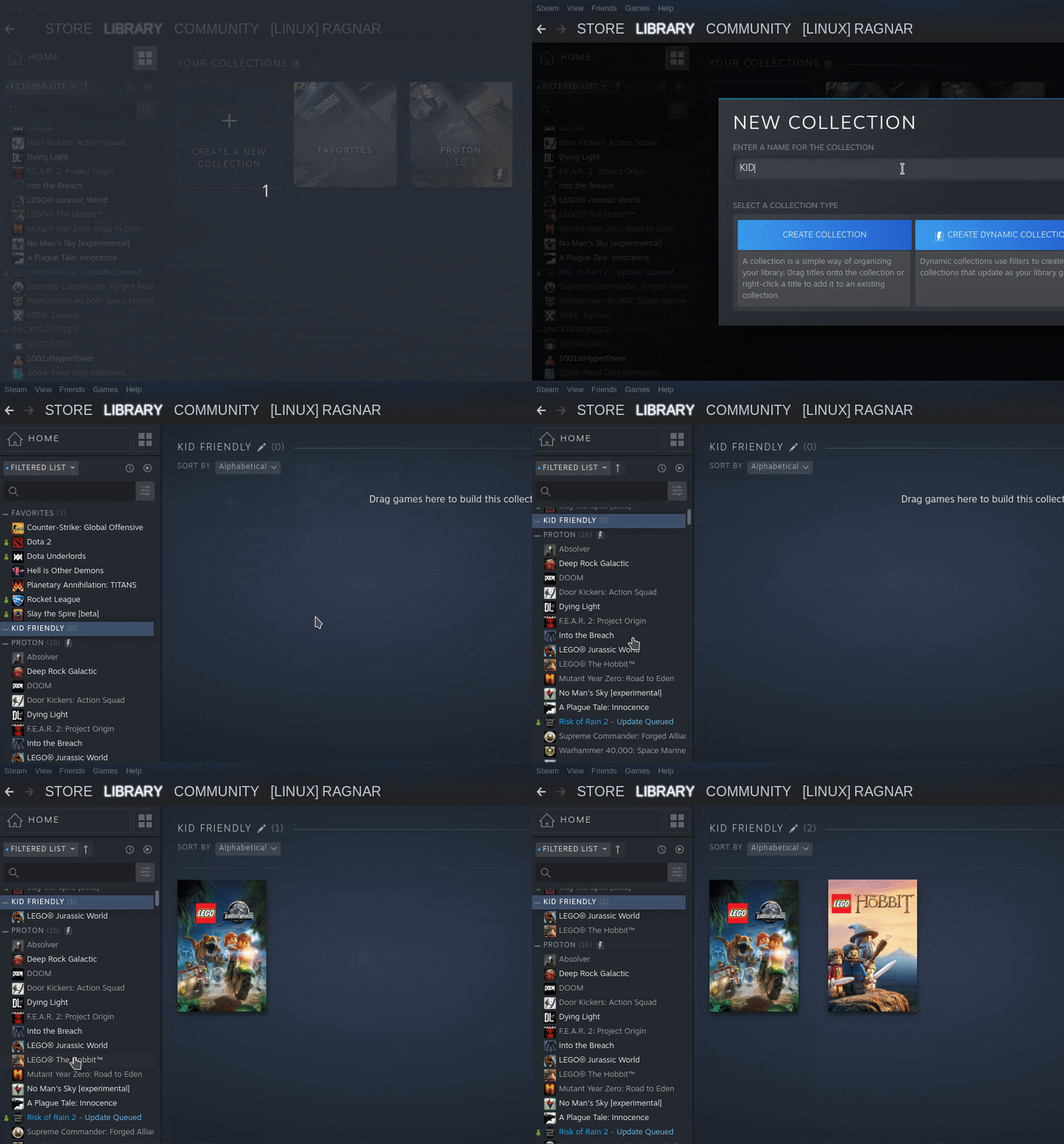
My favourite features is the new Collections which massively expands the old category system. Instead of having a single plain category to add games into you can now sort them by specific features automatically or have them manually sorted and picked by you.
Additionally, you can sort games into digital shelves on your Steam Library home page. To have quick and easy access to things. The new drag and drop abilities are sweet too, make a collection and then drag a bunch of games into it. Super handy!
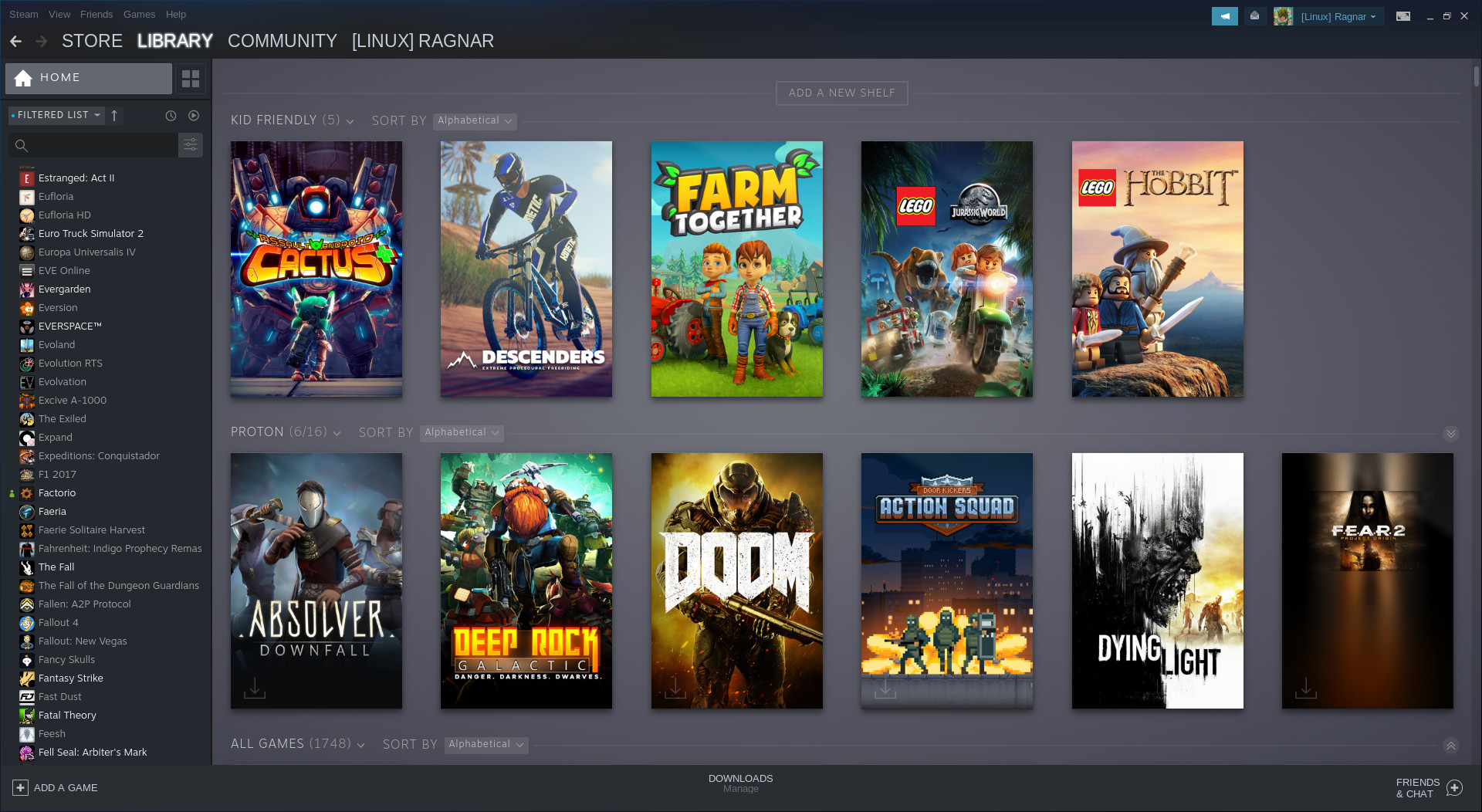
Once you've made a collection, you can then add it to your Home as a shelf like my example above for "Kid Friendly" games which I then added and it works really well:
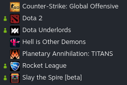
There's quite a lot of smaller touches to this large update. One that instantly caught my eye was the new icon next to the name of a game. It shows you now if someone on your Steam Friends list is currently playing it:
So in the picture above we have Dota 2, Dota Underlords, Rocket League and Slay the Spire all currently being played by people on my own Steam Friends list. It's such a small touch but quite a clever little addition I think.
One thing I am already not sold on, is how they've merged activity on game pages in your Library. So now you see game updates announcements, plus friend activity all together for each game by default. It makes it feel a little messy. There's a button to view all news which is good, but the interface there is a damn slow pop-up. As an example, here's Slay the Spire with an update in between some random friends doing things in it (it gets messier when friends do a lot):
There's a but coming…but I do love the new friends side-bar on each game page. Showing who is on that game right now, who has played it recently and so on. Features like this can really help people decide to pick up a game again.
Also added in this update is a new section in the Steam settings, allowing you to adjust the size of all the elements shown on the Steam Home. If you find all the images too big, you can adjust them down to a smaller size. Additionally there's options for a Low Bandwidth Mode and a Low Performance Mode.
Valve also seem to have removed the syndicated news section from game pages, something that I'm quite thankful for. I do read other sites quite regularly, I have no issues with many. The problem is, the news that appeared on Steam Library pages for games was often nothing to do with the actual game you're currently viewing. So I'm glad to see it gone in favour of more useful things.
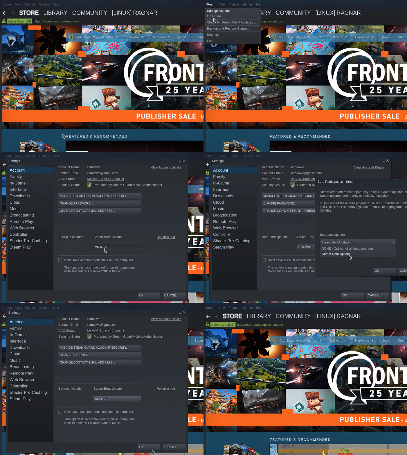
How to access the Steam Library Beta? The usual way, by opting into the Steam Client Beta in the settings like so:
It will then download and you will need to restart Steam for it to
These additional changes also come with the Library Beta:
SteamVR
- Added playtime tracking for SteamVR workshop items and for SteamVR itself
- Titles that are hidden in the Steam Library will now be hidden in the recently played UI in SteamVR Home
Linux
- Fixed a problem where the screen could go to sleep while using a controller
- Fixed cases where the on-screen keyboard would steal focus
- Added support for enabling the Big Picture overlay when using controllers with the desktop client
- Help > System Information now runs several tests to check for common problems with your Steam Runtime environment. Make sure to include it in your bug reports!
- Steam Linux Runtime updated to 0.20190913.0: merged i386/ and amd64/ directories for better layout and space savings.
The ability to now use the Big Picture Overlay when in desktop mode was available on Windows before. I've given it a quick test run and it does now work but it's really rough. With Rocket League for example, it stole all the input making it unplayable. Thankfully, using the normal desktop Overlay works as expected. Going to need a few adjustments there and that might even be specific to KDE which I use.
Another issue I've come across, is there now seems to be no way to view just Linux games. Previously, you could switch between Linux games and all games but now that option is just gone. It also no longer tells you if a game is running with Steam Play, that bit is also just gone.
If you do find issues, you can report them on Valve's steam-for-linux GitHub page.
You can see the dedicated page on Steam here for the new Beta.
It does look better, it presents way more useful information (What's New had a really good selection), showing recently played games is a good idea, some convenient shortcut buttons, better sorting and collapsing and filtering, and you can add "shelves" to list a few categories.
For each game, it finally shows information about the game itself without going to the store; it also gives more emphasis to useful things like the workshop, guides and your achievements and replaces the horrible feed of random news with your/your friends' activity and community content.
As for collections, the new way to categorize games, huge improvements. You can now edit a category itself, rename it or delete it without going to each game and replacing it. The dynamic collections look to work alright, and you can manually override individual games (remove a game added automatically or add one that was missed).
Now, what I wish was better. It could load images a bit faster, probably a matter of caching more content. It could be more customizable, especially in regards to community content allowing us to filter what exactly we want to see (or just disable all "social" content altogether). I wish search/dynamic collections had more options, most especially negative filters (Strategy games that are not RTS, for example) and perhaps "not in another collection already". Also, perhaps a few interesting presets for collections? And finally, non-Steam games look quite bleak, I hope there is some solution or that (a way to easily download a template for a game or something like that).
Oh, and a glaring omission is the lack of operating system filtering in the library... I can't filter by games that support Linux at all (natively, through SteamPlay, either or both). If there is this option I can't find it.
only "downside" i noticed right now is that the contrast between installed/not installed games is not as clear as before.
only "downside" i noticed right now is that the contrast between installed/not installed games is not as clear as before.
I think what's puzzling at first is that there's a button for a second-order "playables" filter that's applied on top of other filters that are listed in a drop-down menu. I kept looking for an 'installed only' option in dropdowns, and realized that the button was there only afterwards.
They're lumping together (locally) 'installed' and 'streamable' under the category 'playable' ... which can be pretty 'telling' depending on the way you look at it.
I appreciate the filters though
game streaming not working now
anyone else having troubles getting the game streaming to work after the client updated I can't play games on the hub system aka stream game to one pc to the other.
I hope they fix this! Because my normal mode of playing Steam games is now streaming games from my Linux desktop computer to my several years old Linux netbook (works great for strategy and RPG games) - so I was relieved to read about the "slow performance" option for my netbook.
Last edited by tkonicz on 17 Sep 2019 at 9:11 pm UTC
so far, it looks terrible, many configurations options seems to be gone. Is there a way to make the game icons smaller in the library-view? They are way to big in my opinion (I have more than 1100 games). I could display 49 games in my steamwindow at once, now this are just 18. There are no options to display just local games (now it is local and streamable games). The filter options are nice, but they are taking features and configurations away.
Steam -> Settings -> Library - Display size -> Small
Guess I'll switch away from the Beta version for now; hopefully by the time this goes Actually Live there'll be something like a List view.
If I have to complain about something, it got to be the text, fonts and the dull contrast in fifty shades of grey.
Its not that placenta to watch. I hope they add some color schemes or third party color schemas :).
And, I am still missing a steam TV / stream page, but I guess we will get a community page update in the future, and I guess we will see steam tv there. Other then that, this is great! ^^
Last edited by Zelox on 17 Sep 2019 at 11:06 pm UTC
And, I have to say... it's an absolute mess regarding performance. Yes. it's a beta. But honestly... an open beta from Valve shouldn't be so incredibly bad with performance. One might say that it's gonna be patched, but... the friends window seems to use the same UI technologies, and it's also quite wonky at times. And that's out for quite some time.
Seriously, I love Valve, but that's just... that's just really not what I expected.
(Thought to add that other companies are not better with that, sadly. Uplay can be sluggish, too, and is also not a bright example of UI design.)
And, I have to say... it's an absolute mess regarding performance. Yes. it's a beta. But honestly... an open beta from Valve shouldn't be so incredibly bad with performance.I was just about to say I've had three unrecoverable lockups in a row, the first after simply leaving Steam running in the background for ten minutes. I had to resort to the magic SysReq key to reboot.
I quite like the changes, but after months on the Beta channel I'm going to have to go back to stable.
The dynamic ones sound interesting, but I'm not sure if these are actually useful. I already have a "Walking Simulator" category, but it would be of course kinda nice to not have to put a new game manually there. But... using the store tag "Walking Simulator" ends up with all kinds of games... even Skyrim, which is of course a joke of the community. This just can't work out. The other options were not really useful, especially "genres".
Yeah, steam tags always were a huge mess. The top selling "Strategy" games are... Counter Strike and a bunch of other shooters. But not to be outdone, Hearts of Iron 4 and several strategy games have the Action tag. RPG is applied to pretty much everything, but somehow misses some very normal RPGs. Which have the Puzzle tag because of some dungeon puzzles, but then some actual hardcore puzzle games are tagged only under Strategy. Look, I know that genres are simplifications and many games are in a gray area... but there has to be a better way.
Frankly, improving how games are tagged is a huge thing they could do to improve discoverability, especially if they are planning on incorporating some form of Deep Dive.
I agree with eldaking. Platform and negative filters would be nice, also unless I missed it there's no OR filter
Yeah, was noticing it... filters are always cumulative, so it is impossible to create a category that combines two tags. I can select games that are both action rpgs and jrpgs, but not all games that are either...
They should hire a couple of library people. We know how to do searches. And subject headings.The dynamic ones sound interesting, but I'm not sure if these are actually useful. I already have a "Walking Simulator" category, but it would be of course kinda nice to not have to put a new game manually there. But... using the store tag "Walking Simulator" ends up with all kinds of games... even Skyrim, which is of course a joke of the community. This just can't work out. The other options were not really useful, especially "genres".
Yeah, steam tags always were a huge mess. The top selling "Strategy" games are... Counter Strike and a bunch of other shooters. But not to be outdone, Hearts of Iron 4 and several strategy games have the Action tag. RPG is applied to pretty much everything, but somehow misses some very normal RPGs. Which have the Puzzle tag because of some dungeon puzzles, but then some actual hardcore puzzle games are tagged only under Strategy. Look, I know that genres are simplifications and many games are in a gray area... but there has to be a better way.
Frankly, improving how games are tagged is a huge thing they could do to improve discoverability, especially if they are planning on incorporating some form of Deep Dive.
I agree with eldaking. Platform and negative filters would be nice, also unless I missed it there's no OR filter
Yeah, was noticing it... filters are always cumulative, so it is impossible to create a category that combines two tags. I can select games that are both action rpgs and jrpgs, but not all games that are either...
Last edited by Purple Library Guy on 18 Sep 2019 at 3:38 am UTC
looks like we can no longer use Remote Play on non-steam games? it seems like I can no longer stream non-steam games it just shows the game with a grayed out install button instead streaming button is this bug?Off topic but I wanted to ask, who's that avatar? Looks like Jack Skellington after using the Charles Atlas system.
there now seems to be no way to view just Linux games. Previously, you could switch between Linux games and all games but now that option is just gone. It also no longer tells you if a game is running with Steam Play, that bit is also just gone.
Exactly the same issues I complained about when there was the "leaked" preview... :|
Functionality-wise, yeah, I agree, it's two steps back for us.
Last edited by cprn on 18 Sep 2019 at 7:18 am UTC



 How to set, change and reset your SteamOS / Steam Deck desktop sudo password
 How to set up Decky Loader on Steam Deck / SteamOS for easy plugins
See more from me