That's it, done, finished. The beta for the new Steam Library is over and the Remote Play Together beta is now out for everyone as soon as your client updates.
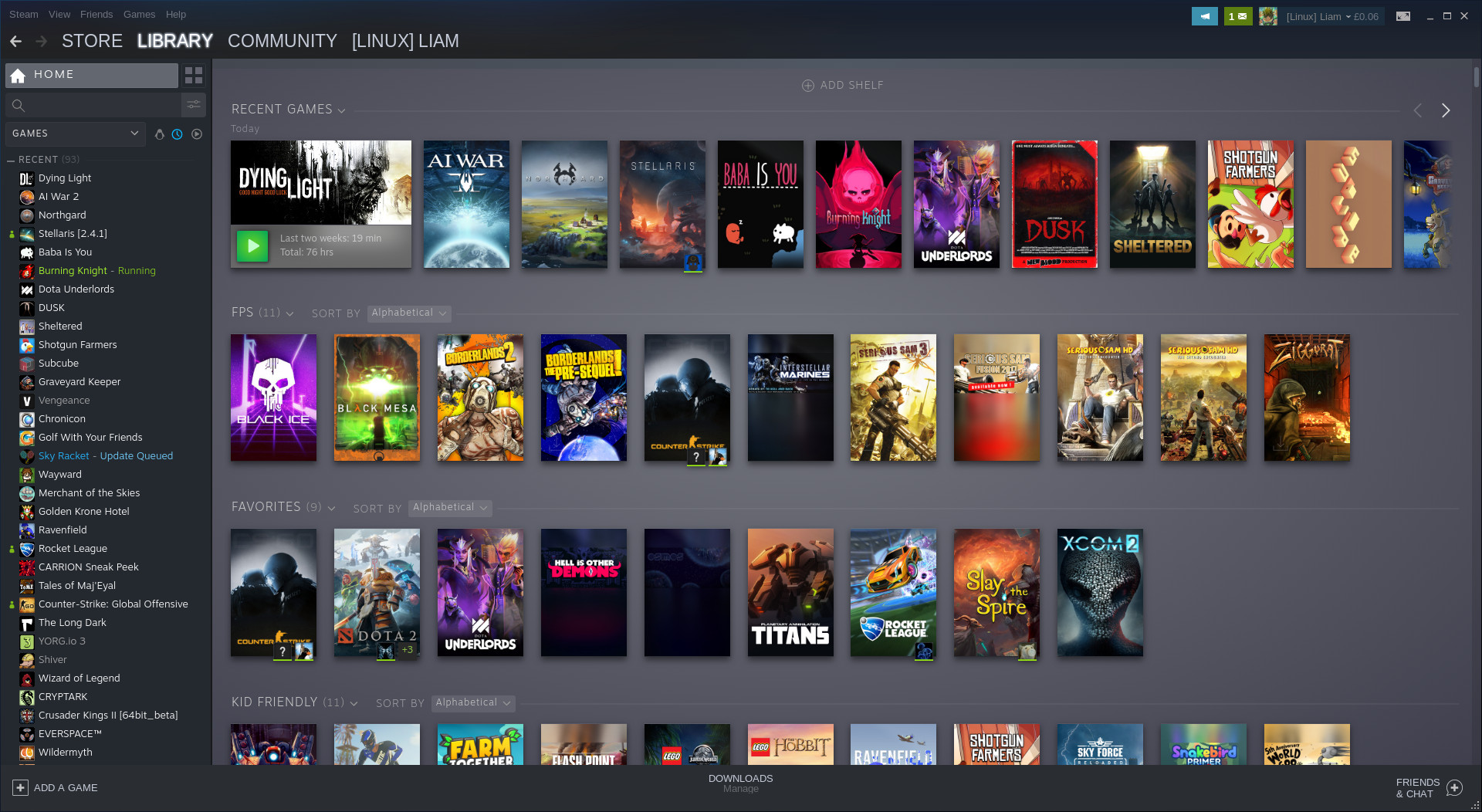
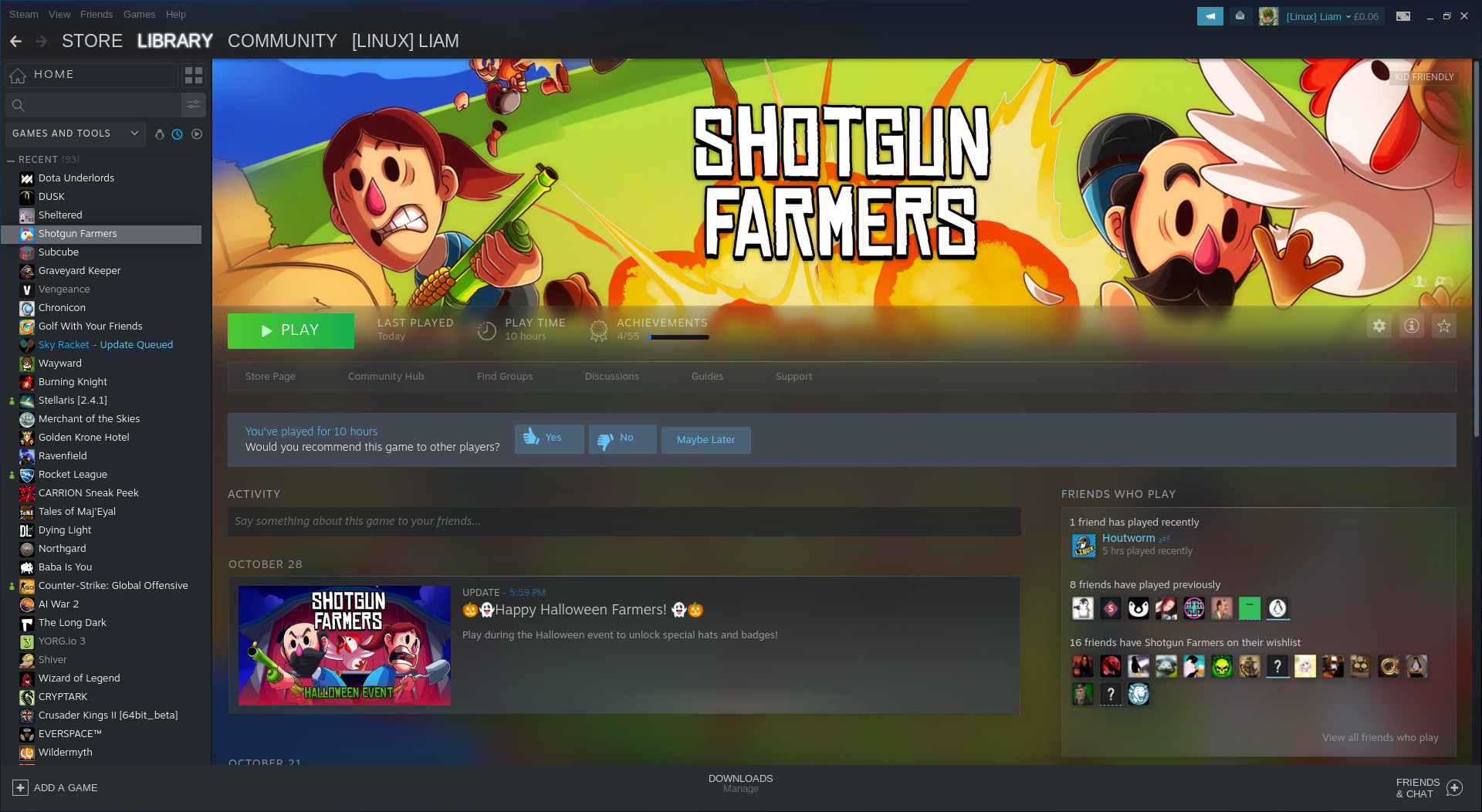
We have tons of new features to play with that have been talked about before like: the ability to sort games into dynamic collections, the customizable home page with different shelves of games made from your collections, a list of recent updates at the top of your Library home, overhauled game pages, a new events system, a Linux "Tux" icon to filter only Linux games in your list and so on.
This update also rolls out Remote Play Together (beta) for everyone now too. The new feature of Steam that allows you to play games that only have local co-op/multiplayer, across the net with your Steam friends. Only the host needs to own it too. It's a huge feature, one that's quite exciting and full of possibilities. For some of us, it's not easy to get people in the same room and not just that, so this breaks down a few walls.
You can see the official announcement on Steam here and there's also a changelog here.
Something else they didn't seem to announce directly, is that Steam will now prompt you to make or update a review when you've put a number of hours into a game. This is good, as we've been told many times how important reviews are for games to get noticed.
Not just to get more good reviews onto store pages though. In the era of live service games that are constantly updated, it's good to get accurate and up to date reviews. Games change drastically often now, so having a client that can actually remind people a little like that is good.
Also, something else seems to be coming involving the Steam Runtime for Linux, which now shows up in the Tools section of Steam. Developer Timothee Besset replied to me on Twitter with "soon (tm)", so when I have more info on what exactly it's for I will let you know.
I mean, there are features missing on the new one, where is the proton info on games.
Why is the UI still slow and clunky. Why is everything huge like its made for blind people or fits more as a big picture replacement for TV..
im really not happy with this. It needs alot more work imo
Anyway, I'm finding it to be sluggish loading stuff and resource hungry.
I do like the direction they took, but as an interface is inconsistent and fragile. Feels like it was put together in haste and I believe it is too early to push this to stable status.
Thank you for forcing a incomplete UI into our faceI respectfully disagree - the new UI functions quite well and the client got more stable since it was first introduced into beta, and certainly since it was first leaked.
While the client can always be better, I think it's about time they made this the official stable version. I wouldn't want minor issues to delay the wider adoption of the new UI (though I do hope they get the proton version [easily visible](https://github.com/ValveSoftware/steam-for-linux/issues/6494) soon).
I'm sure consolidating this change makes it easier for the dev team as well - less surface area to support (old interface and new interface)
Why is everything huge like its made for blind people or fits more as a big picture replacement for TV..I think the larger elements better utilize standard screen sizes of today. The element sizes go quite well with a 1080p screen, and seem fine on a 1280x720 screen... The main list is still compact, and IMHO that's how it should be.
Have you tried this setting?
[](https://postimg.cc/qtRTbfxb)
Last edited by lectrode on 31 Oct 2019 at 12:36 am UTC
Last edited by Grifter on 31 Oct 2019 at 12:59 am UTC
Have you tried this setting?
[](https://postimg.cc/qtRTbfxb)
enlarge is allready off, its still has too big text and icons (gamelist is fine, but the rest). I have 2560x1440 27" monitor
edit:
This is what i mean. Everything is huge under the game info. I't could fit a lot more onto screen.
Spoiler, click me
Last edited by Xpander on 31 Oct 2019 at 1:13 am UTC
As for the client, every time I click on a game I can see it laying stuff out which is clearly slow and clunky. Hmmm I can't see shared games? oh I see they are jumbled up in uncategorized instead of under each user. And it still keeps changing offline to invisible in friends when I restart! The OS filter is gone? (or is that because I have proton enabled?)
Anyone know if the library is electron based now?
Anyway, I'm finding it to be sluggish loading stuff and resource hungry.
I think it's still just using the Chromium Embedded Framework alone. If it's Electron it's really underutilized, seeing as a lot of panels don't really update on the fly, and the library scrolling is terribly sluggish.
For the rest of it: Meh.
I would like my minimal icon-only view back, please.
Edit: Digging through the reddit rage thread dug this up. Paste this into your start arguments for steam.
-no-browser +open steam://open/minigameslist
Warning, it completely disables the store, etc. and you are just left with the minimal list. Not exactly what I was looking for.
Last edited by no_information_here on 31 Oct 2019 at 5:05 am UTC
Anyone know if the library is electron based now?Isn't all computing electron-based? :P
I like that it will enable the steam overlay for the controller without forcing me into big picture mode.
It's always done that for me previously :s
Then why is this line in the update?I like that it will enable the steam overlay for the controller without forcing me into big picture mode.
It's always done that for me previously :s
"Added support for enabling the Big Picture overlay when using controllers with the desktop client"
Last edited by no_information_here on 31 Oct 2019 at 5:08 am UTC
Then why is this line in the update?
I'm probably just misunderstanding what it does in that case.
At least they don't rely on user-defined tags for filtering dynamic collections. Cyberpunk 2077 is still tagged "dating sim".
Last edited by vector on 31 Oct 2019 at 7:19 am UTC
That's it, done, finished. The beta is over and the new Steam Library along with Remote Play Together is now out for everyone as soon as your client updates.
Maybe I'm misreading all of this, but isn't Play Together still on beta?
The OS filter is gone?
There is a little (chubby) penguin icon to filter.
Correct. Bad wording on my part. Adjusted it.That's it, done, finished. The beta is over and the new Steam Library along with Remote Play Together is now out for everyone as soon as your client updates.
Maybe I'm misreading all of this, but isn't Play Together still on beta?




 How to set, change and reset your SteamOS / Steam Deck desktop sudo password
 How to set up Decky Loader on Steam Deck / SteamOS for easy plugins
See more from me