That's it, done, finished. The beta for the new Steam Library is over and the Remote Play Together beta is now out for everyone as soon as your client updates.
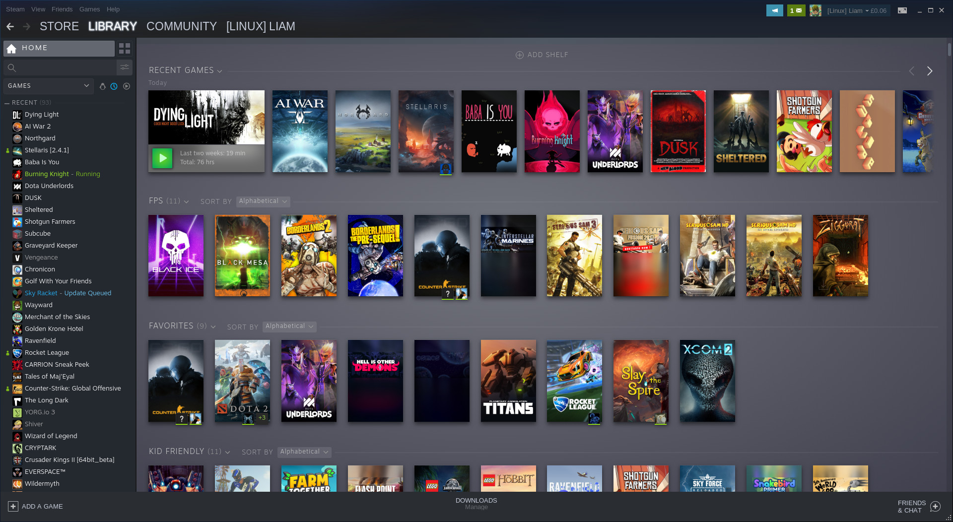
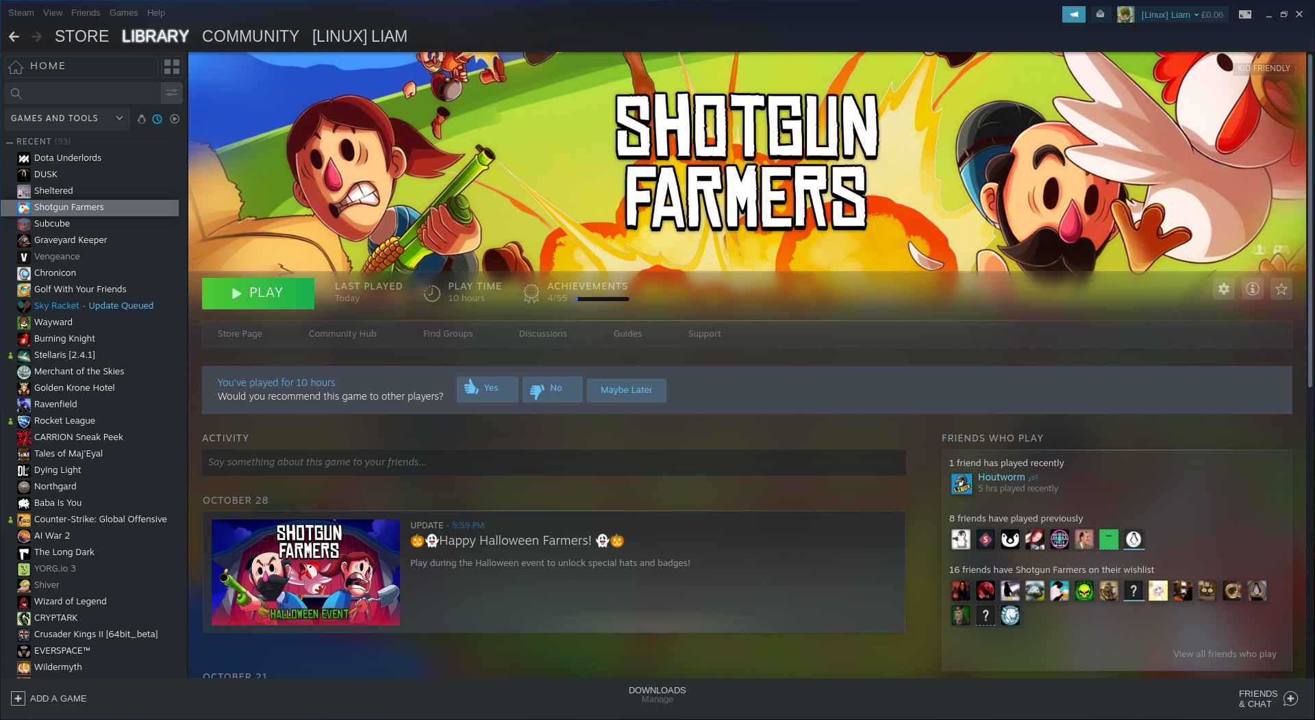
We have tons of new features to play with that have been talked about before like: the ability to sort games into dynamic collections, the customizable home page with different shelves of games made from your collections, a list of recent updates at the top of your Library home, overhauled game pages, a new events system, a Linux "Tux" icon to filter only Linux games in your list and so on.
This update also rolls out Remote Play Together (beta) for everyone now too. The new feature of Steam that allows you to play games that only have local co-op/multiplayer, across the net with your Steam friends. Only the host needs to own it too. It's a huge feature, one that's quite exciting and full of possibilities. For some of us, it's not easy to get people in the same room and not just that, so this breaks down a few walls.
You can see the official announcement on Steam here and there's also a changelog here.
Something else they didn't seem to announce directly, is that Steam will now prompt you to make or update a review when you've put a number of hours into a game. This is good, as we've been told many times how important reviews are for games to get noticed.
Not just to get more good reviews onto store pages though. In the era of live service games that are constantly updated, it's good to get accurate and up to date reviews. Games change drastically often now, so having a client that can actually remind people a little like that is good.
Also, something else seems to be coming involving the Steam Runtime for Linux, which now shows up in the Tools section of Steam. Developer Timothee Besset replied to me on Twitter with "soon (tm)", so when I have more info on what exactly it's for I will let you know.
Also, something else seems to be coming involving the Steam Runtime for Linux, which now shows up in the Tools section of Steam. Developer Timothee Besset replied to me on Twitter with "soon (tm)", so when I have more info on what exactly it's for I will let you know.
Im curious if this new Steam Runtime for Linux is something to do with Proton; given that last night when I was reinstalling everything for my new build, when I went to activate Proton for all games the top and default selection from the dropdown of what Proton version to use was "Steam Runtime for Linux"
I am a happy pinguin.
Sorry, but I think what Valve is doing lately with their client is awful. I love what they're doing with Linux and FOSS in general, but... they're really doing a shitty job regarding their client.
Not that they're alone with this, but... when I installed Steam for the first time more than 15 years ago, everything was quick, snappy and performant. With a computer that has roughly the same processing power as my router has now (that may be a slight exaggeration ;) ). My computer now has so much more power that is it rather hard to express, yet Steam, and many other softwares, struggle to run smoothly.
That seriously sucks.
The OS filter is gone?
There is a little (chubby) penguin icon to filter.
Man thank you for that. Looks nothing like a penguin and would never have realised what that was!
With a few games in a library, the most-used size for me was 284 pixels in width by 638 pixels in height. That allowed me to see the dozen games I had installed, in their categories, and all game names would be fully shown in the list.
This meant the game launcher element of the Steam client could be put out of the way and games could be played either windowed or full screen while the launcher was still operational in the background.
With the beta my behaviour quickly changed to launching a game as soon as the Steam client started, and minimizing the Steam client. I don't want that trash visible in the background of my windowed games. I don't need it in the background consuming higher amounts of RAM than it should.
I'm looking for an alternative which boots my Steam library without being in the way, like Lutris.
Also, something else seems to be coming involving the Steam Runtime for Linux, which now shows up in the Tools section of Steam. Developer Timothee Besset replied to me on Twitter with "soon (tm)", so when I have more info on what exactly it's for I will let you know.
It has something to do with SteamPlay:
Spoiler, click me
I wouldn't mind it if installed vs uninstalled games were less subtly indicated, perhaps uninstalled could be a bit dimmed? The little down-arrow-above-a...tray? a dead bracket?---whatever it is---is impossible to see on many of the game pictures. In fact, it seems it isn't always correctly present or missing. Here's an example of what I'm talking about:

Collapse and Contagion appear installed. Codename Cure and Crashlands might be, but any install symbol is lost in the noise of the game's picture. None of these games are, in point of fact, actually installed. If it weren't for the list to the left of the screen, I wouldn't know what exactly was or wasn't installed.
All in all a step in the right direction, this new library. Now if Valve could just optimize the rest of the client to be half as spry as Steam is in Firefox...
Not that I'm in a hurry but... maybe it hasn't released for everybody yet?
Is a general mess, except for that little button (surrounded by red colour) that allow me to see the games that I have installed.
Am I the only one without the new UI? My steam client hasn't updated itself since the 2nd of October.
Not that I'm in a hurry but... maybe it hasn't released for everybody yet?
My steam client hasn't updated either. I still have the October 2 version. Maybe its a regional rollout?
- The list filters (Recent, Installed, etc) are now actually above the list itself, rather than just in the Library menu
- The game view is way more clean than it used to be before, when it had all those links down the right
- Managing collections also way better than before
I know hating on new stuff is how we like to roll, but there are quite a few improvements.
- The list filters (Recent, Installed, etc) are now actually above the list itself, rather than just in the Library menu
- The game view is way more clean than it used to be before, when it had all those links down the right
- Managing collections also way better than before
I like change when it makes sense and improved things.. however this doesn't feel that way. What was they being to fix? Also the categories are meh for me. I have mine already sorted and have for years. The game view is way too busy.
I just want the option to have small mode. If you like the oversexed new look other fine, but i don't.
Last edited by doctorx on 31 Oct 2019 at 4:46 pm UTC
Am I the only one without the new UI? My steam client hasn't updated itself since the 2nd of October.
Not that I'm in a hurry but... maybe it hasn't released for everybody yet?
My steam client hasn't updated either. I still have the October 2 version. Maybe its a regional rollout?
I was thinking the same thing.
Anyway, my steam client was updated just now, let's see what's new :)





 How to set, change and reset your SteamOS / Steam Deck desktop sudo password
 How to set up Decky Loader on Steam Deck / SteamOS for easy plugins
See more from me