That's it, done, finished. The beta for the new Steam Library is over and the Remote Play Together beta is now out for everyone as soon as your client updates.
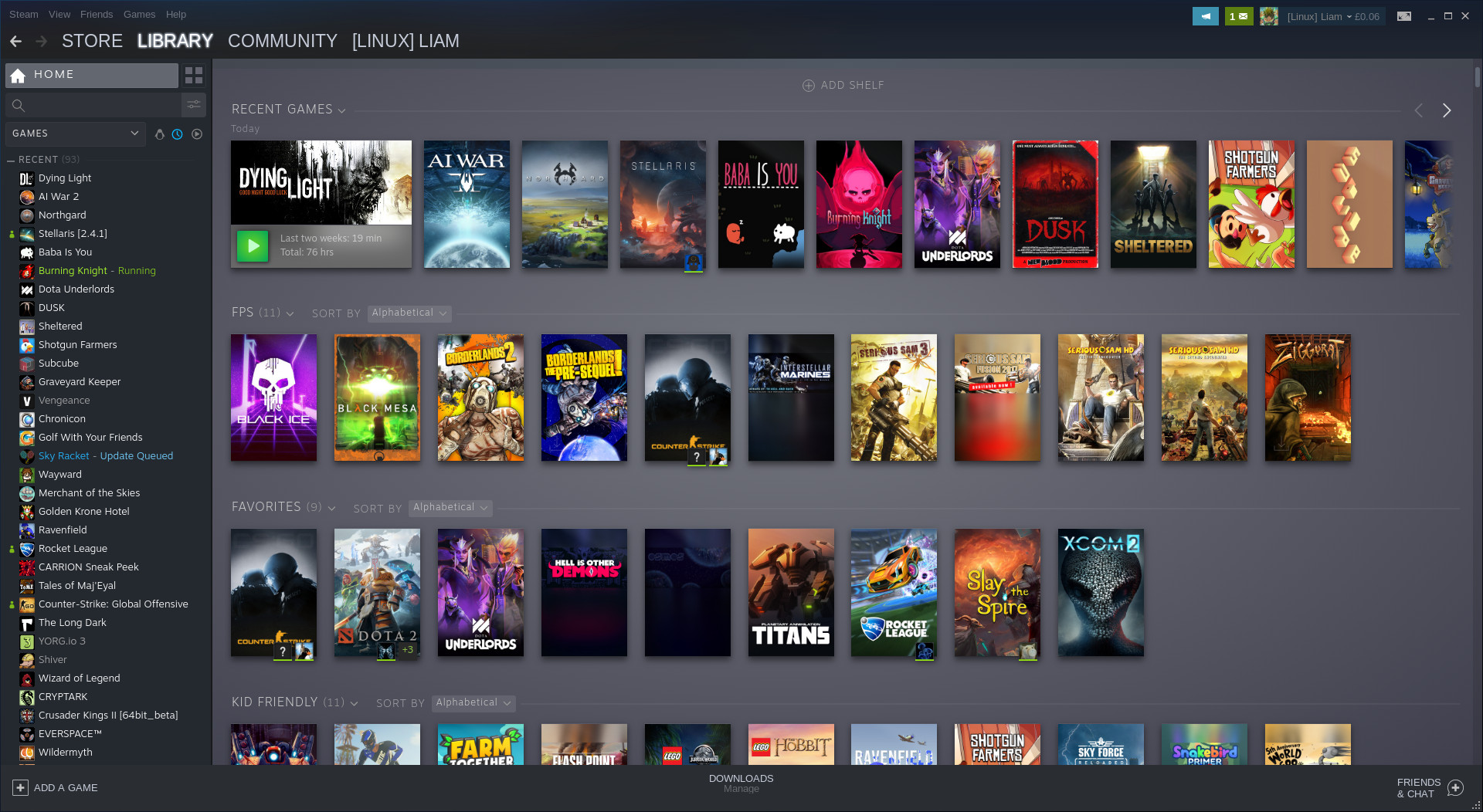
We have tons of new features to play with that have been talked about before like: the ability to sort games into dynamic collections, the customizable home page with different shelves of games made from your collections, a list of recent updates at the top of your Library home, overhauled game pages, a new events system, a Linux "Tux" icon to filter only Linux games in your list and so on.
This update also rolls out Remote Play Together (beta) for everyone now too. The new feature of Steam that allows you to play games that only have local co-op/multiplayer, across the net with your Steam friends. Only the host needs to own it too. It's a huge feature, one that's quite exciting and full of possibilities. For some of us, it's not easy to get people in the same room and not just that, so this breaks down a few walls.
You can see the official announcement on Steam here and there's also a changelog here.
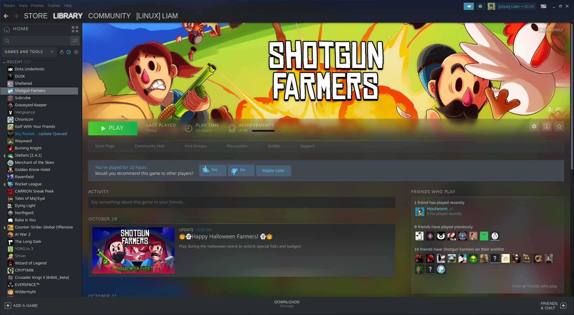
Something else they didn't seem to announce directly, is that Steam will now prompt you to make or update a review when you've put a number of hours into a game. This is good, as we've been told many times how important reviews are for games to get noticed.
Not just to get more good reviews onto store pages though. In the era of live service games that are constantly updated, it's good to get accurate and up to date reviews. Games change drastically often now, so having a client that can actually remind people a little like that is good.
Also, something else seems to be coming involving the Steam Runtime for Linux, which now shows up in the Tools section of Steam. Developer Timothee Besset replied to me on Twitter with "soon (tm)", so when I have more info on what exactly it's for I will let you know.
E.g. Rather than jumbling 52 Steam Dev Days videos with other videos, I would prefer to create a collection (e.g. "Steam Dev Days") or two (e.g. "Steam Dev Days 2016" and "Steam Dev Days 2014") for just those Steam Dev Days videos, but have the ability to include that collection in one or more broader video collections (e.g. "Gaming Industry" or "Valve", etc).
E.g. Rather than have 16 Telltale Games Sam & Max episodic listings mixed with single-listing games, instead create 3 collections (specifically "Sam & Max Save the World", "Sam & Max Beyond Time and Space", and "Sam & Max: The Devil's Playhouse"), then include those 3 collections in broader collections (e.g. "Telltale Games" or "Adventure Games" or "LucasArts Spiritual Successors" or "Sam & Max", etc).
Edit: I am glad that microtransactionless free-to-play games are now visible in my library while they are uninstalled (without needing to hide them).
Last edited by vector on 1 Nov 2019 at 4:38 am UTC
Oh, that's funny. If you click the penguin icon to filter for Linux games, but have Proton enabled for all games, then it doesn't filter anything. Which is behaviour I thought they were going to fix from the old version, but apparently not.
Yep; that's why I immediately turned the option back off after trying it, and why I was much happier when they added the option to enable it on specific games.
I'd really like to know if Valve had an actual UI/UX expert working on this. It certainly does not look or feel like it... It feels overloaded, clunky and is painfully slow.
As a user I'd expect an application's UI to be as clearly laid out as possible, and not such a complete and utter mess. Don't get me wrong, the old Steam UI wasn't great either, but this is certainly a huge step towards the non-usability of iTunes.
You know what the new Steam Library reminds me of? 90s websites with <blink> and <marquee> all over the place. Oh, and annoying background music. Aaaactually, for the younger folks: This is what I'm talking about: https://badhtml.com/ Looks just like the new Steam library, doesn't it?
Thanks you Valve, I hate it.
I'd really like to know if Valve had an actual UI/UX expert working on this. It certainly does not look or feel like it... It feels overloaded, clunky and is painfully slow.
As a user I'd expect an application's UI to be as clearly laid out as possible, and not such a complete and utter mess. Don't get me wrong, the old Steam UI wasn't great either, but this is certainly a huge step towards the non-usability of iTunes.
You know what the new Steam Library reminds me of? 90s websites with <blink> and <marquee> all over the place. Oh, and annoying background music. Aaaactually, for the younger folks: This is what I'm talking about: https://badhtml.com/ Looks just like the new Steam library, doesn't it?
AUCH!!
Horrible memories!
Well at least it is usable for my main pc. With my old laptops i can't really go purchasing stuff with those cause they can't handle the store. Even though the laptops handle like Twitch stream and Discord at the same time. Kappa
I found on another drive a stable client (the version just before this update), made its "package " folder read-only and set it as my main steam client. Now it can't update itself and I have an usable steam client. Have no idea for how long will it be compatible, but hopefully by then the actual client will sort its issues out.




 How to set, change and reset your SteamOS / Steam Deck desktop sudo password
 How to set up Decky Loader on Steam Deck / SteamOS for easy plugins
See more from me