This is an interesting open source project! vkBasalt is a new Vulkan post processing layer that currently supports Contrast Adaptive Sharpening.
Unlike Radeon Image Sharpening, vkBasalt supports Linux and works with both NVIDIA and AMD. This isn't entirely reinventing the wheel though, as it's partly based upon the ReShade port of AMD's CAS. Still, it's fun to see what hackers are able to do with little layers like this, especially when we don't have official support.
Want to see the difference it makes? The developer included a comparison shot of Skyrim:
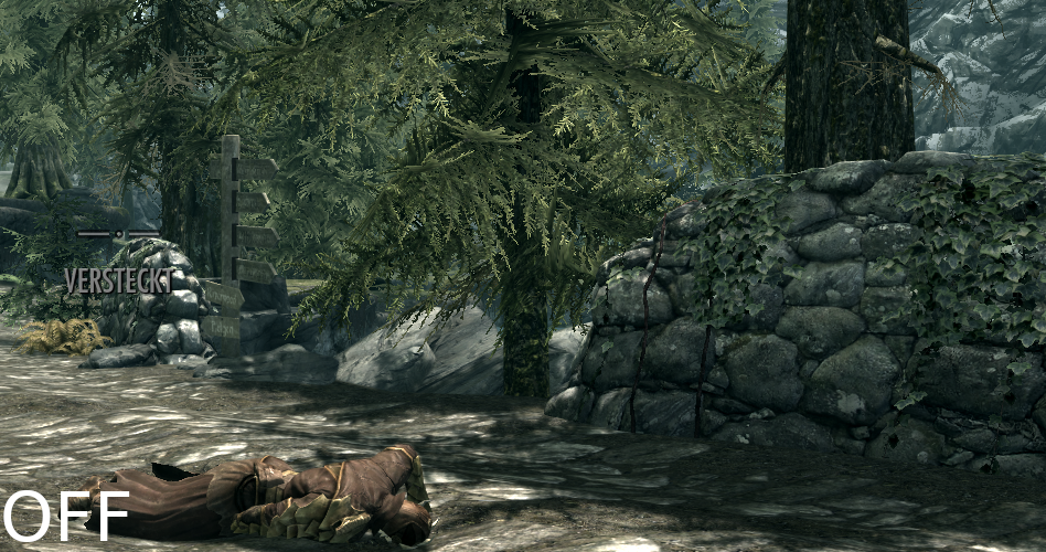
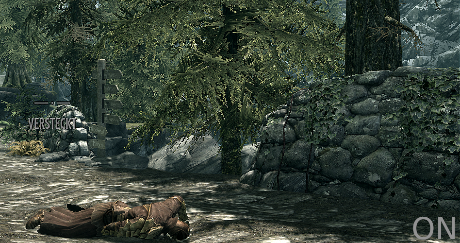
See a bigger comparison on this dedicated page.
Seems like a really fun idea, although the result might not be to everyone's tastes it's very much personal preference. It does make it look quite a lot sharper to my eyes.
It's already seeing plenty of activity on GitHub with others helping out, in time this could be quite an interesting Vulkan layer if more options get added in.
You can find it on GitHub.
Hat tip to RTheren.
Gonna need a shot, not happening at all for me. I'm thinking perhaps we're seeing the same thing differently. The effect on it does make it looks like things shift, but it's the same image in the same place.I don't see any misalignment? Can you point it out?Great job on that sliding preview, it really works well for side-by-side. You are very good at this Liam.Can't take all credit. I implemented it using https://github.com/koenoe/cocoen, no point reinventing the wheel :)
Nice feature, Liam.
Do you notice a slight misalignment between the two pictures?
I wonder if this is due to the source material slightly shifted,
the post-processing or the implementation of the new feature?
Here it's just a pixel or so.
If I quickly move the slider, so that it's like swapping the images,
it clearly looks like the post-processed image is slightly shifted downwards.
Wait, this is strange. :)
When I freshly open the page, it looks fine.
Once I go to another comment page this misalignment occurs and stays until I freshly open the article,
say in another tab.
Firefox on Fedora.
Yet, it's really not a big thing.
Can you reproduce that?
I'm getting this consistently. Seems like the post-processed image is ~2 pixels further down, but it's barely noticeable.
Anyone had any luck compiling it under Ubuntu 18.04 with the libvulkan-dev from graphics-drivers PPA? It asks for vk_layer_dispatch_table.h which is not there.You need to have the Vulkan sdk installed to compile vkBasalt, for Ubuntu 18.04 there is a PPA by Lunarg. But you do not need to compile vkBasalt yourself, there are precompiled Binaries
I don't care about sharpening but this is great, we need some post-processing injectors on Linux. I was actually just messing with the latest version of ReShade. It works in Wine (at least the opengl part) and it's really great.
Same. I've had some success using ReShade with Dragon's Dogma, although the installer does not work, I had to copy a bunch of files.
Installing and using vkBasalt actually was a lot simpler and seems way more performant. So I'm eager to see more filters, maybe some basic colour profile stuff next. That and perhaps a way to mess with it while it's running. For people who like to do screenarchery.
The installer depends on .net so I managed to get it working in a prefix where I have .net up to 4 installed. Doesn't seem to run with Mono though, unfortunately.I don't care about sharpening but this is great, we need some post-processing injectors on Linux. I was actually just messing with the latest version of ReShade. It works in Wine (at least the opengl part) and it's really great.
Same. I've had some success using ReShade with Dragon's Dogma, although the installer does not work, I had to copy a bunch of files.
Installing and using vkBasalt actually was a lot simpler and seems way more performant. So I'm eager to see more filters, maybe some basic colour profile stuff next. That and perhaps a way to mess with it while it's running. For people who like to do screenarchery.


 How to set, change and reset your SteamOS / Steam Deck desktop sudo password
 How to set up Decky Loader on Steam Deck / SteamOS for easy plugins
See more from me