RetroArch is a wonderful and expansive front-end for tons of emulators and other gaming engines, it's just had a fresh release that entirely replaces the user interface.
XMB was the name of what they were using before, which was an interface thoroughly inspired by Sony's inteface for the PlayStation where you slide along and pick various options. While it looked pretty, their XMB interface wasn't very accessible and relied on people really knowing what to look for.
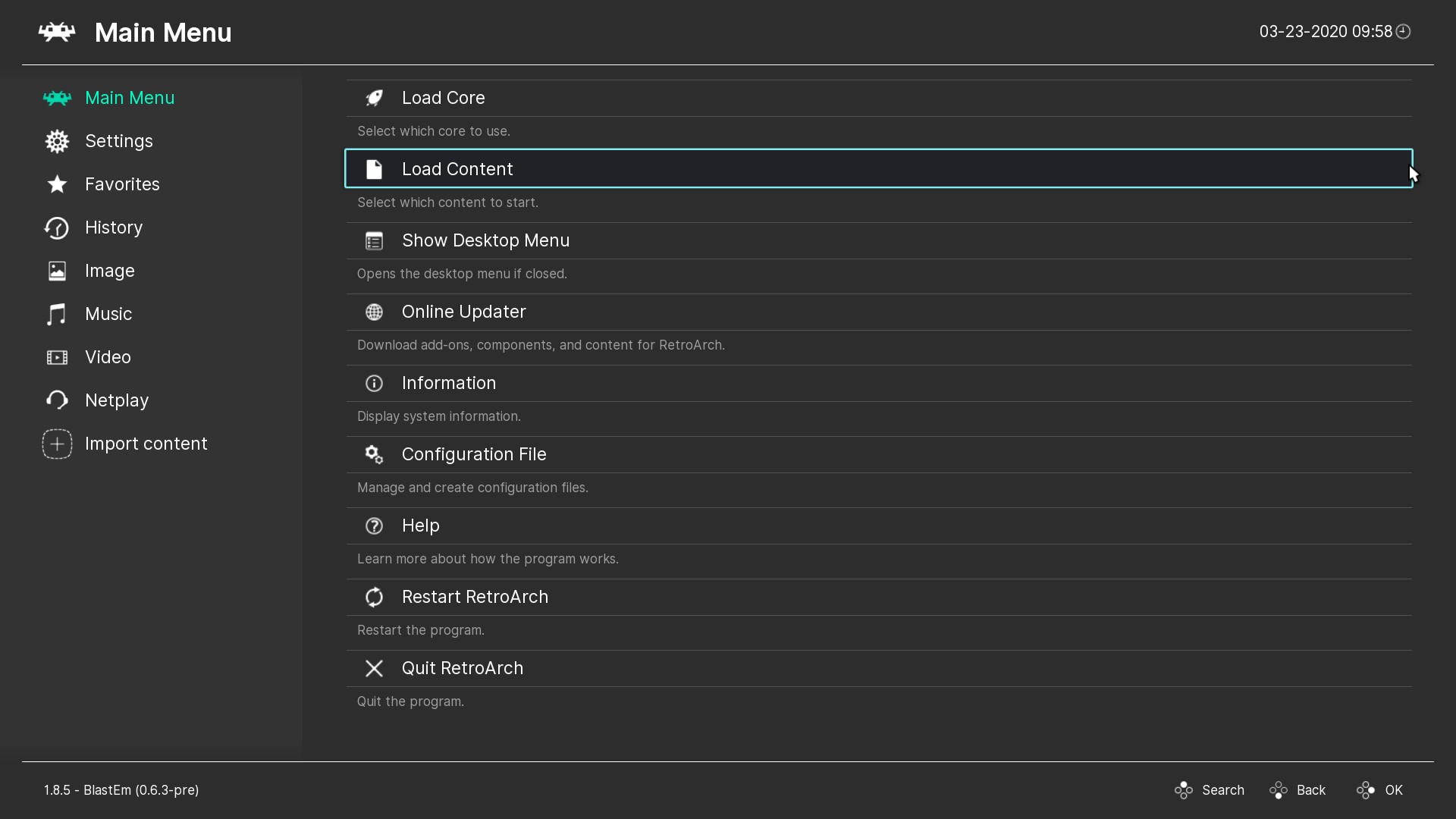
Ozone is the interface that has replaced it, only by default though, you can change between interfaces in the Drivers settings page. Here's what it looks like now by default:
Definitely not as pretty, sure but far easier to understand for people only just grabbing it. Lots of bug fixes and quality of life features sorted in RetroArch 1.8.5 including DPI-based scaling for the new Ozone UI plus rudimentary pointer support, which together makes it feel a lot better.
The older XMB got some new colour themes, there's new date/time formats, mouse capture hotkey was fixed, the newer Disk Control system now has disk labels added to the 'disk inserted' notifications and a bunch of translations were updated, Two important Linux issues were solved too including a crash running it on startup, and threaded video should be more stable.
See more about RetroArch on the official site.
The one thing that bothers me about Ozone is that there are no screenshots for save states.





 How to set, change and reset your SteamOS / Steam Deck desktop sudo password
 How to set up Decky Loader on Steam Deck / SteamOS for easy plugins
See more from me