Bounding Box Software and Humble Games have shown off brand new footage of the upcoming FPS Prodeus, which mixes retro and modern styles together.
It will feature a full single-player campaign, a built-in map editor to build and share, high-quality effects that blends a retro aesthetic with modern over the top visual effects. Also announced today is that it's going to be entering Early Access this 'Fall', which is another delay as it was supposed to be this Summer. Check out the fresh footage in the Early Access announcement trailer:
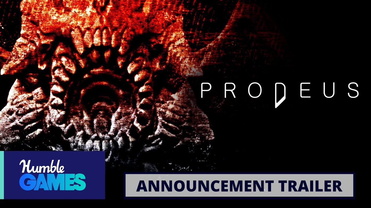
Direct Link
The resurgence of retro themed FPS continues and I fully expect Prodeus to be a big hit. I couldn't be any more excited about it. Just look at that action, it looks immense! Prodeus was originally funded on Kickstarter with full Linux support planned, you can see more crowdfunded games on our dedicated page.
You can wishlist/follow on Humble Store, GOG and Steam.
Thats how retro should look like - old, but with a modern touch :D
Not that this isn't good too, of course.
In those days, the games looked pixelated because of the technical limitations of that era (like low res images and 256 colours) and not because the developers wanted to do that...
I'm very sure the devs of those days wanted to give the highest graphic quality they could achieve with the few technical resources they had.
Anyway, I have an old CRT monitor just in case I want to play real retro games like Hexen or Heretic.
Last edited by Shmerl on 14 Jun 2020 at 6:39 am UTC
I am really tired of these "retro" look games.
In those days, the games looked pixelated because of the technical limitations of that era (like low res images and 256 colours) and not because the developers wanted to do that...
I'm very sure the devs of those days wanted to give the highest graphic quality they could achieve with the few technical resources they had.
Anyway, I have an old CRT monitor just in case I want to play real retro games like Hexen or Heretic.
There are good ways to approach pixel art, which have good reasons behind them. But this isn't one of those situations.
According to videos they've put out, the pixel look is just a filter that you can turn off. It's solely there for the nostalgia factor, not for, say, abstraction or a consistent style the way it is in a lot of games. Honestly, to me it just makes everything look needlessly blurry.
I am really tired of these "retro" look games.You are right about why the games looked that way back then, but you completely ignore the fact that now these looks are "rediscovered" not as a technical fact or limitation or excuse, but as a style of choice or - like in this case - something to experiment with to achieve interesting results (*).
In those days, the games looked pixelated because of the technical limitations of that era (like low res images and 256 colours) and not because the developers wanted to do that...
I'm very sure the devs of those days wanted to give the highest graphic quality they could achieve with the few technical resources they had.
Nowadays, a look like that is very often a conscious decision, and those kinds of decision generally lead to the best results.
Just like there are still black-and-white movies being made - a conscious decision of style for various reasons, not necessarily to look like "back then".
You also strongly confuse graphical style with graphical quality.
Graphical quality is high if the art style is well-executed and consistent - "everything fits together".
It is rather objective and has nothing, absolutely nothing, to do with the amount of pixels or vertices on display.
There is no doubt Prodeus devs are going for the highest graphical quality they can achieve, most devs generally do.
Graphical style is something you can enjoy or - like you in this case - not.
But don't confuse your subjective taste with objective quality.
There are lots of styles that I don't enjoy, no matter how well done they are (e.g. I can't stand most anime, ugh).
* Not sure if I like this look myself, but it sure looks intriguing.
They are using 16-directional sprites afaik and IMO that reaches a level of 3D-detail where you might as well just use full 3D animated models to begin with. There are a few too little gaps for the imagination to fill out to work like 8-directional sprites do.
Personally, I rather look at sprites like they have in Ion Fury, the ones in Prodeus evoke something of an "uncanny valley" for me.
Last edited by TheSHEEEP on 15 Jun 2020 at 10:01 am UTC
Just like there are still black-and-white movies being made - a conscious decision of style for various reasons, not necessarily to look like "back then".
Like the movie Renaissance... It blow my head years ago.


 How to set, change and reset your SteamOS / Steam Deck desktop sudo password
 How to set up Decky Loader on Steam Deck / SteamOS for easy plugins
See more from me