GNOME 3.38 "Orbis" just landed today, which brings in another 6 months of hacking away at all the tech behind the GNOME desktop for a fully modern Linux environment. The Orbis code-name is to recognise the team behind the GUADEC 2020 conference, which the GNOME team said "is only possible thanks to the hard work of many volunteers".
This latest release brings in some big stuff too, here's some highlights:
- The application grid got new tools along with drag and drop support for setting it up how you want
- A newly designed fingerprint UI and better login support for it, along with new parental controls
- Special QR codes to give other devices access to your WiFI easily
- A better Maps application with a night mode too
- Improved screen recording with PipeWire
- Better multi-monitor support
- Updates to the Games app
Check out their seriously slick release video:
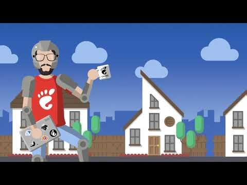
Direct Link
Full release notes can be found here.
As for when you will be able to get it, that depends on your distribution. For Ubuntu, which has GNOME as the default, it will be in the Ubuntu 20.10 release and the same for other distributions with regular release cycles. For distributions based on Arch Linux, it will no doubt arrive in updates shortly.
Coming up next to GNOME is a new versioning system, which is currently being discussed here. The next release will be GNOME 40, due in March 2021. It will go through a 40.alpha, 40.beta, 40.rc and then a 40.0 release. Each stable release after will be 40.x until the next major version with GNOME 41 which will then follow that same pattern.
Neat!
> Different refresh rates
And here I thought they'd finally have different wallpapers per screen like KDE. Eugh.
Better multi-monitor support
Because of EWMH MM support on GNU/Linux is not very good (you simply can't have workspaces on different monitors be independent of each other). WMs which break EWMH compatibility (like Awesome with its Tags) are therefore doing a good job of pushing usability forward. But those lack the surrounding infrastructure of a full DE so everything is terrible for ever until we get rid of EWMH.
Sorry, I was ranting. To get back on topic: it's good that GNOME has been updated, but they should really try and get along with others (we were talking about getting GTK theme colours on the [Emacs Devel mailing list](https://lists.gnu.org/archive/html/emacs-devel/2020-09/msg01305.html)).
Edit: Too much excitement! Got the release version of mutter, but gnome-shell was only version 3.37.92-3. I'm sure it will be updated any minute though.
Last edited by Brisse on 16 Sep 2020 at 5:35 pm UTC
Nah, let's just drop the 3 prefix.
So it's pronounced "guh nome", huh?
I think that was inherited from "guh new" (it is/was GNU Network Object Model Environment).
KDE is/was Kool Desktop Environment.
I say "is/was" on those because I'm not sure if they have retained their original acronyms?
I say "is/was" on those because I'm not sure if they have retained their original acronyms?
I wonder if they tried to come up with a recursive acronym ('backronym', that is) at any point.
GNOME has NO MErcy.
Last edited by walther von stolzing on 16 Sep 2020 at 11:47 pm UTC
What's EWMH?Better multi-monitor support
Because of EWMH MM support on GNU/Linux is not very good (you simply can't have workspaces on different monitors be independent of each other). WMs which break EWMH compatibility (like Awesome with its Tags) are therefore doing a good job of pushing usability forward. But those lack the surrounding infrastructure of a full DE so everything is terrible for ever until we get rid of EWMH.
Sorry, I was ranting. To get back on topic: it's good that GNOME has been updated, but they should really try and get along with others (we were talking about getting GTK theme colours on the [Emacs Devel mailing list](https://lists.gnu.org/archive/html/emacs-devel/2020-09/msg01305.html)).
What's EWMH?
Extended Window Manager Hints.
And yet still an empty desktop.
I don't know about you but the only time I ever see my desktop is when I first boot. That's a weird complaint to have.
I think that getting rid of desktop icons was one of the biggest innovations of GNOME 3. Finding stuff on the desktop is slower than any other method, be it start menus, search, or simply a file manager. To find stuff on the desktop you have to literally move whatever you are doing out of the way, and break your flow. It is only realistically useful for the first few seconds after you have logged in, and before you launched your first application that obscures the view of the desktop.And yet still an empty desktop.I don't know about you but the only time I ever see my desktop is when I first boot. That's a weird complaint to have.
In my opinion a cramped desktop screen reflects people's untidiness; it resembles their real desks and/or their inability to give structure to the files on their drive(s). That's okay for me, but in this case GNOME may not be the right choice.I think that getting rid of desktop icons was one of the biggest innovations of GNOME 3. Finding stuff on the desktop is slower than any other method, be it start menus, search, or simply a file manager. To find stuff on the desktop you have to literally move whatever you are doing out of the way, and break your flow. It is only realistically useful for the first few seconds after you have logged in, and before you launched your first application that obscures the view of the desktop.And yet still an empty desktop.I don't know about you but the only time I ever see my desktop is when I first boot. That's a weird complaint to have.
I think that getting rid of desktop icons was one of the biggest innovations of GNOME 3. Finding stuff on the desktop is slower than any other method, be it start menus, search, or simply a file manager. To find stuff on the desktop you have to literally move whatever you are doing out of the way, and break your flow. It is only realistically useful for the first few seconds after you have logged in, and before you launched your first application that obscures the view of the desktop.And yet still an empty desktop.I don't know about you but the only time I ever see my desktop is when I first boot. That's a weird complaint to have.
^This
And for the people still not convinced, try using a tiling WM/Compositor for a while and get comfortable with it. Notice how you basically never see your desktop wallpaper.
The comparison between GNOME and tiling WM's might sound weird to some, but their workflow aren't that different, only GNOME is intuitive and helpful, and tiling WM's are for geeks that accept that they have to know more than a dozen hotkeys and work mostly with the keyboard rather than the mouse, and they have to find and install their own applications rather than having a nice selection installed right out of the box.
That would technically not be true if you're running multiple desktops--you could go to a fresh desktop; presto, desktop reappears. Not that I do that, it just occurs to me as a possible approach.I think that getting rid of desktop icons was one of the biggest innovations of GNOME 3. Finding stuff on the desktop is slower than any other method, be it start menus, search, or simply a file manager. To find stuff on the desktop you have to literally move whatever you are doing out of the way, and break your flow. It is only realistically useful for the first few seconds after you have logged in, and before you launched your first application that obscures the view of the desktop.And yet still an empty desktop.I don't know about you but the only time I ever see my desktop is when I first boot. That's a weird complaint to have.
But certainly for what I use most, I like to put a launcher on a toolbar. The toolbar is normally visible, and I launch with a single click, which is faster than any of the more newfangled search-oriented schemes. I don't know what things are like now, but early Gnome 3 was very much against the idea of letting you have a toolbar or put a launcher on it or do anything very analogous to any of that, that would let you launch your favourite applications with one click. In the runup to Gnome 3 when they were talking about their design ideas I actually inquired; they were quite specific in their opposition to the concept. I understand that nowadays if you install the right extensions you can frustrate the design ambitions of the Gnome people sufficiently to do many useful things, probably including that. But since Mate or Cinnamon or probably XFCE will allow me to do that out of the box and I'm convinced KDE would let me do something equivalent, I haven't felt the urge to investigate.
I actually do find icons-on-the-desktop good for games. If I'm going to play a game I generally want to clear the decks a bit first anyway; the game is going to be fullscreen, I'm not going to be doing anything else at the same time, and I just always have this sneaking feeling that having a bunch of other software open isn't going to be great for performance. And I have a lot of games (though not by some people's standards), and I don't always decide which one in advance. So it's kind of good to have a few of the games I'm currently interested in as desktop icons; I close up or minimize other software, have a look at what I might want to play, and pick one. Desktop icons can also be nice for that file I need to do something with in the next couple of days--put it in the desktop and resize it big so it'll be there staring at me as a reminder.
To find stuff on the desktop you have to literally move whatever you are doing out of the way
It seems a lot of people like running everything with their windows maximized; I know GNOME3 was trying to encourage that at one point. Personally, I can't stand that.
But certainly for what I use most, I like to put a launcher on a toolbar. The toolbar is normally visible, and I launch with a single click, which is faster than any of the more newfangled search-oriented schemes. I don't know what things are like now, but early Gnome 3 was very much against the idea of letting you have a toolbar or put a launcher on it... I understand that nowadays if you install the right extensions you can frustrate the design ambitions of the Gnome people sufficiently to do many useful things, probably including that.
I like this one (there was another before that, but it stopped being maintained):
https://extensions.gnome.org/extension/1160/dash-to-panel/
I understand it was largely based off of this:
https://extensions.gnome.org/extension/307/dash-to-dock/
Which really is mostly taking GNOME's built-in "dash" and making it always visible.
I have a lot of games (though not by some people's standards), and I don't always decide which one in advance. So it's kind of good to have a few of the games I'm currently interested in as desktop icons; I close up or minimize other software, have a look at what I might want to play, and pick one. Desktop icons can also be nice for that file I need to do something with in the next couple of days--put it in the desktop and resize it big so it'll be there staring at me as a reminder.
I very much can relate to these points.
I agree. My KDE desktop has been "empty" for years. I ran Windows that way, too, back when I was still dual booting.And yet still an empty desktop.I don't know about you but the only time I ever see my desktop is when I first boot. That's a weird complaint to have.
I noticed that one of the new Gnome features is to be able to re-order the app list. Maybe that will help but it's been quite a long time coming.
Most annoying of all is bring up a terminal which I do a fair bit and rather than one step (right-click) it's three.
In Ubuntu there is a very handy keyboard shortcut to open the Terminal. Ctrl+alt+t. When I moved to Debian I discovered that it didn't exist by default in Debian so I guess it's an Ubuntu thing, but that didn't stop me from going into gnome-settings and manually binding it. Just click the + at the bottom of the list to add a new entry, name it "Open terminal" and put "gnome-terminal" as the command and assign to whatever key combination you want. I still use ctrl+alt+t because it became my habit after using Ubuntu where it is the default.



 How to set, change and reset your SteamOS / Steam Deck desktop sudo password
 How to set up Decky Loader on Steam Deck / SteamOS for easy plugins
See more from me