Now that the dust has settled on the new Steam Library design, along with various other UI overhauls like the Properties page for games (and the recent SteamPal console leaks) - Valve will be fixing up the Steam Downloads page now too.
The Downloads page in the Steam client hasn't really been touched for a long time. It does the job, sure but it could be a lot more useful. That's set to change, although we don't know when, you can test it yourself right now if you go to "steam://nav/library/downloads".
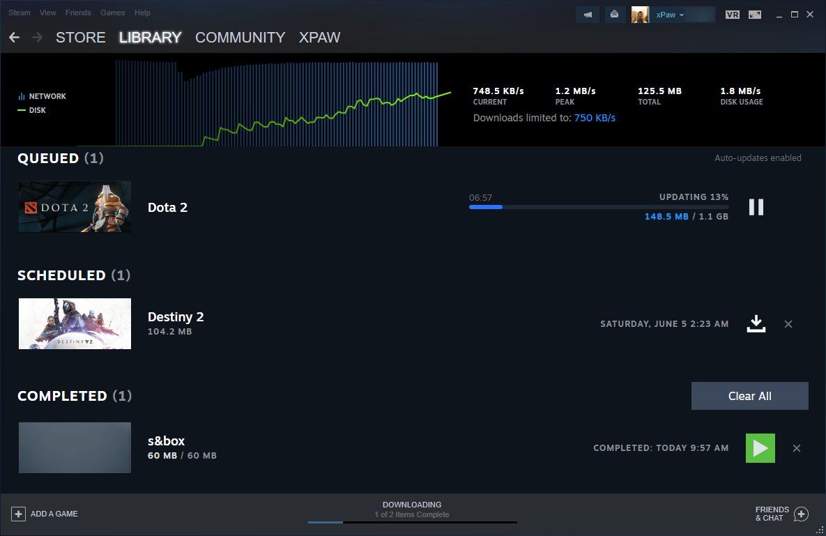
It seems it's supposed to look something like this (thanks to Pavel Djundik of SteamDB on Twitter):
Weirdly though, it's not the same for everyone.
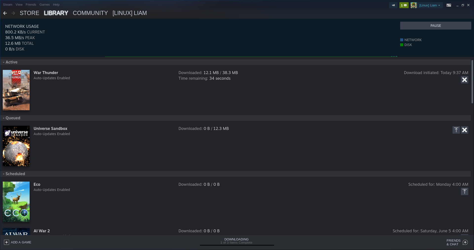
Trying it myself sort-of gives me it, but not quite and this was tested across both the Stable and Beta versions of Steam. So they're clearly not quite ready to roll it out just yet. This is what I see which has a few adjustments but not quite the overhaul as seen above:
Hopefully Valve will finally add a "Download All" button, so we don't have to keep pressing download on individual items to queue them up. Although, that might only be an issue for people like me, who set Steam to only download between super-late hours to prevent it just auto updating everything all the time. As that seems like the only way to have a bit of control over downloads.
Apparently they're also working on a new settings page too, although not easily accessed.
I never had more than half a dozen games to download, and if I would, I wouldn't care to watch them downloading..
Well, when you have lots of disk space, a 4k screen and lots of games, you can pretty easily get that kind of page :

What a waste :(
What a waste :(
Ok, I see the waste of space. But what would you do with the 47 downloaded games? Are you looking through them for update notes? I guess it's not like you touched all of them in the last weeks and care too much? I'd "effacer tout" and all data I'm actually interested in fits fine on the screen.
I never had more than half a dozen games to download, and if I would, I wouldn't care to watch them downloading..
Well, when you have lots of disk space, a 4k screen and lots of games, you can pretty easily get that kind of page :

What a waste :(
I guess I'm curious what you actually want from them to fix that issue? Personally, I use a 4k screen -- but with an armchair in an HTPC setup, so I use scaling to be easier on the eyes. I have no use for tiny interface elements to begin with. I'm going to go out on a limb and suggest you probably run into similar white space issues with a lot of apps.
I never had more than half a dozen games to download, and if I would, I wouldn't care to watch them downloading..
Well, when you have lots of disk space, a 4k screen and lots of games, you can pretty easily get that kind of page :

What a waste :(
I guess I'm curious what you actually want from them to fix that issue? Personally, I use a 4k screen -- but with an armchair in an HTPC setup, so I use scaling to be easier on the eyes. I have no use for tiny interface elements to begin with. I'm going to go out on a limb and suggest you probably run into similar white space issues with a lot of apps.
Will, there's lots of unused space in the middle. Something tiled might help.
I never had more than half a dozen games to download, and if I would, I wouldn't care to watch them downloading..
Well, when you have lots of disk space, a 4k screen and lots of games, you can pretty easily get that kind of page :

What a waste :(
I guess I'm curious what you actually want from them to fix that issue? Personally, I use a 4k screen -- but with an armchair in an HTPC setup, so I use scaling to be easier on the eyes. I have no use for tiny interface elements to begin with. I'm going to go out on a limb and suggest you probably run into similar white space issues with a lot of apps.
Will, there's lots of unused space in the middle. Something tiled might help.
Ugh, hopefully if they ever add something like that it'll just be optional. Sounds like a mental headache to parse for me.
What a waste :(
Ok, I see the waste of space. But what would you do with the 47 downloaded games? Are you looking through them for update notes? I guess it's not like you touched all of them in the last weeks and care too much? I'd "effacer tout" and all data I'm actually interested in fits fine on the screen.
Sometimes Steam downloads 60+ updates the same day.
I indeed want to see the update notes, since the "News" banner in the library is very, very limited (and algorithmically curated, which is wrong imho).
Displaying the downloads with the same tiled view than in the library would be better in my opinion.
On a screen like yours, they might even try to fit (parts of the) update news themselves on the screen...






 How to set, change and reset your SteamOS / Steam Deck desktop sudo password
 How to set up Decky Loader on Steam Deck / SteamOS for easy plugins
See more from me