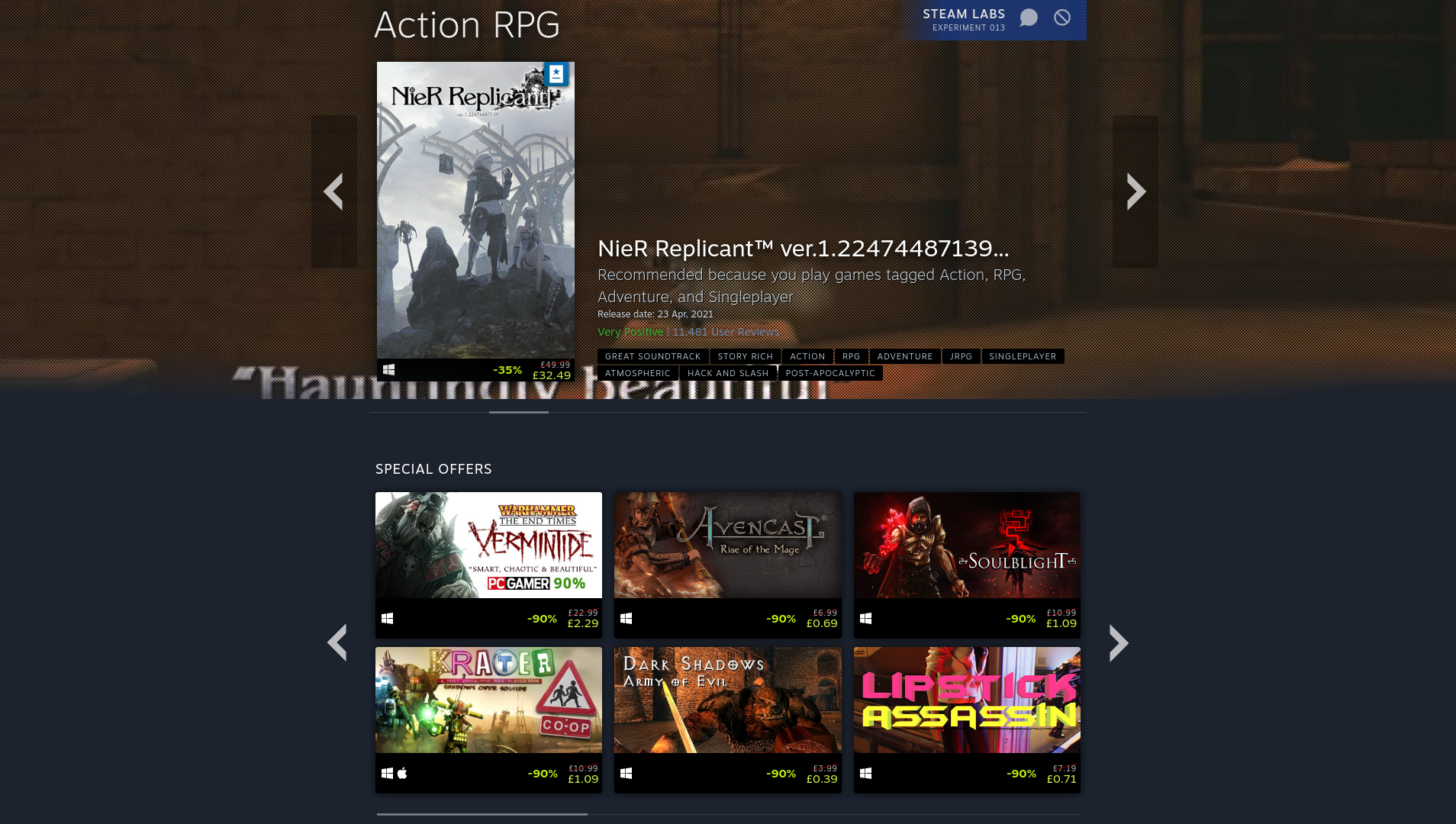
Valve are always tweaking something on Steam and their latest experiment is an upgrade to the Store Hubs, the areas on Steam where you can browse through all the random tags.
Now, when you click a tag on Steam (if you opt-in), there's a great big banner carousel at the top to go through some of the featured games. This shows off those titles that are new, top-sellers, discounted, recommendations from users and curators and more from their mighty algorithm. Below that you will get a list of recent and upcoming events, helping you to stay on top of everything.
The massive banners at the top do waste a bit of space IMO but they certainly do grab your attention - so I guess they're working as intended. They also, again, don't seem to respect your operating system preferences as it just shows anything.
When you scroll further down, Valve also shows off various personalised recommendations based on what you've been playing, plus items from your wishlist that might be relevant. On top of that, there's also all their new sorting and filtering options available in a list towards the bottom (which does have a platform filter).
Overall, it's far more useful that what Valve had before for tag hubs, it's looking pretty good.
I think this was part of the previous experiment, but glad they have included in the latest one. The filters are far more useful than before for browsing bit more niche categories as you can also filter by subgenres.
I tried with some niche genres like point and click adventure, CRPG and rogue-lite FPS. Hits were mostly spot on, so it should be also possible now to find games from bit more niche genres. With this combining two genres by manipulating categories in URL is no longer needed.
They also, again, don't seem to respect your operating system preferences as it just shows anything.Considering how much time and money they've invested in SteamOS and the Steam Deck, it baffles me that this is still an issue.
Really what I want to see is fractional scaling options instead of the automatic 2xUI thing. %125, 133, 150 specifically!
This. Is either tiiiiiny or HUGE if running a high-res display. Same problem with Spotify and some GTK apps.
Last edited by Appelsin on 20 Dec 2021 at 11:41 am UTC


 How to set up Decky Loader on Steam Deck / SteamOS for easy plugins
See more from me