Now that the dust has settled on the bottle of Wine 7.0, the biweekly development releases have begun and Wine 7.1 is out with new features and bug fixes. This is the compatibility layer that allows you to run games and applications developed for Windows - on Linux. Part of what makes up Steam Play Proton. Once a year or so, a new stable release is made.
Release highlights include:
- Vulkan 1.3 support.
- A number of theming fixes.
- WebSocket improvements.
- Improved cursor clipping on macOS.
- IDL compiler fixes for C++.
For bugs reported as fixed as of this release they noted 42 including issues solved for: Final Fantasy 7, Arx Fatalis, Rising Kingdoms, Far Cry 5, GTA IV, X3 Albion Prelude, WRC 7, Project Cars 2, Age of Empires 3 and more.
Additionally a new World Wine News is also out, going over some of the improvements in Wine 7.0 in a bit more detail like showing a number of bugs that were solved that had been open for many years.
something like this would be nice to have as an option:
https://gist.github.com/Zeinok/ceaf6ff204792dde0ae31e0199d89398
(shown on left in following [image](https://ibb.co/PgSWmNv))

Last edited by lectrode on 29 Jan 2022 at 12:20 am UTC
(shown on left in following [image](https://ibb.co/PgSWmNv))Given those three alternatives, I'm still quite fond of the regular old Windows 2000 era look (the middle one). Good contrast, easy to see what's a button/tab/etc. and what's just text. Luckily, with my usage of Wine exclusively for gaming I don't really have to deal with Windows user interfaces.

At work, where I can't avoid them I always have to jump through hoops to get something that's halfway palatable.
(shown on left in following [image](https://ibb.co/PgSWmNv))Given those three alternatives, I'm still quite fond of the regular old Windows 2000 era look (the middle one). Good contrast, easy to see what's a button/tab/etc. and what's just text. Luckily, with my usage of Wine exclusively for gaming I don't really have to deal with Windows user interfaces.

At work, where I can't avoid them I always have to jump through hoops to get something that's halfway palatable.
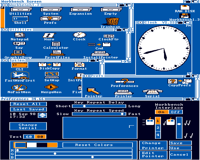
I remember the days when GUI:s used color:
I remember the days when GUI:s used color:

Good times!
I remember the days when GUI:s used color:That pretty much changed with Workbench 2.x, however.

Guess grey never gets old for me :-)
Hell yes! Also, Ambermoon is on my list of games to beat. Were you aware there is an effort to recreate it with open source for modern systems?I remember the days when GUI:s used color:That pretty much changed with Workbench 2.x, however.

Guess grey never gets old for me :-)
Also, Ambermoon is on my list of games to beat.It's my favorite Amiga exclusive RPG, so can only recommend doing that :-). Not sure how it'll hold up, though. Those early 3D dungeons will likely feel dated by today's standards. Though I guess the 2D parts and gameplay ought to be just fine.
Were you aware there is an effort to recreate it with open source for modern systems?Didn't know that. Are you are referring to [Ambermoon.net](https://github.com/Pyrdacor/Ambermoon.net)? Looks like it is already pretty much complete.
I remember the days when GUI:s used color:That pretty much changed with Workbench 2.x, however.

Guess grey never gets old for me :-)
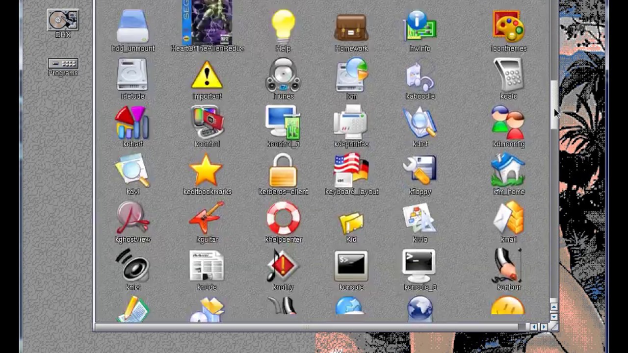
Yeah unfortunately they changed the default to all grey, thankfully there where lots of projects like MagicWB that changed it up a bit:
Last edited by F.Ultra on 30 Jan 2022 at 1:19 pm UTC
That's the one; I think there were some bugs needing to be squashed still, though it may have been a while since I was reading the threads over at eab.Also, Ambermoon is on my list of games to beat.It's my favorite Amiga exclusive RPG, so can only recommend doing that :-). Not sure how it'll hold up, though. Those early 3D dungeons will likely feel dated by today's standards. Though I guess the 2D parts and gameplay ought to be just fine.
Were you aware there is an effort to recreate it with open source for modern systems?Didn't know that. Are you are referring to [Ambermoon.net](https://github.com/Pyrdacor/Ambermoon.net)? Looks like it is already pretty much complete.
Ha, I still buy Amiga and Atari games. 'dated' is kind of an interesting term. Take for example Prince of Persia on the Atari 8bit; https://www.youtube.com/watch?v=eTyuuPG-ibI this looks AMAZING on the Atari. Likely couldn't have been done back in the day, as development tools and some hard ware tricks really weren't known about. Plus there was always this 'we'll make it easier to port to other systems, so not use a lot of the very special modes system X supports'. Is it a giant 100gb download? No, but still very impressive. Watching people squeeze every bit of performance out of old systems still makes me smile.
Ambermoon was absolutely amazing to see run on the Amiga. One of these days I'll put mine all together and play it (though with an 060, it should be very smooth).
I love MagicWB. Still prefer it over the new icons that the 3.1.+/3.2 come with. Do find it awesome that 3.2.1 came out recently.I remember the days when GUI:s used color:That pretty much changed with Workbench 2.x, however.

Guess grey never gets old for me :-)
Yeah unfortunately they changed the default to all grey, thankfully there where lots of projects like MagicWB that changed it up a bit:

Ambermoon was absolutely amazing to see run on the Amiga.No doubt about that. When viewed in context of the hardware it ran on, I think it's on par with any AAA first person game you can throw at modern systems. But 30 years from now I'll likely still call those games dated :-). For me, 2D graphics age much better than 3D ever will.
One of these days I'll put mine all together and play it (though with an 060, it should be very smooth).I played on a stock A500 and what made the biggest difference for me was when I finally got a hard drive. The game read assets from multiple floppies on each area transition, so there was a lot of disk swapping involved and loading times were slow. With that out of the way, it was smooth sailing, even at 8 MHz :-).
I love MagicWB. Still prefer it over the new icons that the 3.1.+/3.2 come with. Do find it awesome that 3.2.1 came out recently.I remember the days when GUI:s used color:That pretty much changed with Workbench 2.x, however.

Guess grey never gets old for me :-)
Yeah unfortunately they changed the default to all grey, thankfully there where lots of projects like MagicWB that changed it up a bit:

Amiga lives forever :), I have to fix my A4000 someday, it has the famous leaky battery and have been stored for over 20 years since I found that it leaked so huge change the whole MB is ruined...
Ewww! I have seen some saves for such things, but it usually requires a lot of bodge wires. Even as bad as some of those Amigas with batteries have become, I've still seen worse on some of the old XTs where the battery acid eats through the case and board.I love MagicWB. Still prefer it over the new icons that the 3.1.+/3.2 come with. Do find it awesome that 3.2.1 came out recently.I remember the days when GUI:s used color:That pretty much changed with Workbench 2.x, however.

Guess grey never gets old for me :-)
Yeah unfortunately they changed the default to all grey, thankfully there where lots of projects like MagicWB that changed it up a bit:

Amiga lives forever :), I have to fix my A4000 someday, it has the famous leaky battery and have been stored for over 20 years since I found that it leaked so huge change the whole MB is ruined...
Ambermoon was absolutely amazing to see run on the Amiga.No doubt about that. When viewed in context of the hardware it ran on, I think it's on par with any AAA first person game you can throw at modern systems. But 30 years from now I'll likely still call those games dated :-). For me, 2D graphics age much better than 3D ever will.
One of these days I'll put mine all together and play it (though with an 060, it should be very smooth).I played on a stock A500 and what made the biggest difference for me was when I finally got a hard drive. The game read assets from multiple floppies on each area transition, so there was a lot of disk swapping involved and loading times were slow. With that out of the way, it was smooth sailing, even at 8 MHz :-).
Did you ever play Legends of Valor? That was another RPG that had very impressive 3D movement. It was kind of Daggerfall before Daggerfall was a thing. It's amazing even pre-AGA how well such games ran. Granted they pulled a lot of awesome tricks.
I originally played Legends of Valor on my Mega STe. At 16mhz it was rather smooth.
Did you ever play Legends of Valor?No. And I don't remember hearing that name either. Though I vaguely recall a magazine article about an upcoming RPG set in a single, fully simulated city, which had piqued my interest way back in the past. Legends of Valor might fit the bill, though I neither recall the game nor the magazine. So it could easily have been something else, 5 years or a decade later. Until now I have assumed it was something that just never materialized, like the Amiga port of Darklands, but perhaps it just went under my radar.



 How to set, change and reset your SteamOS / Steam Deck desktop sudo password
 How to set up Decky Loader on Steam Deck / SteamOS for easy plugins
See more from me