GNOME 43 is officially out now, bringing with it some pretty wonderful sounding changes to one of the most popular Linux desktop environments.
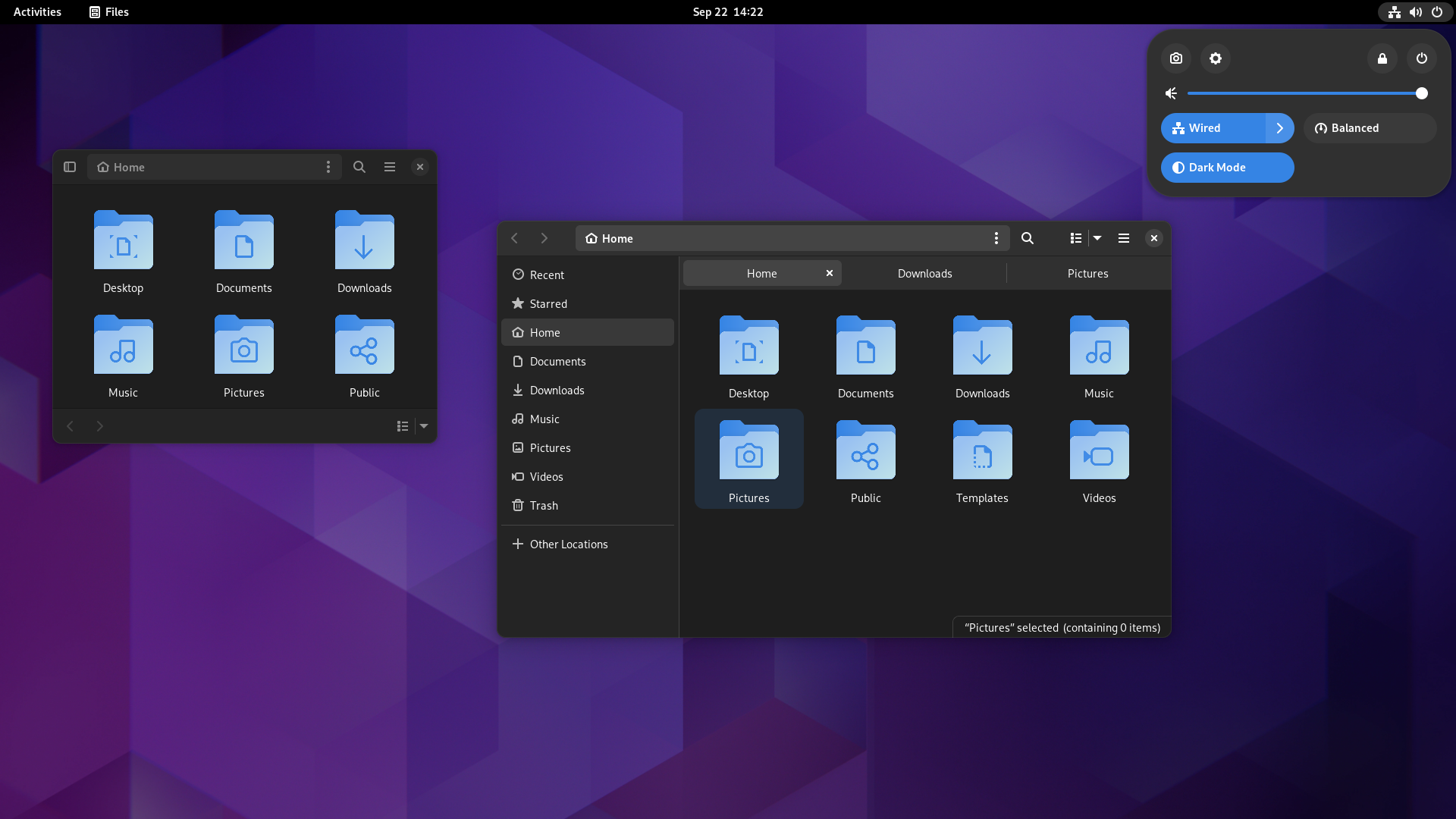
One of the new highlights is a Quick Settings feature. This is a redesign of the status menu in the top right, giving you more settings that are easy to change like the UI style, a screenshot button, the ability to switch between sound devices and more.
More apps are switching over to GTK 4, the next-generation GNOME user interface toolkit and as of GNOME 43 these apps have newly moved over: Files, Maps, Logs, Builder, Console, Initial Setup and Parental Controls.
The Files app also went through a refresh with a new modern design for the file and folder properties window, the layout adjusts itself to various widths automatically, reorganized menus, a new layout for search results, recent, and starred files, there's a new Open With dialog and in the list view opening the context menu for the current directory is now much easier.
You will also find a new Device Security section in the privacy settings, a new and improved Web Apps feature to install websites to the desktop as apps and more.
Lots of other improvements including:
- The screen keyboard now shows suggestions as you type. It will also show Ctrl, Alt, and Tab keys when typing in a terminal.
- Web’s screenshot feature is now easier to use: it can now be found in the web page context menu, or triggered with the Shift+Ctrl+S keyboard shortcut.
- Also in Web, the style of interface elements in web pages has also been updated, to match modern GNOME applications.
- The Characters app now includes a much wider selection of emoji, including people with different skin tones, genders, and hair styles, and more regional flags.
- Some of the animations in the Activities Overview have been optimized, so that they are smoother.
- The “about windows” of GNOME apps, which show details about each app, have been revamped.
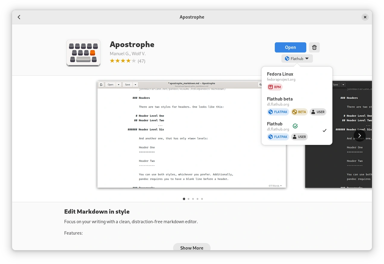
- In Software, application pages have an improved switcher for selecting the source and format.
- The dark UI style used by GTK 4 apps has been polished, so the appearance of bars and lists is more harmonious.
- When connecting to GNOME with a remote desktop app (using RDP), it is now possible to receive audio from the host.
- GNOME’s range of alert sounds has been updated, and includes a new default alert sound.
See the release notes for more.
As for when you'll get it? You'll need to refer to the update cycle of your Linux distribution as they're all different. You can try it out right now though, using the GNOME OS Nightly image.
Anyone figure out how to get it onto the SteamDeck yet? Still maintain that Gnome would have been a better interface on it...
Gnome would be a worse interface due to it’s forceful restrictions and constant desire to break it’s addons.
Plasma is looser but less likely to decide things like “the global file menu isn’t necessary” or “the calendar and clock should be centered”.
Now all I would want is proper toolbars and menus in applications and some common functionality to fill them with,
some sensible option concerning height of Window Title Bar and the option to remove of random icons from said bar and I might actually be tempted to give it another look.
Anyone figure out how to get it onto the SteamDeck yet? Still maintain that Gnome would have been a better interface on it...
Gnome would be a worse interface due to it’s forceful restrictions and constant desire to break it’s addons.
Plasma is looser but less likely to decide things like “the global file menu isn’t necessary” or “the calendar and clock should be centered”.
On a tiny screen none of that matters. It's better at a touch inferface (matters), and in fact it's restrictive nature is probably better on a system that is sort of locked down in the first place. Also, later versions of gnome allow you to move the clock/calendar and notifications to other places (at least I'm pretty sure I saw the option somewhere). Really the ONLY argument I can see against using Gnome on it is 'it's not what people are used to.' since there are some changes like not having a permanent dock, etc.
So don't use addons. The only one that's necessary in some instances is AppIndicators. Can you name some of these forceful restrictions?Anyone figure out how to get it onto the SteamDeck yet? Still maintain that Gnome would have been a better interface on it...
Gnome would be a worse interface due to it’s forceful restrictions and constant desire to break it’s addons.
Plasma is looser but less likely to decide things like “the global file menu isn’t necessary” or “the calendar and clock should be centered”.
Gnome would be a worse interface due to it’s forceful restrictions and constant desire to break it’s addons.
Yeah that is my biggest issue with Gnome, look at all those plugins you can use... oh wait they keep breaking because the backend code keeps going through fundamental changes for some reason and plugin makers give up... sigh..
Benefit to Plasma has been ALL THAT is available in some way out of the box if you learn how to customize it all.
In saying that I'm tempted to try out Gnome again. Maybe I'll create a new user account and test it out.
Last edited by TheRiddick on 22 Sep 2022 at 11:18 pm UTC
You really can make KDE look like whatever you want. So for those that love to do that, it's fantastic! Amazing even. I've gotten to the point in my life where that no longer is something I desire to do, and just want some good defaults. If there are more than just a few things that I tweak to get where I find a thing usable, then I'll give up and find something else to mess with. Which is sad, as I totally like messing around with stuff, and usually get bored if it 'just works'. Granted, I'll spend hours messing around with getting drivers and bits and pieces working on my Amigas... But that's fun. My Linux desktop is generally just there to launch whatever applications I'm trying to use.Gnome would be a worse interface due to it’s forceful restrictions and constant desire to break it’s addons.
Yeah that is my biggest issue with Gnome, look at all those plugins you can use... oh wait they keep breaking because the backend code keeps going through fundamental changes for some reason and plugin makers give up... sigh..
Benefit to Plasma has been ALL THAT is available in some way out of the box if you learn how to customize it all.
In saying that I'm tempted to try out Gnome again. Maybe I'll create a new user account and test it out.
I've also found the 'hit a key and type' method of launching applications far more useful than digging through menus. Though I think KDE finally added something similar (though they've had the 'start menu' style of it for a while, just didn't have the 'activities' version of it). Same with macOS, I use Spotlight search more than I'd ever use Finder / Applications.
Granted, I still install the vertical overview extension (it needs to be updated for 43) because with some screen ratios, it makes more sense to have it on the left.)
I really should make a video showing all the fucked up shit wayland does to my desktop. The new floating panel option for example has shadow render issues.. lol
Wayland still MILES away from being ready, at least on plasma.
So don't use addons. The only one that's necessary in some instances is AppIndicators. Can you name some of these forceful restrictions?Anyone figure out how to get it onto the SteamDeck yet? Still maintain that Gnome would have been a better interface on it...
Gnome would be a worse interface due to it’s forceful restrictions and constant desire to break it’s addons.
Plasma is looser but less likely to decide things like “the global file menu isn’t necessary” or “the calendar and clock should be centered”.
Yikes, that’s the whole issue with Gnome is telling it’s users what they do and don’t need. I don’t use Gnome at all because it’s very restrictive. To the point where you have to install a separate config utility to tweak certain options on the desktop.
So I will gladly not use addons because I don’t use Gnome I use KDE Plasma.
Eh? dconf is included as part of gnome. If that is what you are referring to. I think Tweaks is now deprecated, and even extensions can be managed through their website (which is weird to me, but generally works.) Extensions not working shouldn't be a thing if developers would simply have a VM installed with the gnome nightly set up... at least I would think so, I haven't developed one, so I may be speaking out of my exit orifice.So don't use addons. The only one that's necessary in some instances is AppIndicators. Can you name some of these forceful restrictions?Anyone figure out how to get it onto the SteamDeck yet? Still maintain that Gnome would have been a better interface on it...
Gnome would be a worse interface due to it’s forceful restrictions and constant desire to break it’s addons.
Plasma is looser but less likely to decide things like “the global file menu isn’t necessary” or “the calendar and clock should be centered”.
Yikes, that’s the whole issue with Gnome is telling it’s users what they do and don’t need. I don’t use Gnome at all because it’s very restrictive. To the point where you have to install a separate config utility to tweak certain options on the desktop.
So I will gladly not use addons because I don’t use Gnome I use KDE Plasma.
The issue isn’t the developer’s setup but rather the constant moving target.
I've also found the 'hit a key and type' method of launching applications far more useful than digging through menus.Doesn't do much for me. I have two basic categories of applications: The few I use all the time, which I have stuck in launchers on a taskbar. And the ones I use every once in a while, whose names I can't recall off the top of my head, but I'll know them when I see them in their menu category. That second sort, typing doesn't help me much with launching. The first sort, I click the launcher.
Use cases vary. I'm glad I use Linux, which has interfaces that are good for lots of people's use cases instead of Windows "one size fits poorly".
Tried Plasma Wayland yesterday, WHAT A MESS that was. Broken UI and Font everywhere! you want functional non blurry desktop scaling then wayland won't be delivering anytime soon!
I really should make a video showing all the fucked up shit wayland does to my desktop. The new floating panel option for example has shadow render issues.. lol
Wayland still MILES away from being ready, at least on plasma.
This is incorrect. It's not wayland that is at fault - it's the KDE implementation of it.
Wayland is a protocol for a compositor to talk to its clients as well as a C library implementation of that protocol. The compositor can be a standalone display server running on Linux kernel modesetting and evdev input devices, an X application, or a wayland client itself. The clients can be traditional applications, X servers (rootless or fullscreen) or other display servers.
It is more likely that the KDE compositor and various other bits need a lot more work. Unfortunately we're probably going to see bugs for a long while thanks to C++ and QT being used (neither are very nice to use).
https://wayland.freedesktop.org/
You can use vague terms too, like 'terminal' 'web' etc. So at least there's that. Metadata is nice :)I've also found the 'hit a key and type' method of launching applications far more useful than digging through menus.Doesn't do much for me. I have two basic categories of applications: The few I use all the time, which I have stuck in launchers on a taskbar. And the ones I use every once in a while, whose names I can't recall off the top of my head, but I'll know them when I see them in their menu category. That second sort, typing doesn't help me much with launching. The first sort, I click the launcher.
Use cases vary. I'm glad I use Linux, which has interfaces that are good for lots of people's use cases instead of Windows "one size fits poorly".
That was my point, you can install a Gnome Nightly VM that the Gnome team themselves manage. If you're developing an extension for Gnome, that's likely the best way to make sure it's still working when a new release is starting to trickle into distributions.Eh? dconf is included as part of gnome. If that is what you are referring to. I think Tweaks is now deprecated, and even extensions can be managed through their website (which is weird to me, but generally works.) Extensions not working shouldn't be a thing if developers would simply have a VM installed with the gnome nightly set up... at least I would think so, I haven't developed one, so I may be speaking out of my exit orifice.So don't use addons. The only one that's necessary in some instances is AppIndicators. Can you name some of these forceful restrictions?Anyone figure out how to get it onto the SteamDeck yet? Still maintain that Gnome would have been a better interface on it...
Gnome would be a worse interface due to it’s forceful restrictions and constant desire to break it’s addons.
Plasma is looser but less likely to decide things like “the global file menu isn’t necessary” or “the calendar and clock should be centered”.
Yikes, that’s the whole issue with Gnome is telling it’s users what they do and don’t need. I don’t use Gnome at all because it’s very restrictive. To the point where you have to install a separate config utility to tweak certain options on the desktop.
So I will gladly not use addons because I don’t use Gnome I use KDE Plasma.
The issue isn’t the developer’s setup but rather the constant moving target.
FOSS Maintainers usually do this as a side gig. It’s not something they keep up with because there is little incentive. The moving target desktop platform requires more time to keep up. So extensions get broken. It’s not the developer setup. It’s the time and effort cost and little to no return.
I know, what I am saying is the development effort would be less this way... I am betting most do not know that gnome has a nightly distro build. I was just trying to spread the word that it exists. There should probably be more communication between extensions writers and the Gnome Foundation on the directions they are going.That was my point, you can install a Gnome Nightly VM that the Gnome team themselves manage. If you're developing an extension for Gnome, that's likely the best way to make sure it's still working when a new release is starting to trickle into distributions.Eh? dconf is included as part of gnome. If that is what you are referring to. I think Tweaks is now deprecated, and even extensions can be managed through their website (which is weird to me, but generally works.) Extensions not working shouldn't be a thing if developers would simply have a VM installed with the gnome nightly set up... at least I would think so, I haven't developed one, so I may be speaking out of my exit orifice.So don't use addons. The only one that's necessary in some instances is AppIndicators. Can you name some of these forceful restrictions?Anyone figure out how to get it onto the SteamDeck yet? Still maintain that Gnome would have been a better interface on it...
Gnome would be a worse interface due to it’s forceful restrictions and constant desire to break it’s addons.
Plasma is looser but less likely to decide things like “the global file menu isn’t necessary” or “the calendar and clock should be centered”.
Yikes, that’s the whole issue with Gnome is telling it’s users what they do and don’t need. I don’t use Gnome at all because it’s very restrictive. To the point where you have to install a separate config utility to tweak certain options on the desktop.
So I will gladly not use addons because I don’t use Gnome I use KDE Plasma.
The issue isn’t the developer’s setup but rather the constant moving target.
FOSS Maintainers usually do this as a side gig. It’s not something they keep up with because there is little incentive. The moving target desktop platform requires more time to keep up. So extensions get broken. It’s not the developer setup. It’s the time and effort cost and little to no return.
you want functional non blurry desktop scaling then wayland won't be delivering anytime soon!https://pointieststick.com/2022/06/17/this-week-in-kde-non-blurry-xwayland-apps/
sudo pacman -S kde-git-meta



 How to set, change and reset your SteamOS / Steam Deck desktop sudo password
 How to set up Decky Loader on Steam Deck / SteamOS for easy plugins
See more from me