Smelling fresh and ready to invite you in, Linux Mint 21.1 is officially out now so here's what's new and improved. I covered the Beta release and so of course not a whole lot apart from some bug fixes has happened since then. Now is the time to jump in though, as it's better than ever.
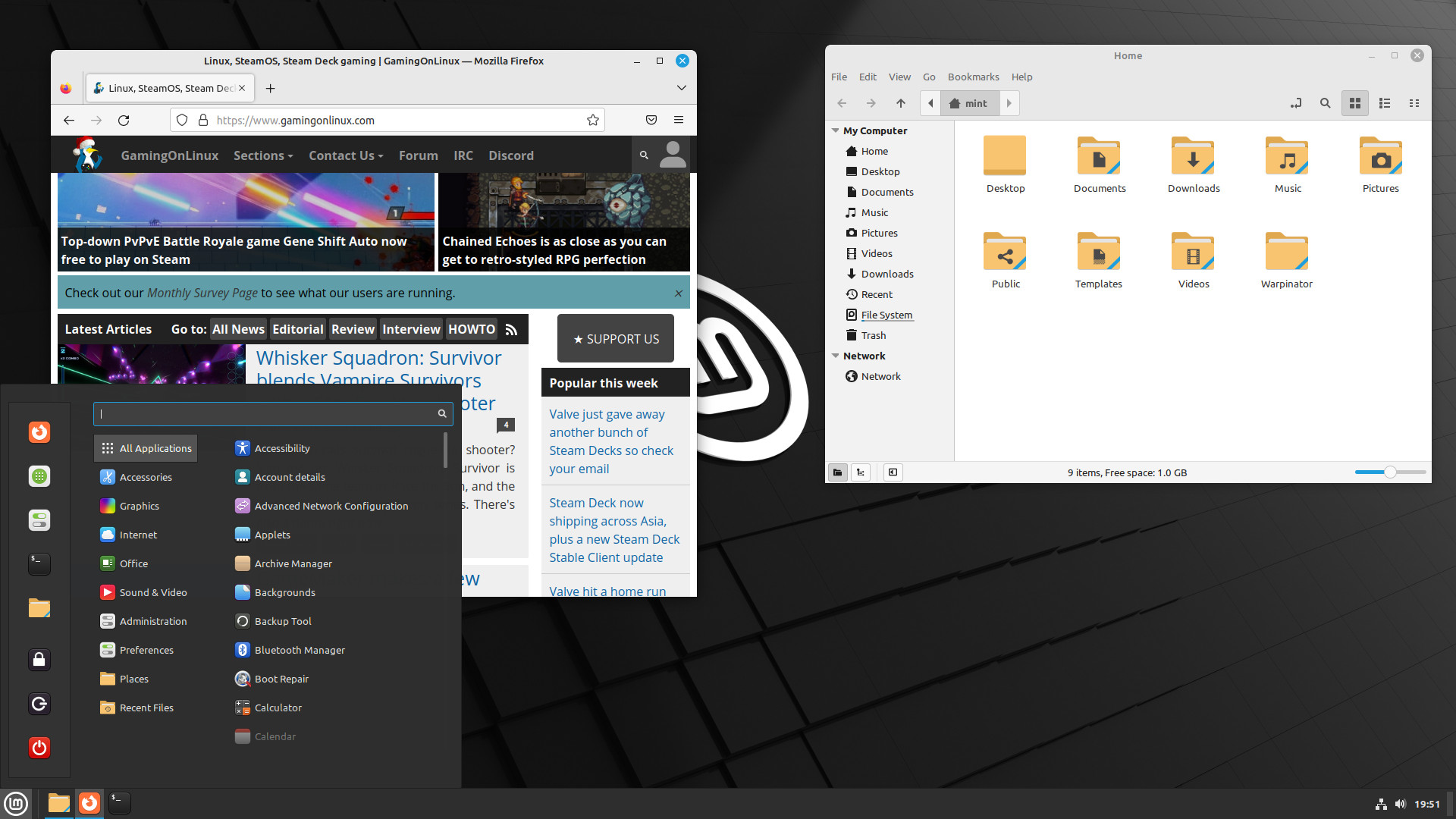
Built on top of Ubuntu 22.04 you get everything that has, minus Snaps. There's Cinnamon 5.6, Linux kernel 5.15 and it will receive security updates until 2027. It's sporting a bit of a new look too, with plenty of style changes including the removal of unneeded items from the desktop, more vibrant colouring for accents, a change to Aqua by default so say goodbye to Linux Mint being green out of the box and a new mouse pointer theme.
As a reminder on some of what's new:
- Driver Manager no longer needd a password to launch, plus improved offline support and fixes for NVIDIA.
- Full Flatpak integration in the Update Manager.
- More places needing a password prompt were removed that don't need administrative permissions.
- Right click on desktop now has a Display Settings option.
- A refreshed interface for the Software Manager, that makes it easier to tell the difference between Flatpak and normal packages. Plus you can switch between them if an app has both.
- A Verify ISO tool was added.
- Other visual changes include a seperator next to the Mint Menu button, a corner bar applet on the far right of the panel inspired by Windows 10, selecting an item in the file manager Nemo only highlights the name now and not the icon as well.
For more on what's new see their announcement.
One annoyance, though, is that you can't seem to turn off the windows fanning out per *desktop*, in desktop view -- which makes selecting a desktop with the mouse frustrating, because you end up 'raising' a window that you didn't intend to.
If I can find a way to turn that off, I'm even considering to switch to Cinnamon from Xfce.
more vibrant colouring for accents
Hell yes. My dark pastel red theme suddenly looked like a fire engine after the upgrade ! Switched to aqua (light blue) theme and it looks good, though. I see some influence from Pop OS, which I like.
Upgrade went fine : no sign of anything broken after 24 hours.
While I really appreciate the efforts of the Mint team, I can't overlook this aspect, since it is the first impression for many people of the Linux desktop and first impressions are important. Obviously one can change the icon theme if a newcomer wants to and knows about the option, but sane defaults are always better.
Imho.
Edit:
typo
Last edited by omeganebula on 22 Dec 2022 at 3:03 pm UTC
I don't understand why they don't use a more neutral icon theme. The Firefox icon, for example, is completely alien to what Mozilla wants to promote. Moreover, I have yet to hear of anyone who considers Moka icons aesthetically pleasing.Matter of taste I guess. I don't mind the icon theme at all. Haven't even thought of switching away from Moka since it was introduced in Mint. IMHO it's a perfectly "sane default" as you put it. I haven't actually heard anyone complain about it before, and I know a bunch of Mint users.
While I really appreciate the efforts of the Mint team, I can't overlook this aspect, since it is the first impression for many people of the Linux desktop and first impressions are important. Obviously one can change the icon theme if a newcomer wants to and knows about the option, but sane default are always better.
Imho.
That said, I'm not yet sure if I like the new, bright colours and yellow folders.
Matter of taste I guess. I don't mind the icon theme at all. Haven't even thought of switching away from Moka since it was introduced in Mint. IMHO it's a perfectly "sane default" as you put it.English is not my native language, and I'm not even an Indo-European speaker, so sorry for any incorrect grammar. However, I can't see how overriding common application icons could be a sane default. In fact, one of the first reactions when I recommend Mint to someone, is asking if they can do something about it. Firefox is usually the one that's particularly striking, and the server-side decoration on it. Not a deal breaker, just an annoyance, because other than that, it's a great distro.
Matter of taste I guess. I don't mind the icon theme at all. Haven't even thought of switching away from Moka since it was introduced in Mint. IMHO it's a perfectly "sane default" as you put it.English is not my native language, and I'm not even an Indo-European speaker, so sorry for any incorrect grammar.
Your grammar is fine. Or maybe I just think it is because my native language isn't Indo-European either.
However, I can't see how overriding common application icons could be a sane default. In fact, one of the first reactions when I recommend Mint to someone, is asking if they can do something about it. Firefox is usually the one that's particularly striking, and the server-side decoration on it. Not a deal breaker, just an annoyance, because other than that, it's a great distro.
Personally I enjoy the visual consistency and dislike having a bunch of clashing icon styles in my panel or on my desktop. And apparently my friends and family don't mind it either. To me it seems like a perfectly sane default.
You might like the fact that in addition to Mint's own (partially Moka-based) icon themes, this new release comes with a bunch of alternatives out of the box. Namely Breeze, Numix, Papirus and Yaru. Maybe one of those is more to your liking. I think Papirus might have application icons as well though.




 How to set, change and reset your SteamOS / Steam Deck desktop sudo password
 How to set up Decky Loader on Steam Deck / SteamOS for easy plugins
See more from me