While you're here, please consider supporting GamingOnLinux on:
Reward Tiers: Patreon. Plain Donations:
  PayPal.
This ensures all of our main content remains totally free for everyone! Patreon supporters can also remove all adverts and sponsors! Supporting us helps bring good, fresh content. Without your continued support, we simply could not continue!
You can find even more ways to support us on this dedicated page any time. If you already are, thank you!
Reward Tiers:
This ensures all of our main content remains totally free for everyone! Patreon supporters can also remove all adverts and sponsors! Supporting us helps bring good, fresh content. Without your continued support, we simply could not continue!
You can find even more ways to support us on this dedicated page any time. If you already are, thank you!
Login / Register
- Intel and NVIDIA drivers holding back a public SteamOS release, Valve not trying to compete with Windows
- GOG joins the European Federation of Game Archives, Museums and Preservation Projects
- NTSYNC driver for improving Windows games on Linux with Wine / Proton should finally land in Linux kernel 6.14
- Prime Gaming January 11th 2025 edition round-up for Linux / SteamOS and Steam Deck
- Even with SteamOS coming to more systems Bazzite has no plans to go anywhere
- > See more over 30 days here
-
Game save data backup tool Ludusavi v0.28 brings new fe…
- robvv -
Intel and NVIDIA drivers holding back a public SteamOS …
- WorMzy -
FINAL FANTASY VII REBIRTH gets Steam Deck Verified ahea…
- Cyba.Cowboy -
Cubic Odyssey announced as a fusion of Minecraft and No…
- Cyba.Cowboy -
Roll the dice to make crazy combos instead of collectin…
- Purple Library Guy - > See more comments
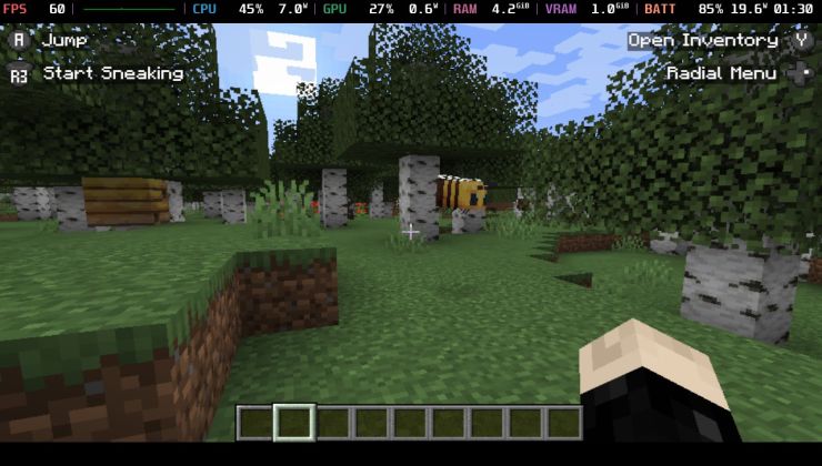
 An idiots guide to setting up Minecraft on Steam Deck / SteamOS with controller support
 How to install extra software, apps and games on SteamOS and Steam Deck
View PC info
!https://i.postimg.cc/nrCBSHH0/Screenshot-at-2024-01-13-17-02-46.png
Again: if people need to use adblockers, go for it. You can also support via patreon, to ensure you never ever see an advert or sponsor and help fund a website you read regularly if you're able to do so.
Adverts for logged-out users are staying, they will not be removed, I need the funding. Plain and simple. And eventually they will be for all non-Patreon supporters. The adverts can be tweaked, and ridiculous adverts can be stopped if properly reported. I did say clearly in the OP I would be tweaking stuff.
Edit: I've been trying to restrict the size of those between the articles without luck, adsense kept overwriting my max-size and height css. So I've swapped them for a different type, which is much smaller. Should make it much nicer overall!
Last edited by Liam Dawe on 14 Jan 2024 at 11:53 am UTC
View PC info
I think removing the ones on the bottom of the page would make it feel a lot less ad infested, feels a bit to much with them.
The only ad that was a bit annoying is the one attached to the bottom of your screen. Yeah, it can be minimized, but it takes up permanent screen real estate.
View PC info
Last edited by m2mg2 on 14 Jan 2024 at 6:26 pm UTC
View PC info
It may be that adsense tries to force ads to be the same size as the content for the same reason I don't like it.
Last edited by m2mg2 on 14 Jan 2024 at 6:35 pm UTC
View PC info
It's still about 50 percent screen space can occupied by ads on mobile, at least that's what I'm seeing.
Last edited by m2mg2 on 14 Jan 2024 at 6:48 pm UTC
Firefox user and idiot here, how does one do this?
Would love to do that for Humble and Fanatical in particular. I always change humble to split most of the money between GOL and the charity, though have occasionally forgotten to use the affiliate links to do so.
First, one bookmarks the affiliate link from the Support us page.
Then, in bookmarks -> manage bookmarks
search for the just-created bookmark, set keyword of said bookmark to, for example, gog. From then on, if you enter gog in the address bar, it'll go to the affiliate link. Take care that if you type gog.com it'll go to the plain website without affiliate code.
Last edited by emphy on 16 Jan 2024 at 8:56 am UTC
Last edited by Liam Dawe on 26 Jan 2024 at 8:30 pm UTC
Anyway, once enabled, it should certainly aid in me in becoming Mr. Muscles, like a proper nerd. Oh yeah!
!Muscles
Although, it's fashion choices are questionable at best.
(Thought I'd share, because I found that particular ad quite amusing.)
I visited the web today from a work computer (macOS and Chrome browser), not being logged in and without any adblockers, etc and in the places where the adverts would be, only one would show, and in the other spaces only a blank space leaving a weird spacing between the articles.
Not sure if a bug, but wanted to flag :)
Last edited by Arehandoro on 7 Feb 2024 at 5:38 pm UTC
The extra muscles will be useful for it.
You might bruteforce your way into them, but then how do you get back out?
PS: I'm totally sticking a "kick me sign" on your back, between your shoulders when you nerds become Mr. Muscles, you won't be able to reach it to get it off