While you're here, please consider supporting GamingOnLinux on:
Reward Tiers: Patreon. Plain Donations:
  PayPal.
This ensures all of our main content remains totally free for everyone! Patreon supporters can also remove all adverts and sponsors! Supporting us helps bring good, fresh content. Without your continued support, we simply could not continue!
You can find even more ways to support us on this dedicated page any time. If you already are, thank you!
Reward Tiers:
This ensures all of our main content remains totally free for everyone! Patreon supporters can also remove all adverts and sponsors! Supporting us helps bring good, fresh content. Without your continued support, we simply could not continue!
You can find even more ways to support us on this dedicated page any time. If you already are, thank you!
Login / Register
- Intel and NVIDIA drivers holding back a public SteamOS release, Valve not trying to compete with Windows
- GOG joins the European Federation of Game Archives, Museums and Preservation Projects
- NTSYNC driver for improving Windows games on Linux with Wine / Proton should finally land in Linux kernel 6.14
- Prime Gaming January 11th 2025 edition round-up for Linux / SteamOS and Steam Deck
- Even with SteamOS coming to more systems Bazzite has no plans to go anywhere
- > See more over 30 days here
-
Roll the dice to make crazy combos instead of collectin…
- g000h -
Don't miss the Fanatical Build your own Explosive Bundl…
- g000h -
Game save data backup tool Ludusavi v0.28 brings new fe…
- robvv -
Intel and NVIDIA drivers holding back a public SteamOS …
- WorMzy -
FINAL FANTASY VII REBIRTH gets Steam Deck Verified ahea…
- Cyba.Cowboy - > See more comments
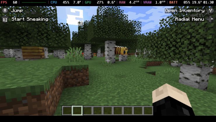
 An idiots guide to setting up Minecraft on Steam Deck / SteamOS with controller support
 How to install extra software, apps and games on SteamOS and Steam Deck
Note
Yes, the switcher requires JavaScript. Since I know some don't like that, you can still use the theme switcher in your User settings. That was also updated, as it now properly forces your picked theme there (which overrides the top nav slider).
Of course, there will be issues, some edge-cases I've missed.
If you see anything that doesn't look right or act right please let me know here so I can fix them. Before reporting, please refresh your cache to ensure it's not your browser keeping old CSS/JS around.
The forum
The old category/forum view is gone, long live flat forum. Honestly, it's just better, it matches the home page style of all categories shown. This way, categories that don't usually get a look-in will now actually have their posts show up when people make them.
Last edited by Liam Dawe on 29 Mar 2020 at 8:52 pm UTC
View PC info
View PC info
If you switch to the dark theme and then close the browser, or go to another website and come back, you end up with the light theme.
If you Force the theme through the profile settings, it works fine.
Last edited by serge on 29 Mar 2020 at 4:14 pm UTC
I am seeing the same behaviour as well. Also when the dark theme is enabled and (re)loading the page, the toggle button "switches" after the page have finished loading which draws attention to it. I find it a bit annoying. At least now that I noticed it :)
As it turns out, the above is exactly what Twitch do. Only realised after I did it, so it seems like the real solution that I fell into there :D
Haven't yet come up with a good solution for the switcher flicking between though. Happy to take on ideas.I've moved the slider into the user menu on desktop/mobile menu.
I'll also adjust for Guests/Not Logged In people to have a menu to do so too.Guests now have their own little menu.Last edited by Liam Dawe on 29 Mar 2020 at 8:48 pm UTC
The "theme" key in local storage is saved, though and set to "dark".
Since the attribute "data-theme" is set, your code doesn't even look at what's set in the local storage and just uses "default" as the value, as that's set in:
<html data-theme="default" class=" idcae idcac" lang="en">var website_theme='light';
if (document.documentElement.hasAttribute("data-theme")) {
website_theme=document.documentElement.getAttribute("data-theme");
} else {
// If I run this on its own, the theme changes to dark as expected.
if (localStorage.getItem("theme")) {
if(localStorage.getItem("theme")=="dark") {
website_theme="dark";
}
}
else if (window.matchMedia("(prefers-color-scheme: dark)").matches) {
website_theme="dark"
}
if (website_theme=="dark") {
document.documentElement.setAttribute("data-theme","dark")
}
}
Last edited by chris.echoz on 1 Apr 2020 at 9:58 pm UTC
Edit: Actually just noticed it says default, that looks like a leftover issue from the switch. Hold on 5 mins.
Edit 2: Should be fixed, a bunch of people didn't have their theme correctly unset from "default" (which no longer exists) it's either nothing and set by the JS and the new toggle or forced as light/dark in the User Control Panel.
Last edited by Liam Dawe on 1 Apr 2020 at 10:06 pm UTC
Hate this reddit category type BS :(
Edit: Also finally made the category view more responsive to the screen size, hiding some bits to make it better :)
Last edited by Liam Dawe on 19 Apr 2020 at 11:52 am UTC
The vertical centre alignment of the images on the front page looks really messy to me. Since the right part is top aligned, the image is never in the same place. Doesn't look good to me. Never had any problems with the top alignment.
Ever more of an issue for me is the share buttons with the articles. It starts with "share", which doesn't really do anything. Then I get four icons for services that I don't even have an account for. And the last one is RSS feed of articles which is not a share and is since it doesn't apply to the article, it is out of place. All of it is combined with attention grabbing colours. Although it's worse for me than the first, I can easily have the whole thing removed with ublock. In fact, it already does so with my standard setup.
Otherwise everything is great. Still not a fan of the dark theme, but standard suits my needs just fine.
That I actually agree with, the share image itself was also aligned funky across different browsers. It's now just a nicely aligned plain text. It makes it clear while also taking less attention. Good shout.
Again, agreed. RSS icon removed, wrong place for it and we already have it on the home page article list anyway. Good shout again on it.
:D:D:D:D
Frankly, Firefox's current default content line, where it decides to load the full image is not great, it's far too close to your actual view. Chrome has a more sane default with things loading when slightly off the screen so you save data and see less pop-in.
Of course:

It gets more interesting though. When I click up on the scrollbar once, I get:

See how the picture was replaced, but it has moved up with respect to the position of the "tiny" picture. So might be an alignment thing of some sort.
Edit: also another interesting thing. Right now it doesn't matter how far I scroll the page and go back. When scrolling up, the first image to not load when scrolling back up is the one from the fractalis post.
Last edited by Ehvis on 21 Apr 2020 at 1:28 pm UTC
That was part of the problem here I think, as the tiny low-res image never matched up and it couldn't because the tagline images were always a different size. I've adjusted the first 7 items on the home page, let me know how you get on.